Det Kongelige Akademi - the new visual identity by Urgent Agency


On the 6 October the Royal Danish Academy of Fine Arts Schools of Architecture, Design and Conservation (KADK) launched a new visual identity created by the academy communications department and Urgent Agency. This is not just about graphics but appears to be a major rethink of how the Royal Academy presents itself, its students and their work to a wider public.

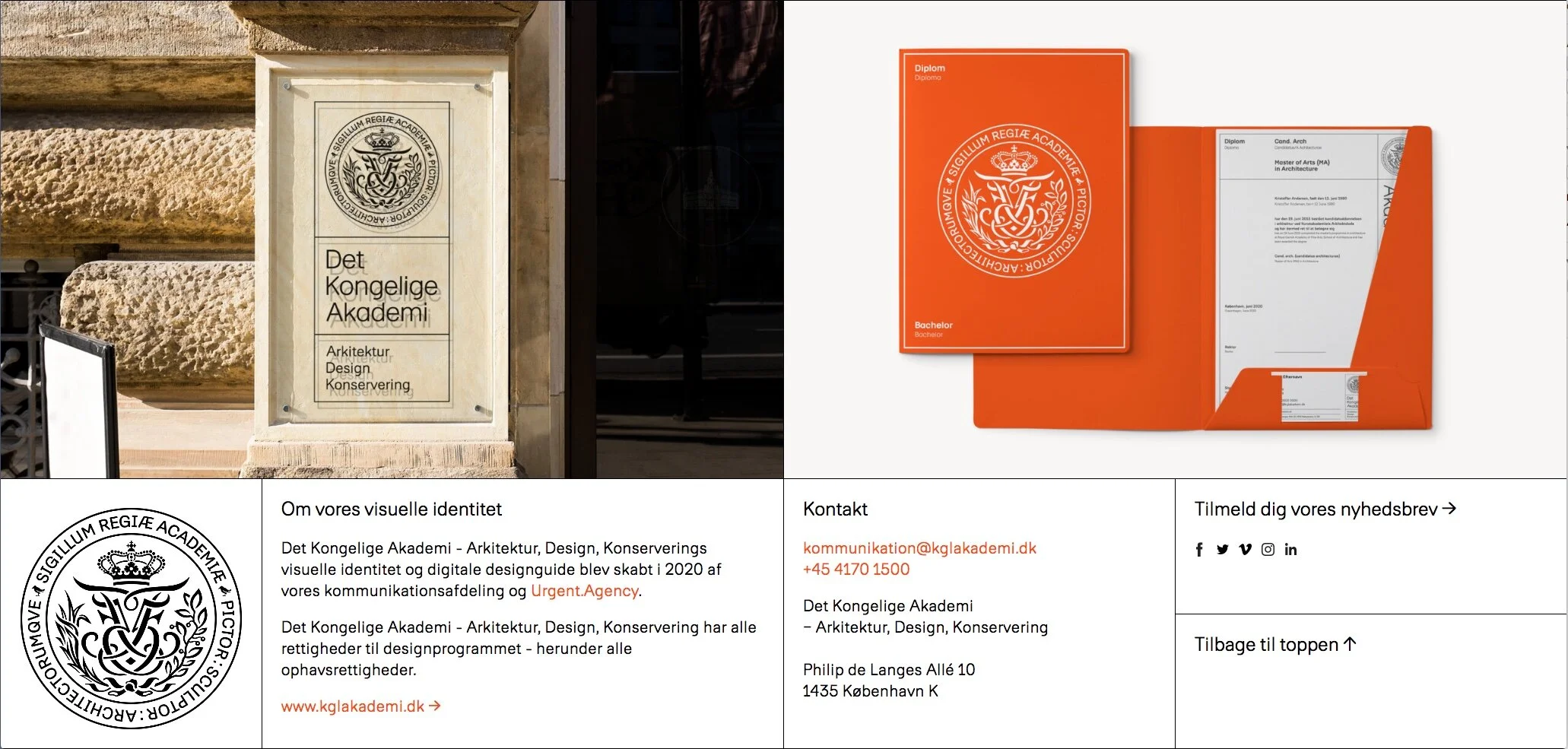
The name of the Academy and its design schools has been shortened to Det Kongelige Akademi - Arkitektur, Design, Konservering / The Royal Academy - Architecture, Design, Conservation and there is a new royal seal.

Without doubt, the old branding - with very heavy use of black borders and black blocks - was looking tired and dated and the online site was far from easy to navigate. The complete redesign of the online site cannot have been easy because it is the initial access point to a vast amount of information for students and staff; for potential students; for companies and potential employers and for a broader general public who are looking for information about the libraries, public exhibitions and so on.

Overall, the new visual identity is light and elegant and simple with just four colours - white, a strong and distinct orange, black and a light sand colour.

For all printed material and for the online site there is a new font called Akademi that has low ascenders and short descenders so it forms compact text blocks that are clean, neat and straightforward.

Even if, generally, you are not particularly interested in graphics or typefaces or layout it is worth looking at the online page for the new visual identity because it is itself a model of clarity. There are nice touches like an animation to show the new seal and information about the modular grid to be used for online pages and for all printed work. This is a crucial part of the design … a good grid has done it's job when it brings order and creates a consistent character but you don't register that it is there. Without a good grid, layouts quickly become muddled or crowded but without it being clear to the user exactly why.

Det Kongelige Akademi / Royal Danish Academy
Det Kongelige Akademi - visuelle identitet
Urgent Agency

Flexibility

A small exhibition - described as a pop-up exhibition - has just opened at Designmuseum Danmark.

With the subtitle The Missing Link in Danish Typography History, it spotlights the new font called Flexibility that was introduced last year as part of an updating of the typography and graphics used for the museum and is to be used across all aspects of their graphic design from posters to signage and display graphics, as the font for the museum's website and for in-house leaflets for publicity. This work was undertaken by the Copenhagen studio Urgent. Agency.

As part of the commission they searched through the archives of the museum and found initial sketches for this font that dated from the beginning of the 1960s and were by Naur Klint - the architect and designer who was the son of Kaare Klint. The designs were digitized and this was the starting point to produce a font appropriate for the museum.

With the exhibition there is a handout newspaper that sets out a good brief history of the design museum and also sets out the iterations of the typeface with various weights and an italic and an outline version.

The exhibition continues from 5 October through to 6 January 2019

Designmuseum Danmark
Urgent.Agency

Designmuseum Danmark on line

Recently, major changes have been made to the on-line site for Designmuseum Danmark. Not only have pages and routes through the site been rethought but this is part of a much more extensive reassessment of the visual or brand image of the museum itself that has been undertaken by the Urgent Agency and Stupid Studio.

There is clear information on the site about opening times, exhibitions and news - as you would expect - but this is also the portal to the online catalogue for the museum collection so it is also a major research tool.


The extensive long-term exhibition of current Danish design from 2000 to 2015, under the title Dansk Design Nu, has a section on Danish typography, graphic design and book production. Type and graphic design has always been an important aspect of design in the country - for instance for corporate image for the Copenhagen Metro or for the newspaper Politiken and, of course, the national newspaper Berlingske has it’s own typeface. 

And manufacturers of classic products and furniture, obviously associated with Denmark, do actually spend considerable time and thought on corporate logos, advertising, packaging and catalogues of the highest standard … even if customers discard the box with hardly a second thought, a study of the process of purchasing would surely find that exactly the same product presented in a shoddy or badly-designed box would not sell as well.

Denmark has a well established and, hopefully, a thriving book industry and not just for books on design.

For it’s own packaging, publications and products, Designmuseum Danmark has digitised the font ‘Flexibility’ that was developed in the 1960s by the architect and graphic designer Naur Klint (1920-1978).

On so many levels this is an inspired choice. Klint was the son of the architect and designer Kaare Klint and the grandson of Peder Vilhelm Jensen-Klint so he was, importantly, a member of one of the great families of Danish design but of course Kaare Klint was, as its main architect and designer, the creator of the Design Museum that the visitor sees now, as he was responsible for the work to convert the 18th-century hospital into a museum. He also taught design in the building when it was the home of the department of Interior and Furniture Design of the Academy of Fine Arts.

More important, perhaps, the typeface, with it’s relatively broad letters and generous spacing, is good over a broad range of sizes and line weights for digital on-screen use.