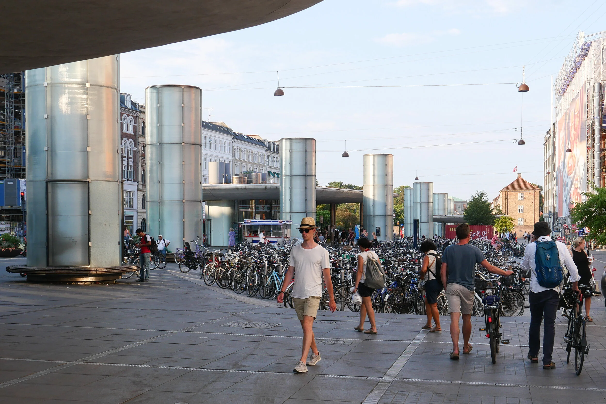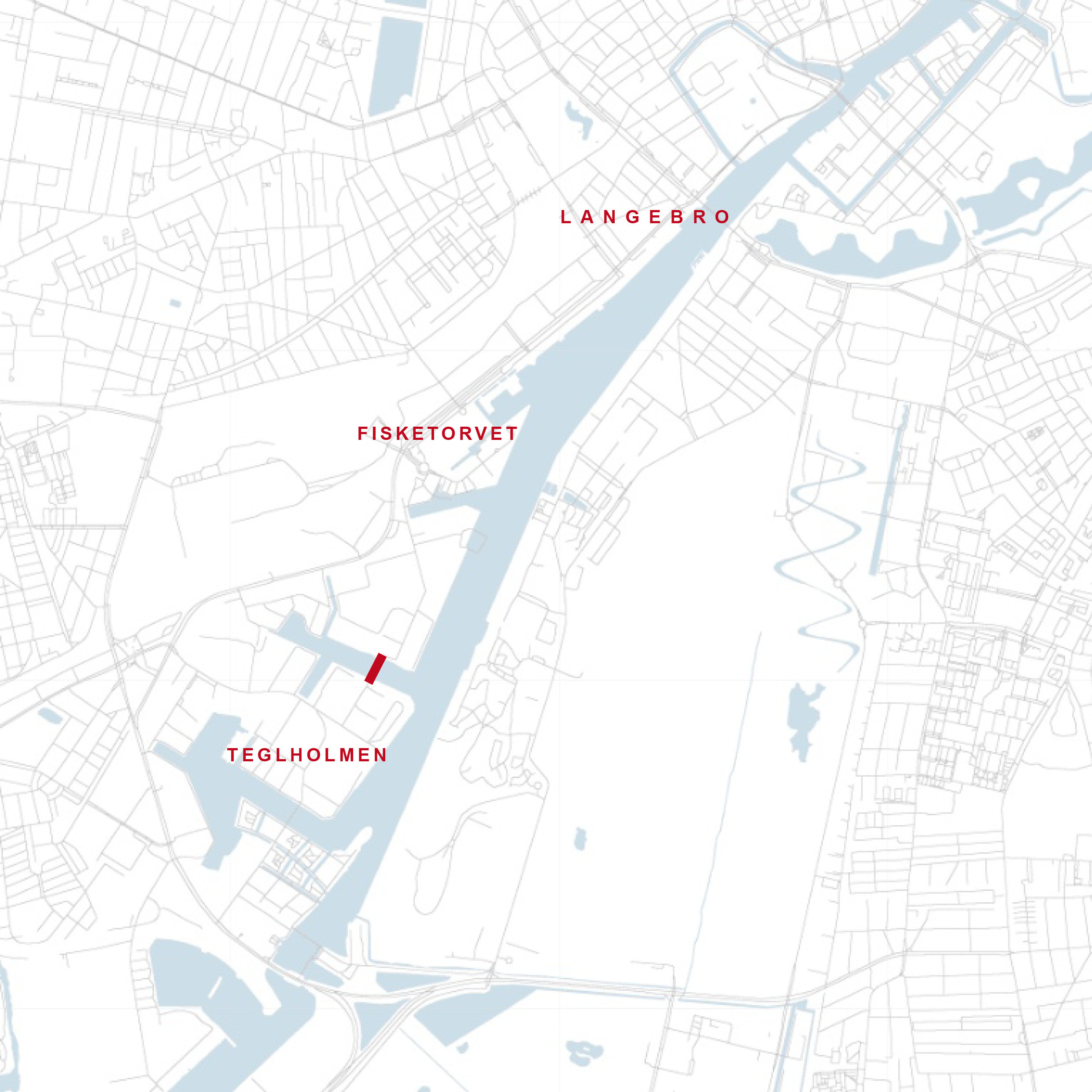
Papirøen / Paper Island
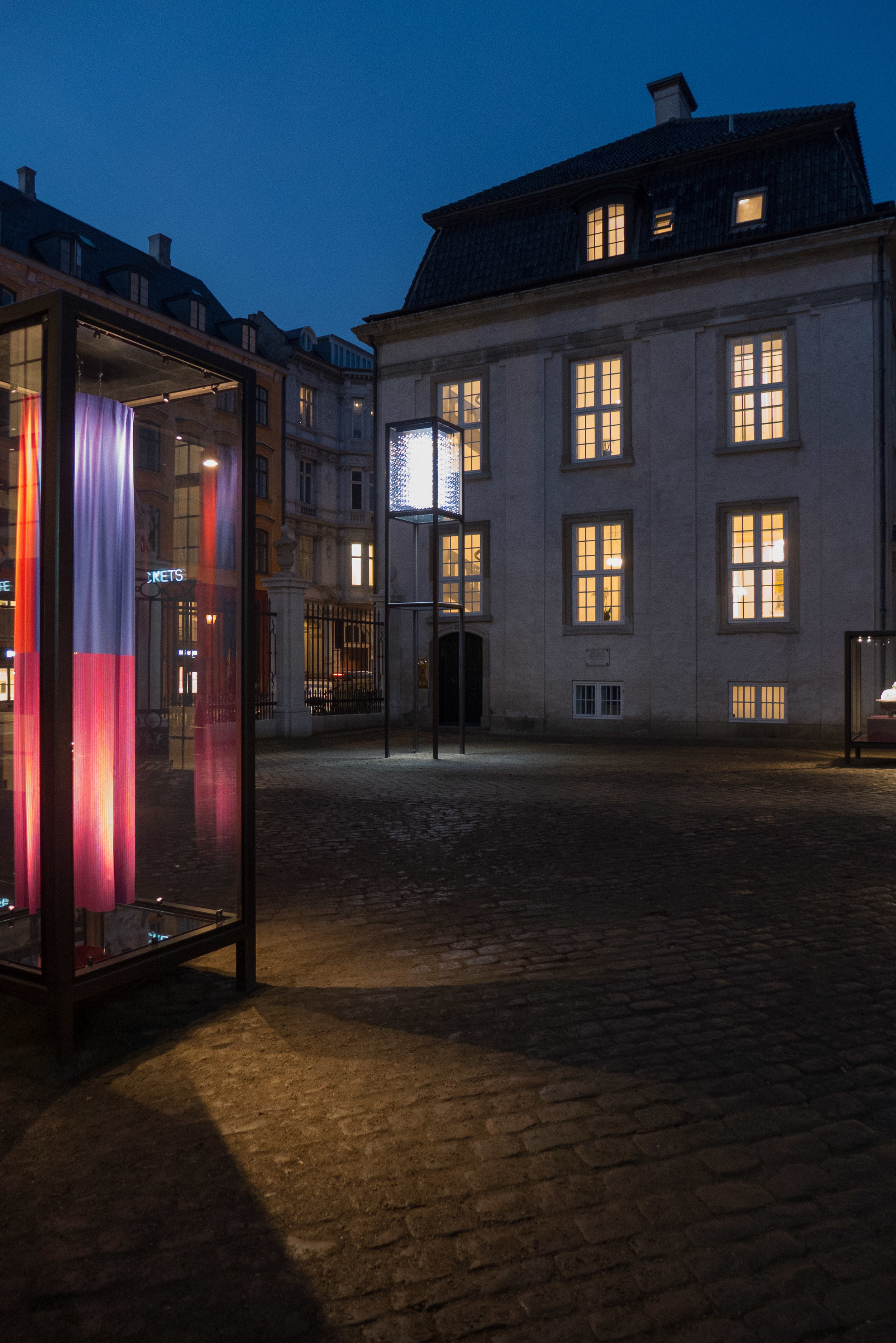
/from the north west looking across to the opera house
and to the new apartment buildings beyond
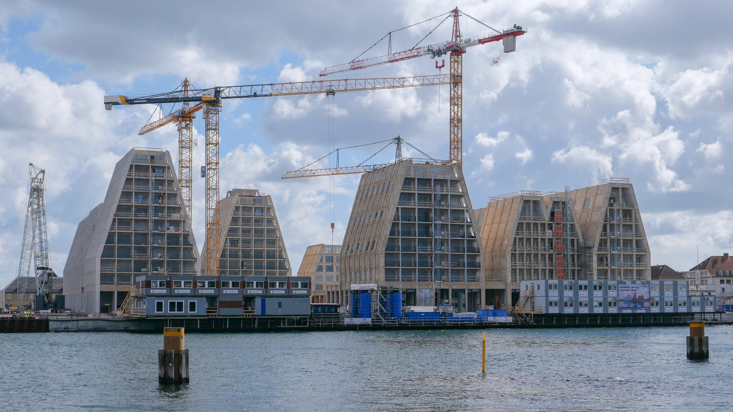
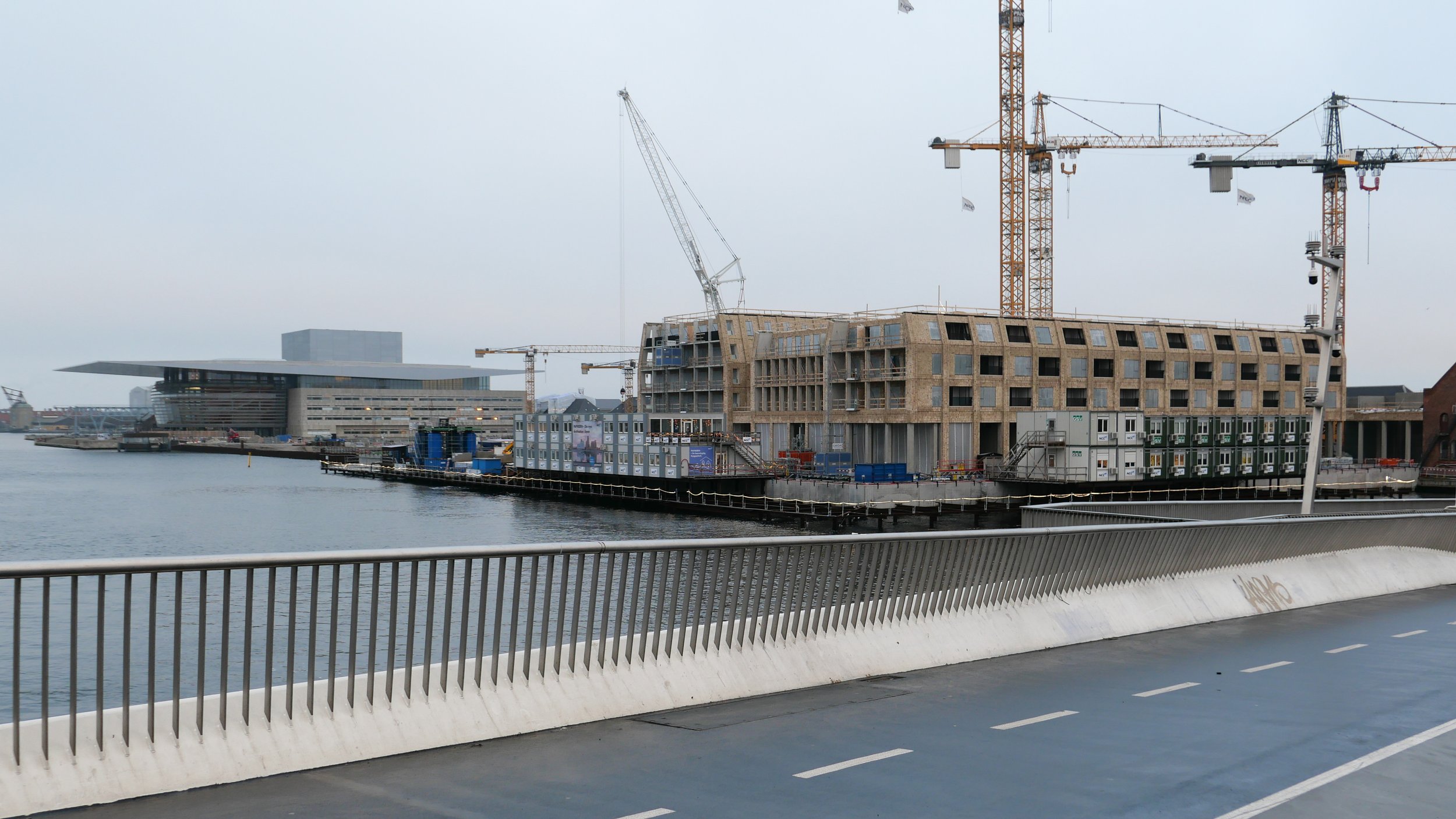
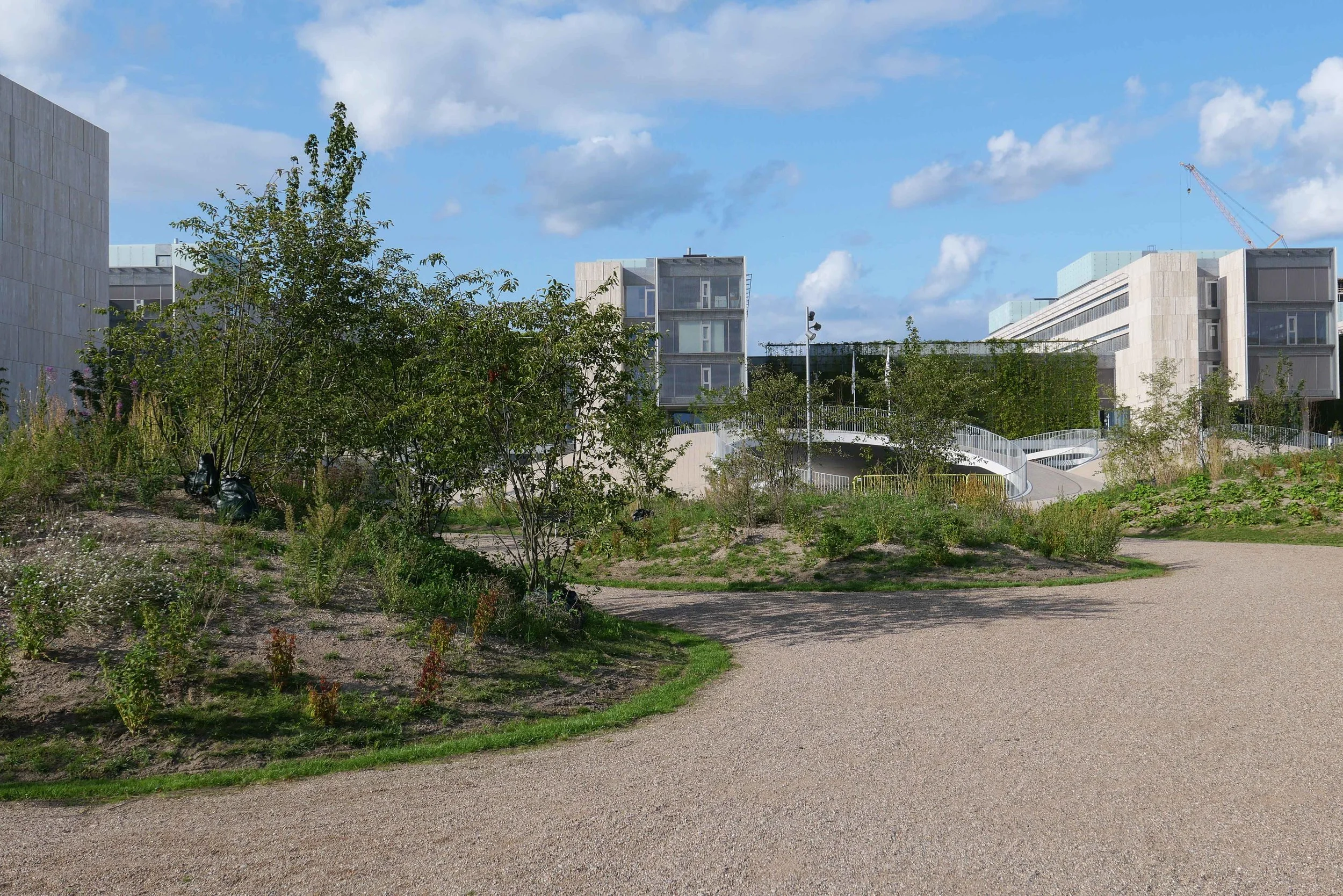
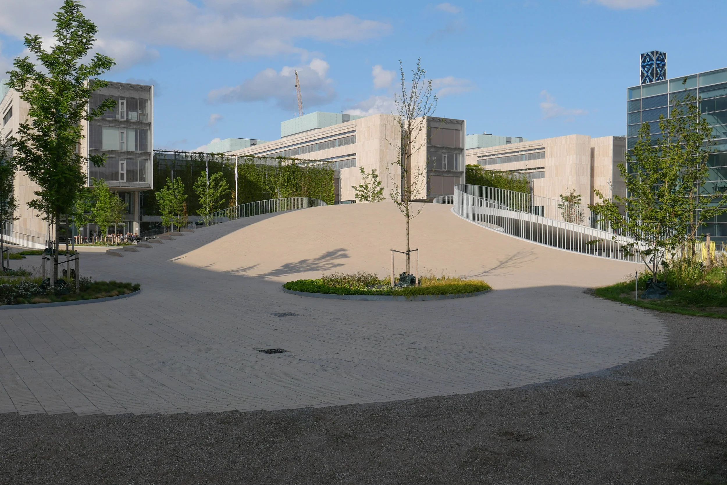
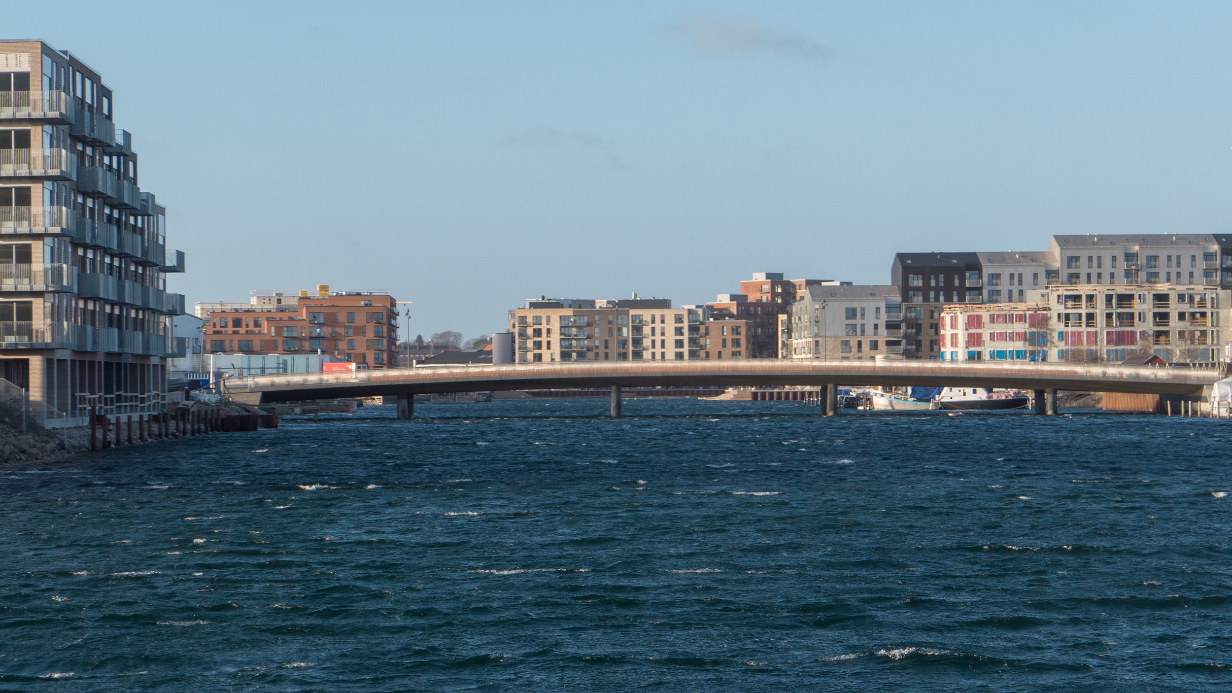
It's a year since I last posted about the new apartments under construction on Papirøen or Paper Island at the centre of the harbour in Copenhagen.
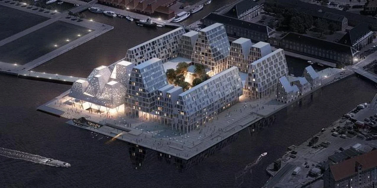
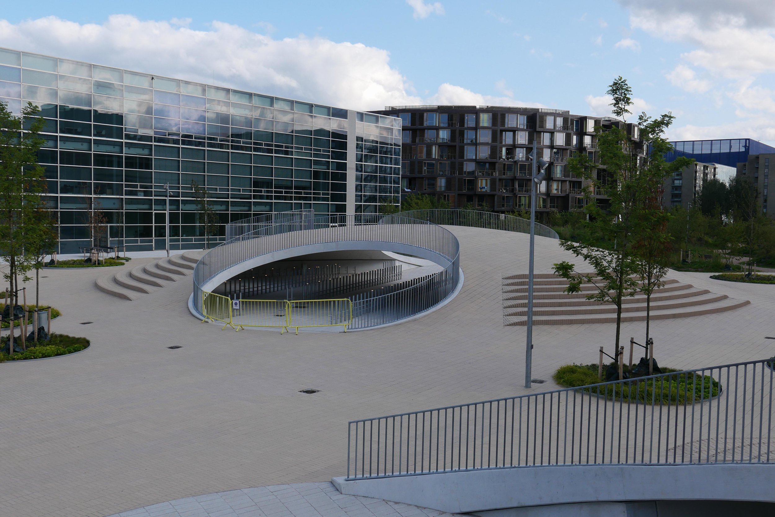
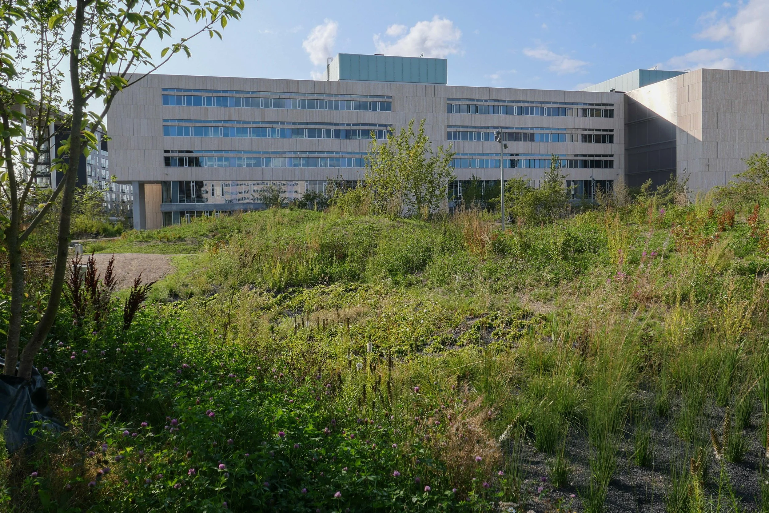
The main blocks are all up to their full height and, in the last couple of months, high cranes cross the site have been taken down so you can now see clearly the scale and the full impact of this large development.
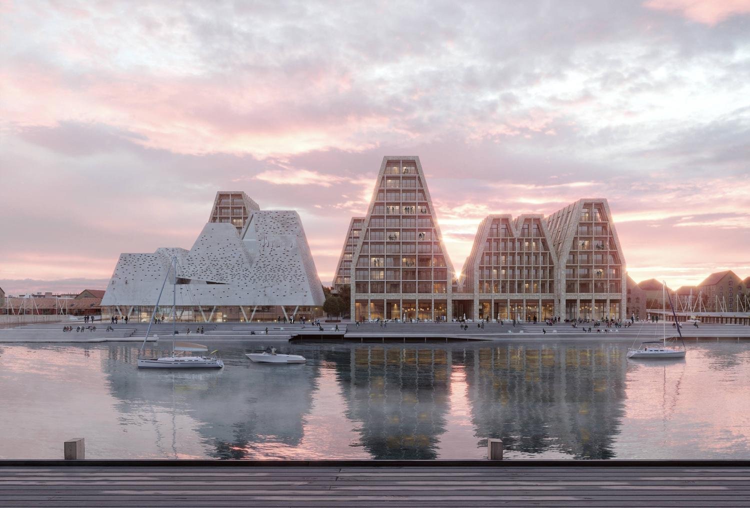
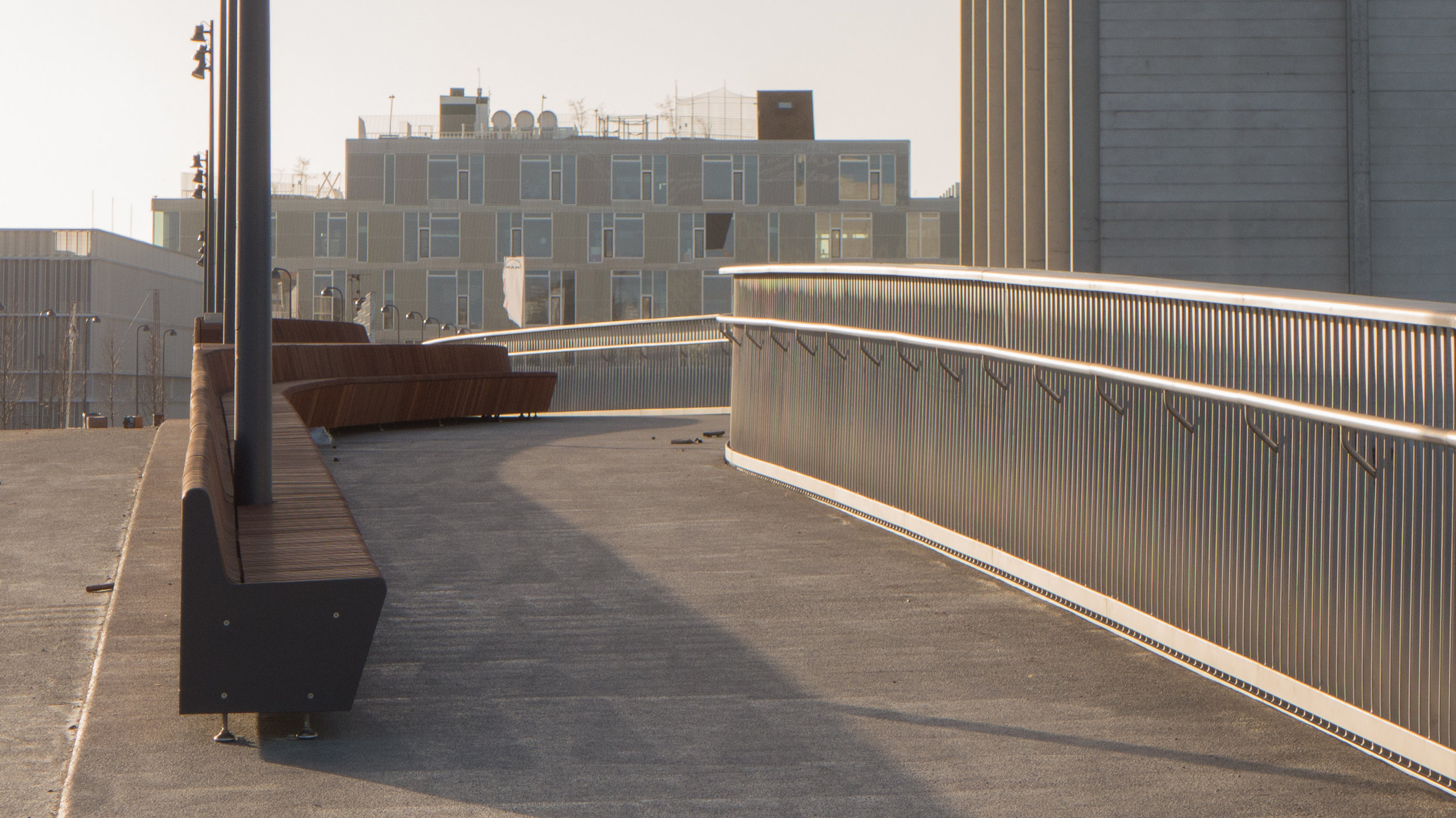
There are high, wedge-shaped blocks of different heights grouped around a courtyard and they are all faced in pale yellow brick with long sloping roofs but with slightly different arrangements of closely-spaced windows and balconies. There are also large slabs of concrete in place now for the cross walls of what appear to be a short row of houses on the north side of the island, facing towards the opera house, and a second row of seven houses across the south side of the island facing towards the canal and the inner harbour bridge. However, without their roofs or windows, it is still difficult to assess how these lower buildings will have an impact on the whole group although they should disguise and reduce the apparent height of the apartment blocks as they will appear from the level of the quay.
The elongated and tapered shapes of the individual buildings mask their overall height - the tallest block has twelve floors - and, to some extent, the sloping shape reduces the deep shadow that will be cast by the buildings.
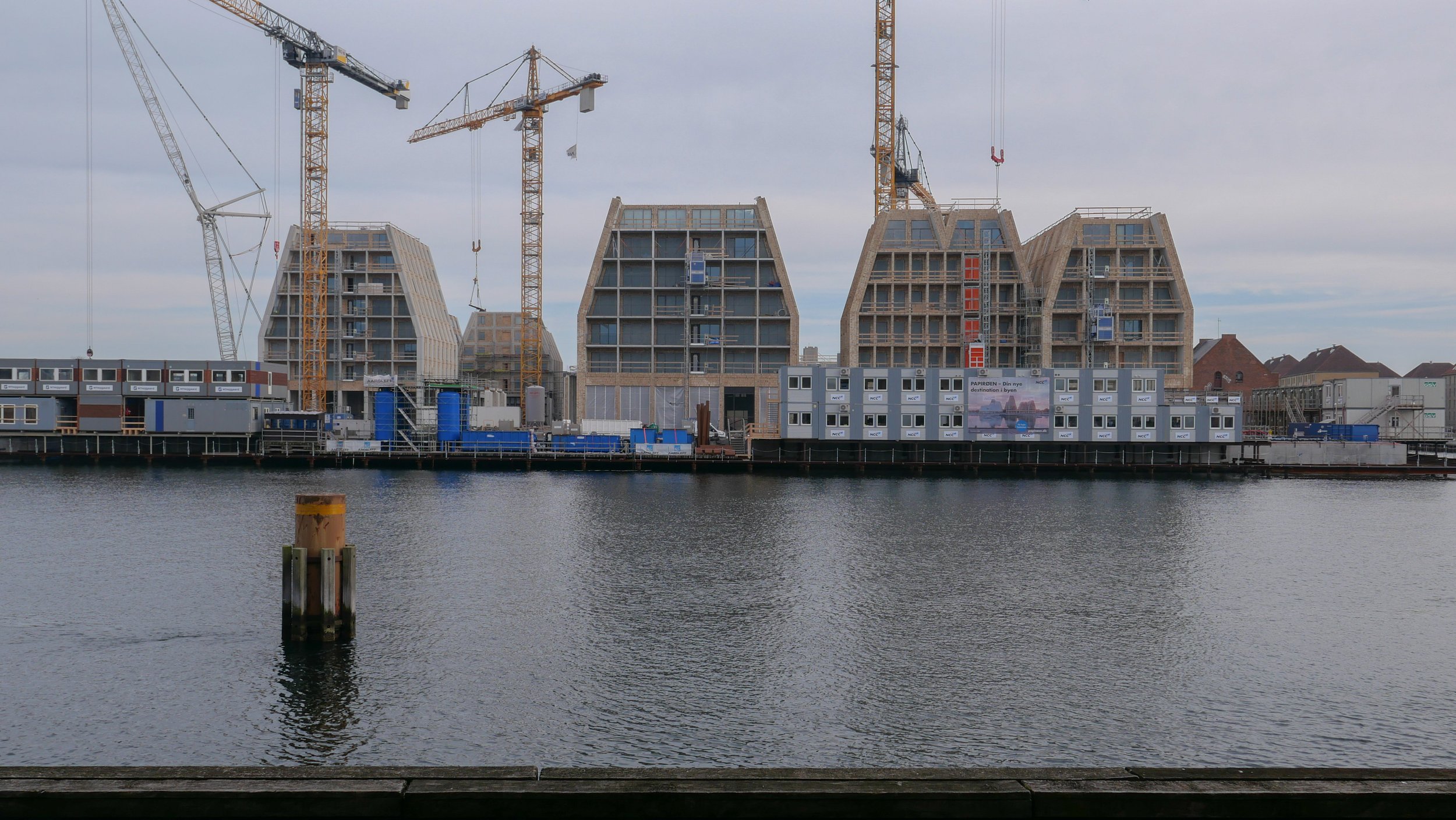
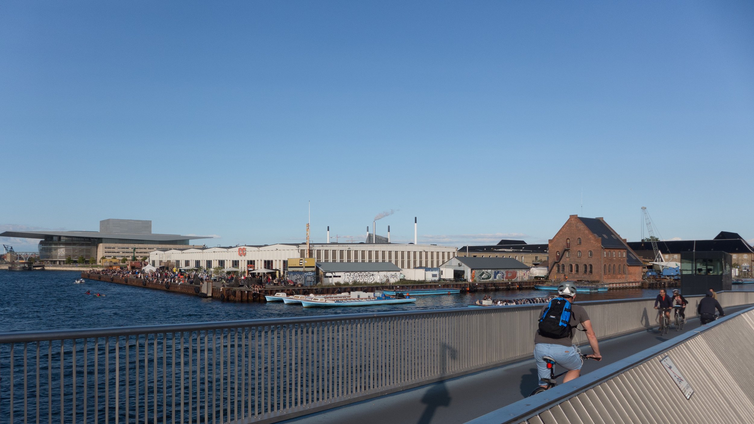
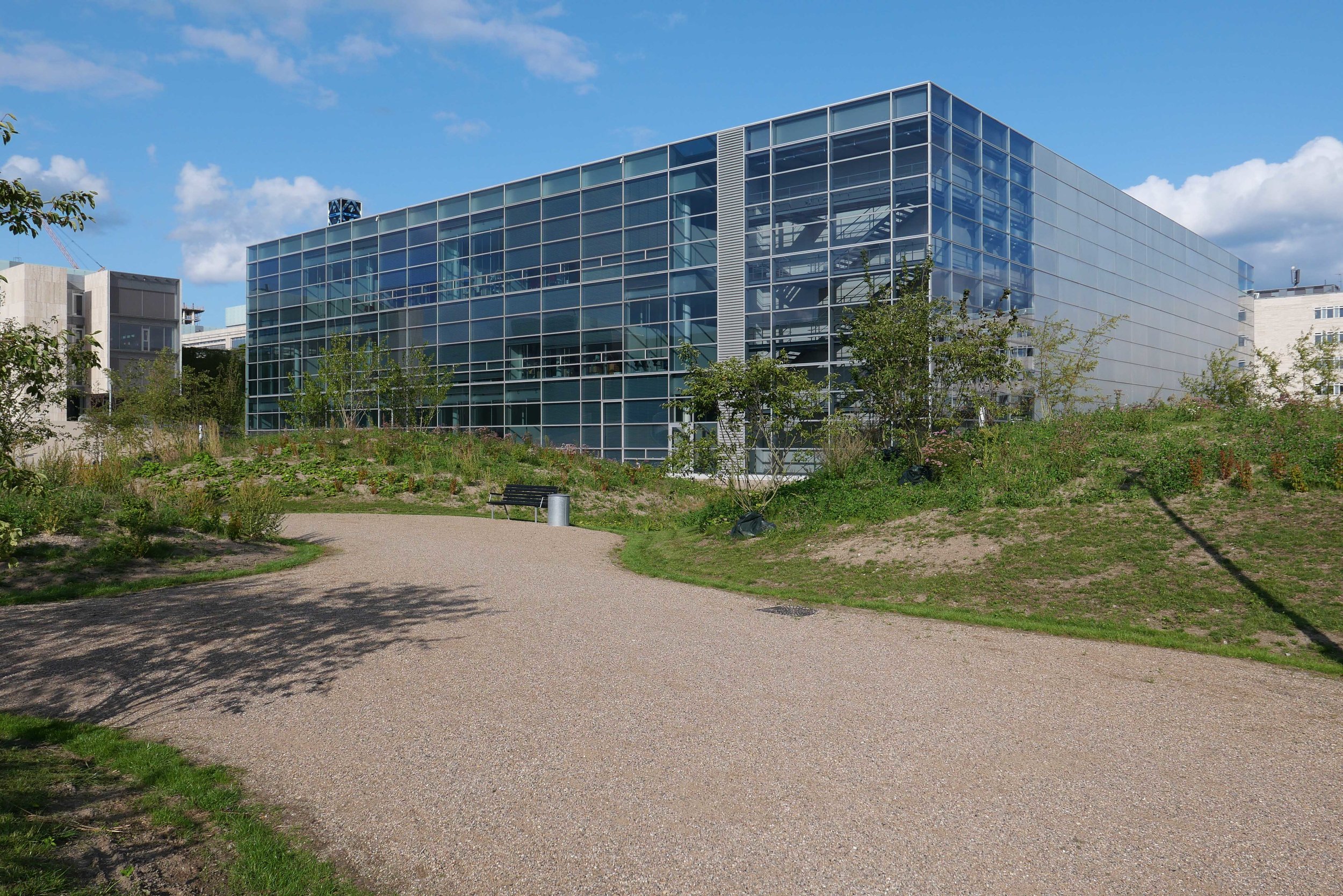
There will be a swimming complex at the north-west corner of the island but little of the upper structure or the pyramid-shaped roof of that building is yet in place so, again, it is difficult to assess the visual impact on the harbour when the scheme is seen from the north, where the harbour, until now, has been dominated by the striking roof line and strong silhouette of the opera house.
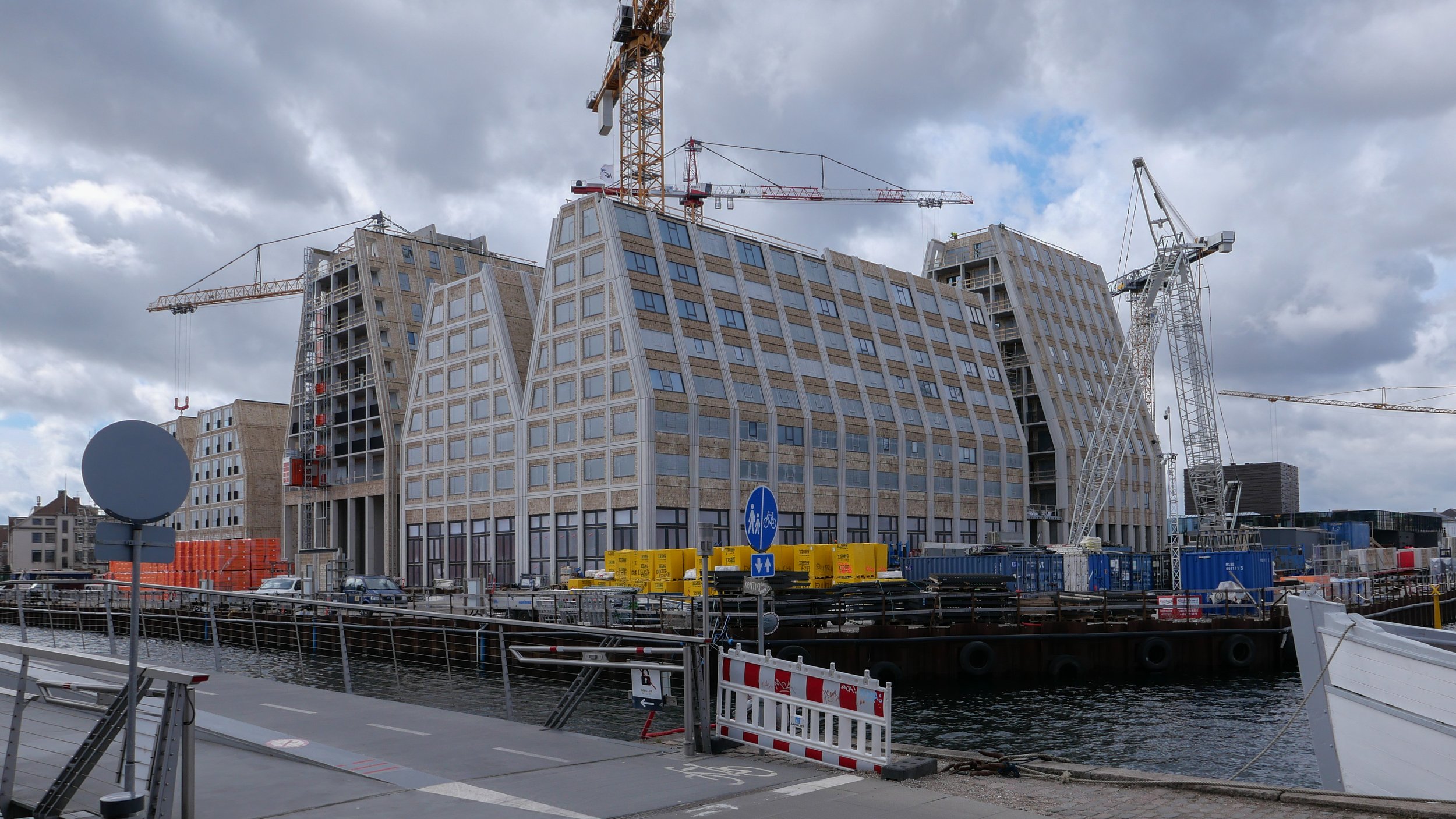
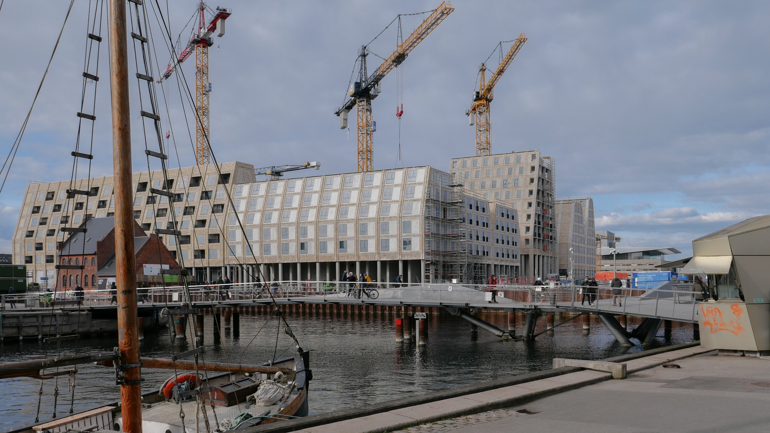
Temporary, opaque-plastic sheeting over the phenomenal number of balconies has protected the interior from dirt and debris while the major construction has been completed but now, as the interiors are fitted out, much of this protection has been removed and it certainly gives a better impression of the final appearance of the blocks. The plain long slopes of pale brick had made the blocks look like narrow wedges of cheese stacked on end but the balconies are deep with what appear to be dark framing to the windows that are set back - the balconies are 'internal' rather than being cantilevered out - and these form a strong pattern of shadow and light across the slopes that relieves the otherwise massive but bland slopes.
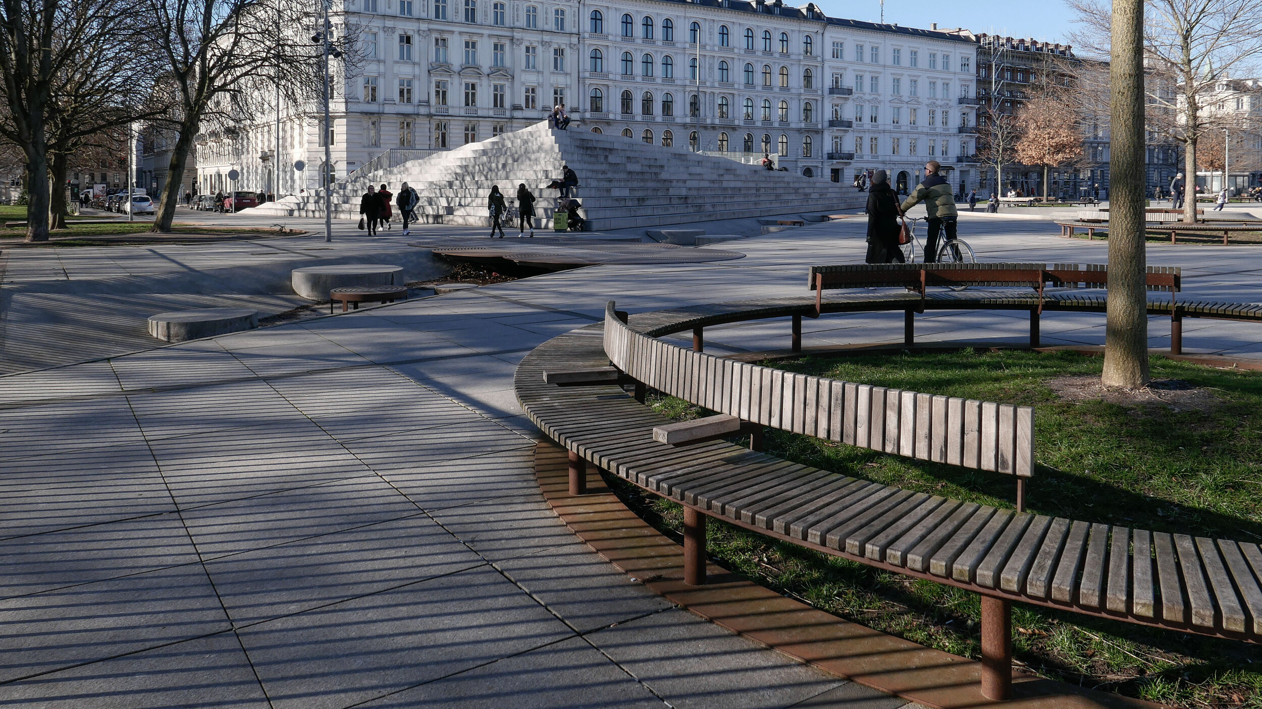
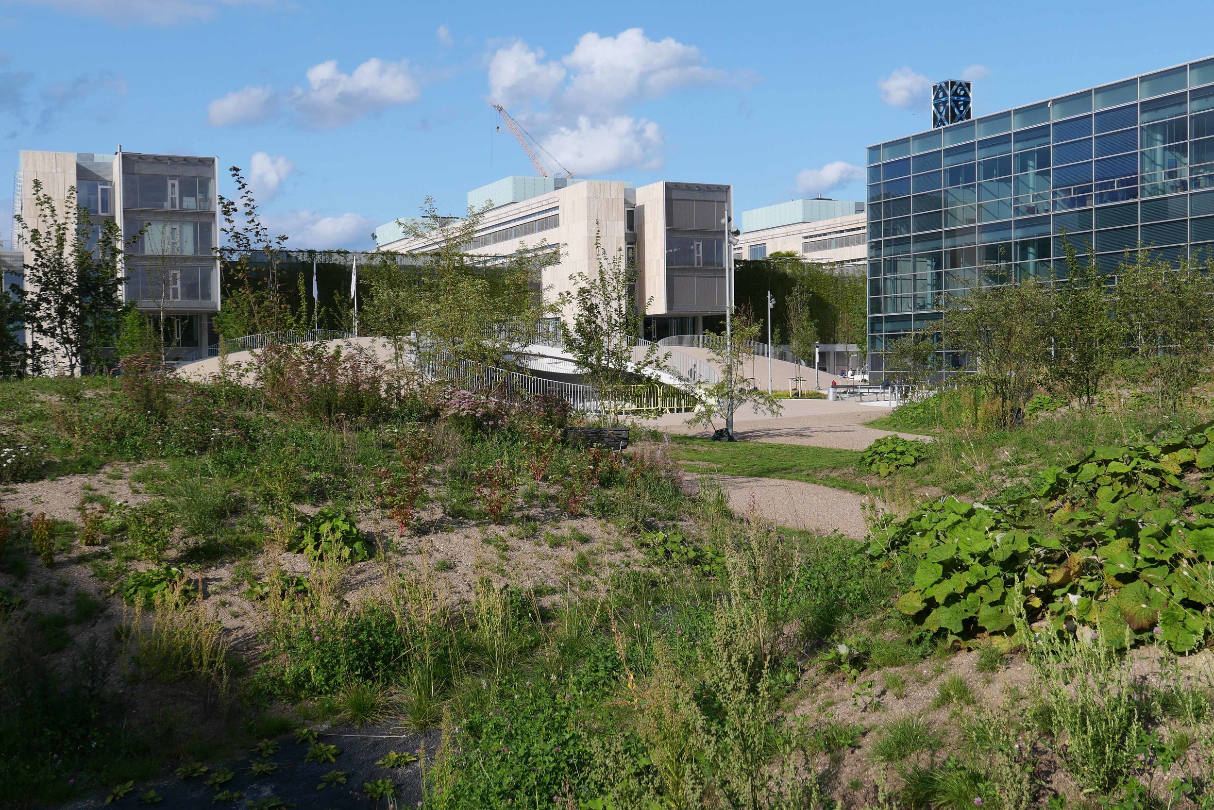
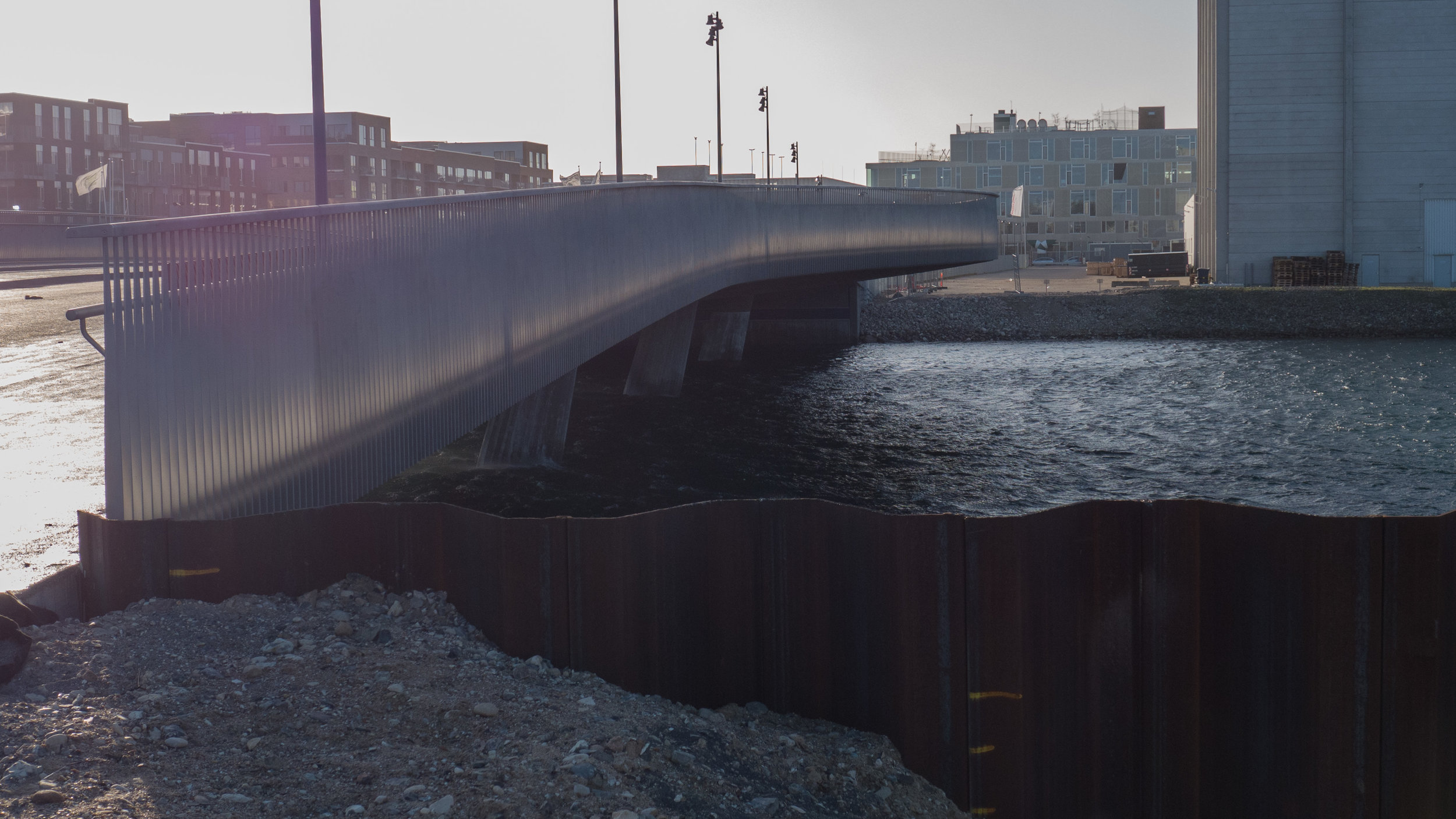
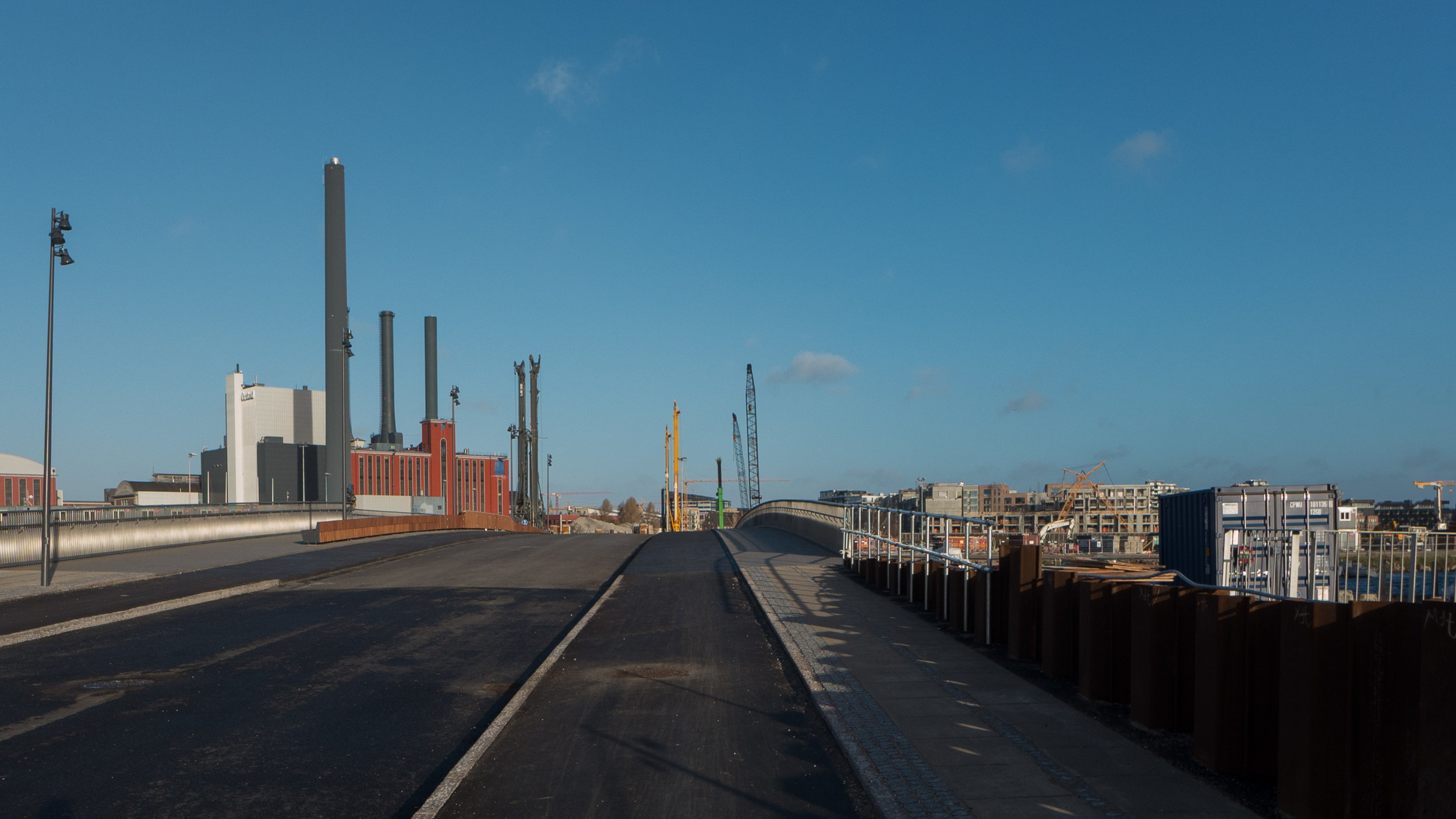
Obviously, it is still difficult (and unfair) to judge the design at this stage - when it is still without the broad walks around the perimeter and still has a clutter of builders cabins and scaffolding and small cranes - but what is clear is that the massive scale of the development will have an impact on the harbour. The development looms over the important 18th-century buildings of the Arsenal to the east and the buildings are so tall that they can be seen from Knippelsbro to the south and from the quays as you approach the inner harbour bridge from that side and has a marked and not obviously good impact on the harbour when seen from the north. The buildings now close the view down the important open space of Sankt Annæ Plads, on the opposite side of the harbour, immediately north of the theatre, and can now be seen as the most distinct feature on the skyline rising above the trees when looking towards the city from the south from as far away as Kløvermarken.
COBE, the architects for the Papirøen development, in their own distinct but quiet way, are one of the most adventurous and most interesting architectural studios in the city and I find it difficult, normally, to be critical of their work. In a clever and well thought-through way, they challenge or push against conventions but generally stop short of being overtly controversial.
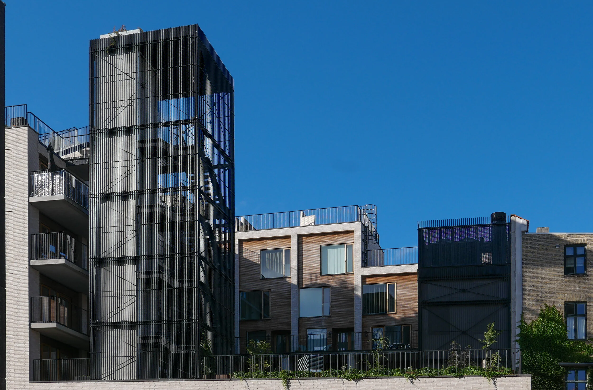
At Krøyers Plads, a development of apartment buildings just south of Papirøen, they helped Vilhelm Lauritzen, the main architects, negotiate a controversial scheme through difficult planning objections that had been mired in controversy for decades. Ironically, the apparent impasse was resolved by going for much lower buildings where high-rise towers had been proposed in earlier schemes. COBE completed a careful assessment of the streets and quays that form the wider setting of that development and went back to the silhouette and arrangement of historic warehouses along the harbour as their starting point for the design but then played with the forms and angles of roofs and the arrangement of balconies to produce an interesting and generally well-received development.
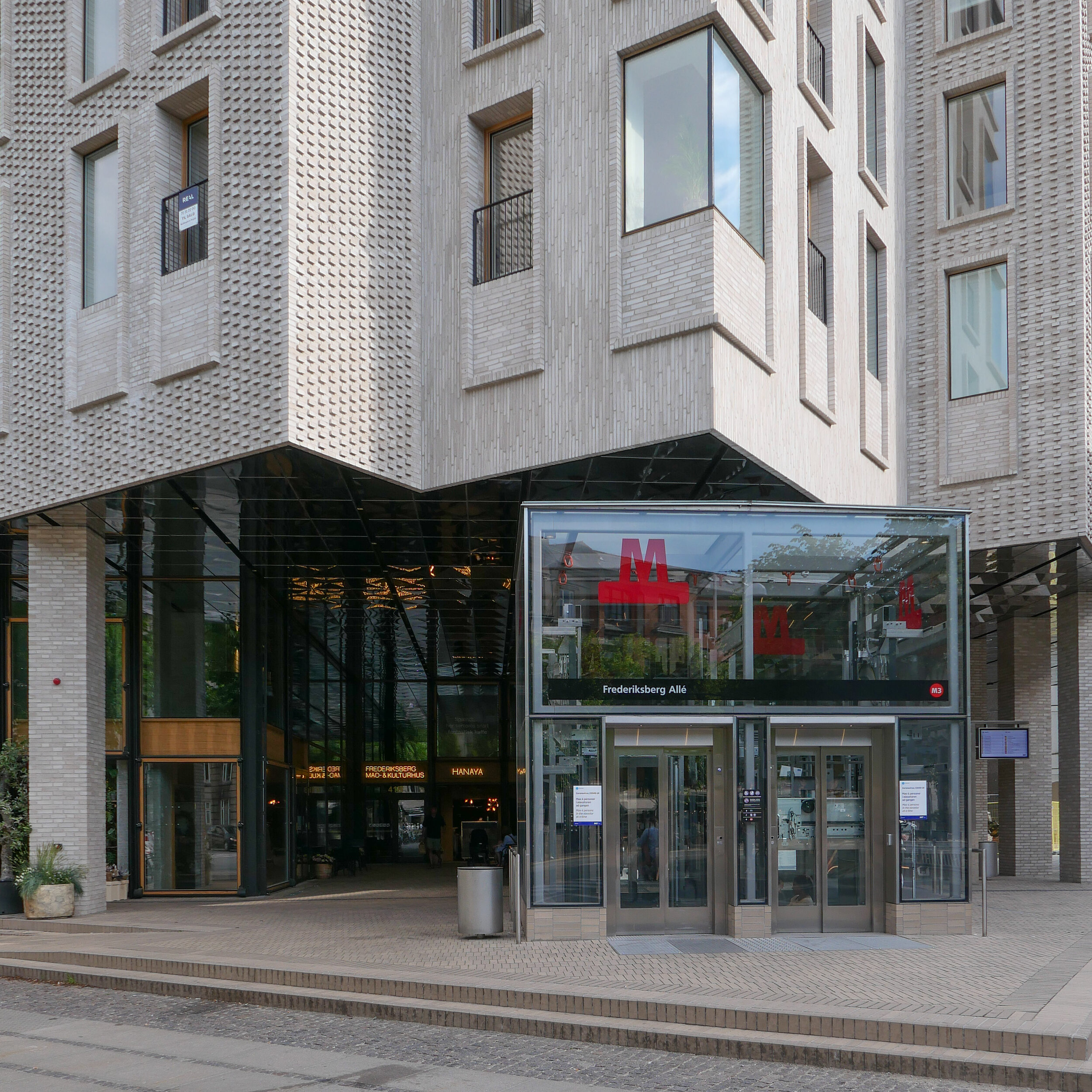
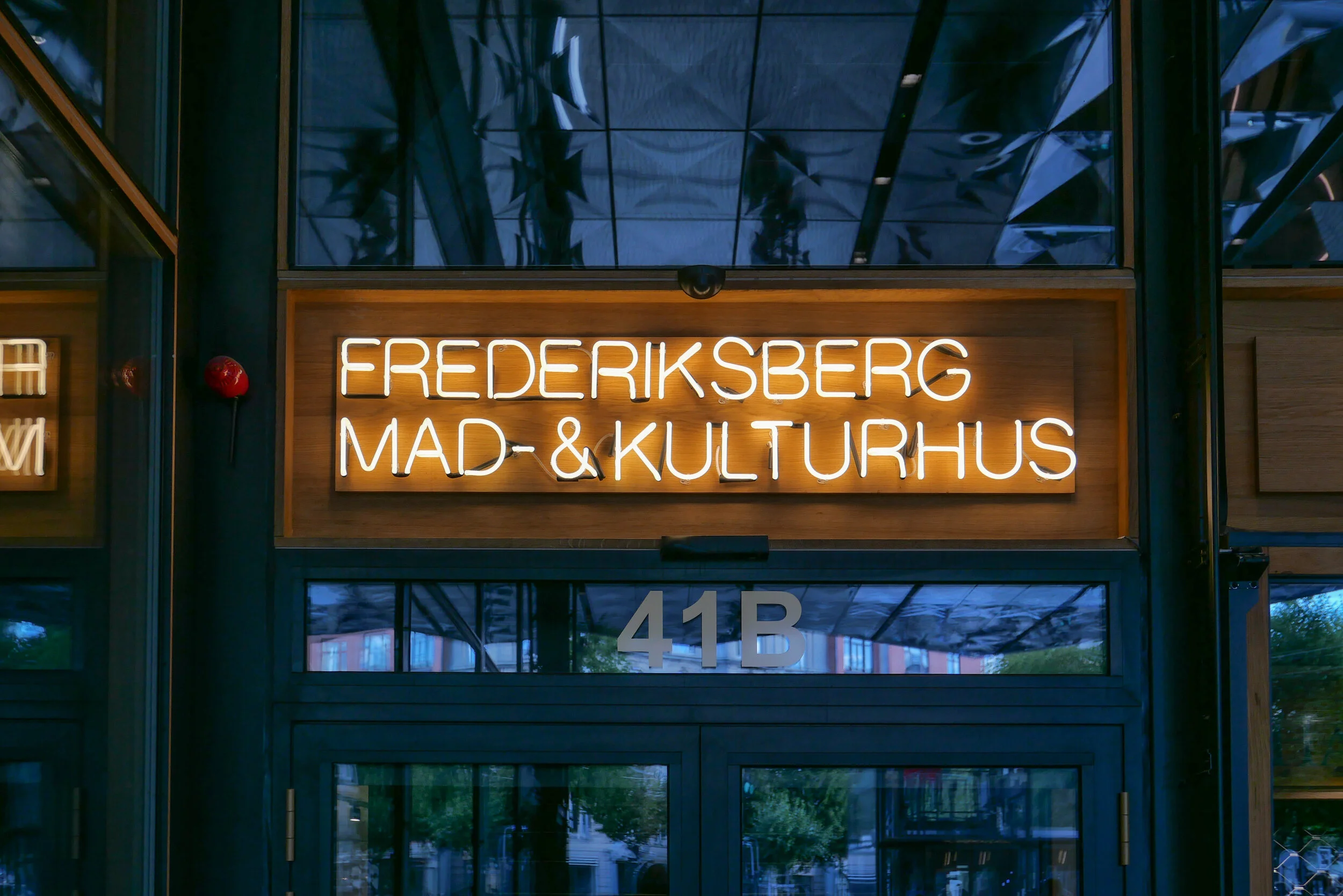
On Frederiksberg Allé, COBE designed a new apartment block over the new metro station that played with historical conventions to produce a very sophisticated design on a very sensitive site and, in complete contrast, at Orientkaj, their new metro station in brutal concrete is uncompromising but is appropriate as a homage to the earlier industrial forms of the buildings there when the area was once the dock of a busy container port.
However, here at Papirøen, on such a crucial site at the centre of the old harbour, just down from the opera house and immediately opposite the national theatre, when you get up onto such an important stage, you have to be completely sure of the value and quality of the scheme that will be there for fifty or a hundred or, probably, more years.
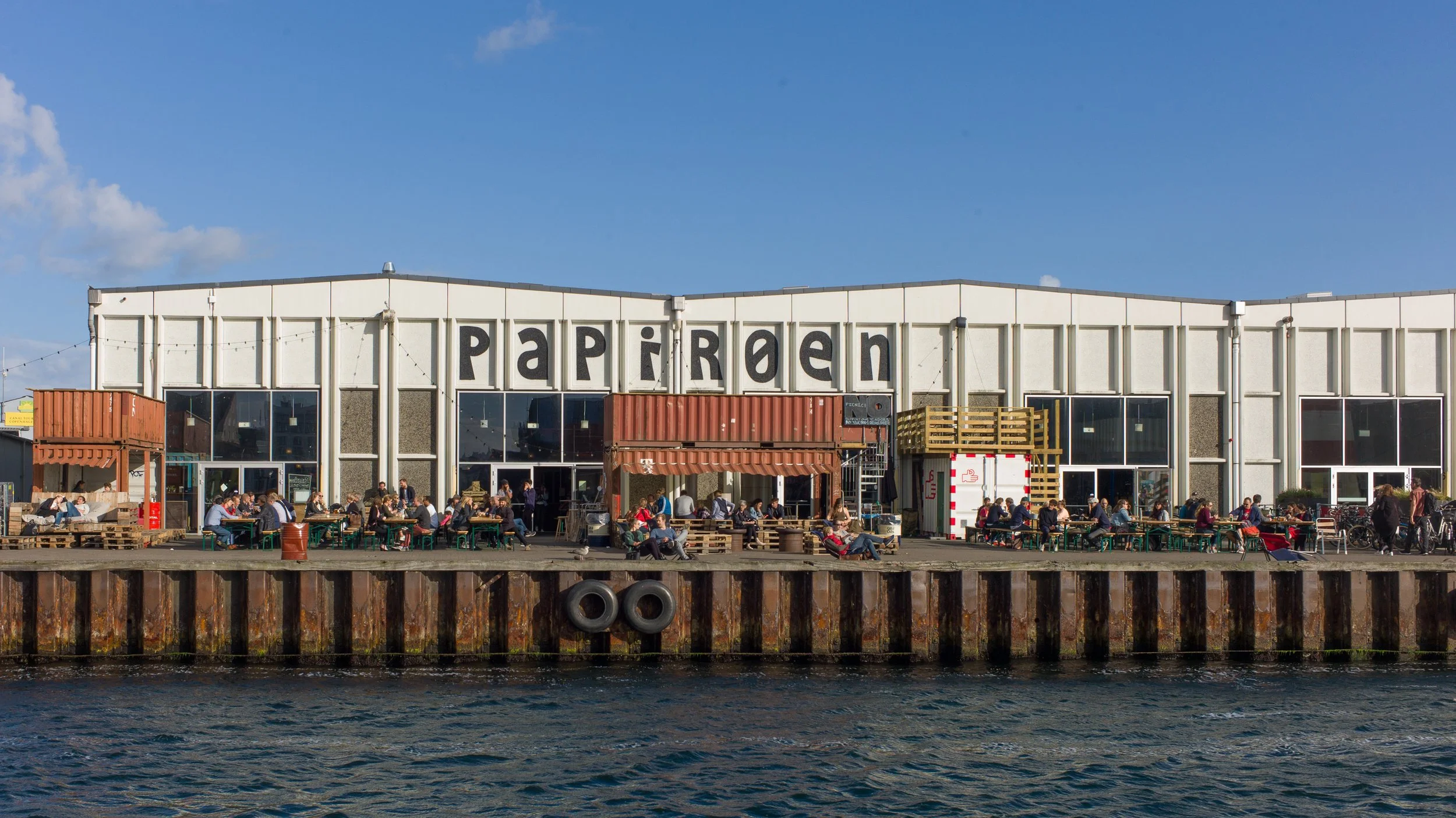
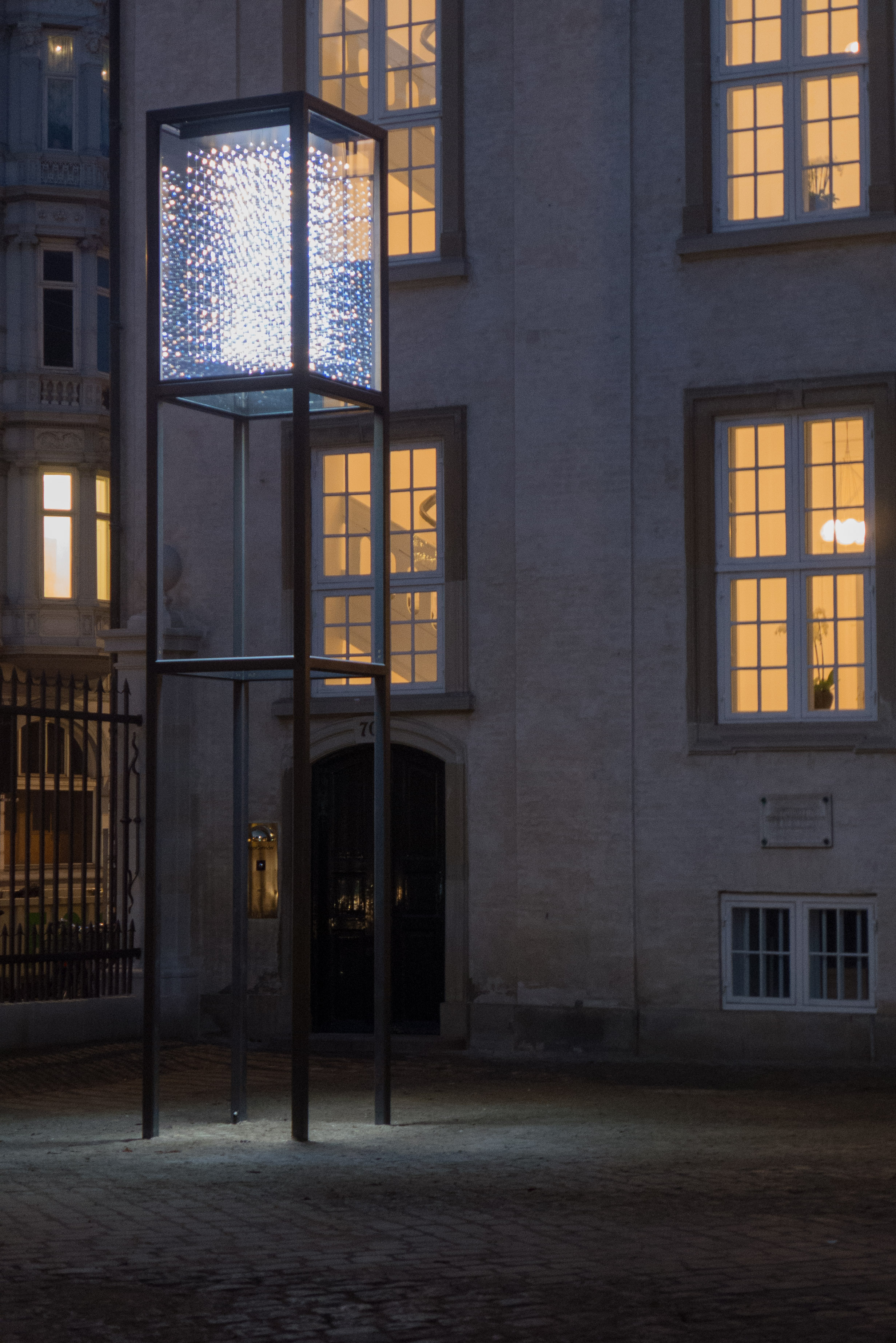
The popular food halls that were in the concrete warehouses here in the years immediately before building work started, are set to return, so the site could become well used again and the buildings, even unfinished as they are, looked good at night when they were illuminated for the Copenhagen Festival of Light but will that be enough to compensate for the obvious and justified criticism that this is a massive development that really should mark a nadir for the rampant exploitation and gentrification of the historic harbour.
new apartment buildings on Papirøen 2 March 2022