good proportions and a sense of scale

the dome of the Marble Church in Copenhagen

Understanding how architects use proportions and scale - or rather looking at how good proportions, used properly in a design, and the construction of buildings with an appropriate scale - is essential in trying to appreciate architecture. 

Appropriate proportion and scale are not just just significant in the design of an individual building - having a strong impact on how good or how bad, how attractive or potentially how ugly, the facades are in isolation - but proportion and scale are important in the relationship of the building to its setting … and not just for building in an urban streetscape but also for the way a building relates to its setting in a garden or in a natural landscape. 

In part, this is because we seem to respond instinctively to the scale of a building and can decide quickly if it looks wrong or looks right. Often this comes down to judging a building against our own human scale and normally that means deciding if it is right or wrong depending on if we feel comfortable or uncomfortable with the size of the building. 

It’s a difficult balance to get right. We can easily feel overwhelmed by a large building but we can also feel that a building is mean and too small if it’s not an appropriate scale for its function, particularly if its a civic building or a building of wider national significance. 

read more

Golden Section and Golden Rectangle

adjustable dividers used to set out or measure golden sections and golden rectangles


Over the last year, several articles on the internet, and the comments that they have generated, have been scathing about the use of the Golden Section or Golden Rectangle as an underlying geometric system for designing a building or designing a piece of furniture or for setting out the main elements in a painting as if it was either just an odd intellectual game - and therefore obviously suspicious - or something that was so malleable that it has hardly any real meaning.  

read more

all in the detail … frame and plane

the City Hall, Rødovre from the east

Through the 1950s and 1960s Arne Jacobsen experimented with different types of curtain-wall systems for glazing and not just for office and commercial buildings but also for houses and apartment buildings. The term curtain wall is here used in it’s broadest sense to mean a building where cross walls or internal columns or piers carry the full weight of the floors and roof so that large frames that do not carry any load can be constructed to form walls with large areas of window glass. At the summer house at Strandvejen in Tisvilde on 1956 one whole wall onto a long balcony on the first floor was glazed; at Munkegård Elementary School in Søborg, completed in 1957, large areas of glass with minimal frames were used for corridors and classrooms and, even more dramatically, a curved wall of glass was constructed in the house completed for Leo Henriksen at Odden on the north coast of Sjælland in 1956.

Jacobsen encouraged manufacturers to produce thinner and thinner metal profiles for the frames, at first in timber that was clad with aluminium but then with aluminium or steel profiles, and he used geometry and proportions to design complicated arrangements of glass with closed panels below and above the windows in various materials including enamelled metal sheet, in concrete, reinforced with fibre (asbestos) and then painted, or in opaque coloured glass.

read more

Copenhagen in the snow

Houses in Kronprinsessegade from the King's Garden


This photograph of houses on Kronprinsessegade in Copenhagen was taken from the King’s Garden walking across to the National Gallery - to Statens Museum for Kunst - to see their major exhibition on the work of the Danish artist Christoffer Wilhelm Eckersberg on the last weekend before it closed.

Eckersberg was born in 1783 in Schleswig - then part of Denmark - and moved to Copenhagen in 1803 to study at the Royal Danish Academy of Fine Arts. He would certainly have known the King’s Garden and these houses. This large area of avenues and formal planting had been the private garden of the King’s house of Rosenborg, built in the early 17th century and just outside the city walls, but was opened to the public in the late 18th century and the iron railings and pavilions, between the gardens and the street, designed by Peter Meyn, date from about 1800 … so just before Eckersberg arrived in the city. 


the pavilions and railings between the garden and the street


Historiske Huse, a catalogue of historic houses in the city, that was published by the National Museum in 1972, indicates that these fine town houses date from the first decade of the 19th century and were part of the expansion of the city to the north in the late 18th century and early 19th century.

The National Gallery did not move to its present building until the 1890s and, through the 19th century, the royal collection of paintings, the core of the National Gallery collection, was housed in the Christiansborg Palace on the opposite side of the city but the Royal Academy, where Eckersberg studied, was in the Charlottenborg Palace on Kongens Nytorv just a few blocks from the gardens. The Academy had been established in the Palace in 1753 and is still in that building.

After a period at the Academy as a student, Eckersberg travelled first to Paris in 1812 to study under the artist Jacques-Louis David and then on to Rome where he remained until 1816. Back in Copenhagen he returned to the Academy and was appointed to a professorship in 1818.

As a product of the Royal Academy and as a teacher Eckersberg did produce grand paintings of historic and classical scenes but he is better known now for his portraits of wealthy middle-class families of Copenhagen society and for marine landscapes and for studies of his city and of his family. He lived in an age noted for rational investigation and he knew and associated with contemporary scientists - men like the physicist Hans Christian Ørested whose portrait he painted in 1822. Linked to scientific observation, an interesting areas of the exhibition at the National Gallery were the cloud studies by Eckersberg and his drawings and studies of perspective including a modern version of the viewing screen with gridded glass that he used for drawing in the landscape and a copy of notes and instructions on perspective for his students produced at the academy.

perspective study by Christoffer Eckersberg from the collection of Statens Museum for Kunst in Copenhagen

By comparing preparatory sketches and the paintings completed in the studio you could see that in the finished works he rationalised the view to create distinct planes, rather like theatre sets, so that more distant features could be pulled forward and given more emphasis. This might sound as if the works were therefore not strictly naturalistic but in fact he simulated well what the human eye does so well naturally … how often have people taken a landscape photograph and realised that a distant feature, quite clear to the human eye, looks more distant and much smaller in the photograph but then if a zoom lens is used, the distant feature looks more like what the eye can focus on but the width of view suddenly looks much narrower.

Eckersberg used the same rationalisation and the same sharp observation in his portraits and his drawings of interiors. In these works, you see some of the well-established and prosperous families of Copenhagen but remarkably little ostentation or show. Clearly, in part, that is because of the style in clothes at this period, with little expensive lace or ornate embroidery, but as with the uncluttered interiors you can see the expression of wealth in high-quality materials and well made clothing and furniture. 

detail of the painting of the Nathanson family from the collection of Statens Museum for Kunst in Copenhagen

The interiors themselves seem surprisingly but deliberately simple with shutters, rather than draped curtains, or at most blinds at the windows and stripped plain floors and unified and straight-forward colour schemes with all the panelling one flat and quite dark colour or at most one colour below the dado and a second colour for all the panelling and the cornice above the dado rail. There seem to be relatively few pieces of furniture in each room but that furniture is relatively restrained but clearly of good quality.

Similarly with the houses of this period, typical examples being those looking down into the King’s Garden, which are sober and elegant with carefully spaced windows and features such as doorways with columns that are based on classical precedents. Solid and respectable.

view of Sankt Annæ Plads, close to the Academy at Charlottenborg Palace


Does this sound familiar? I would not go so far as to suggest that what is called the classic period of Danish design from the 1950s and 1960s - the work of Arne Jacobsen, Hans Wegner or Finn Juhl - looked back to the first half of the 19th century in terms of style but at least you can see through the works of Christoffer Eckersberg an important stage in the development of middle-class Danish taste that can be seen echoing still in the best modern furniture and interiors in Denmark.


the daughters of the artist as they look out of a window in the Academy. Drawn by Eckersberg shortly before his death in 1853. From the collection of Statens Museum for Kunst and available through the Google Art Project

a Belgian viewpoint


At northmodern this year there were seven designers from Brussels chosen by the architect and designer Julien de Smedt who also designed the exhibition stand that was set in one of the large central halls.

The exhibition was promoted and co-ordinated through MAD Brussels - the Brussels Fashion and Design Centre - and Brussels Invest & Export.

Included were textiles from Sarah Kalman and the design studio nomore twist, furniture by Alain Berteau and by Alain Gilles, lighting by the designer Pierre Coddens, work by Pierre-Emmanuel Vandeputte (who also showed his work at northmodern last August) and work by Jonas Van Put. 

What seemed to distinguish three of the designers, in slightly different ways, was that their work was ideas led rather than initiated by a product brief. The reality of much design work is that a manufacturer or design company will approach an independent designer with a commission that has a fairly tight brief that essentially and inevitably means starting with preconceptions about the starting point and the end result. 

What should be more interesting but is possibly more of a risk (in terms of commercial returns) is to give a designer the time and space to approach the problem from a different direction or to consider a completely unconventional material or to simply think about and design something where the need or the use has not been identified.


Jonas Van Put

An interior architect and designer, Jonas Van Put actually doesn’t just want to have a different starting point himself but wants the user to have a different view point.

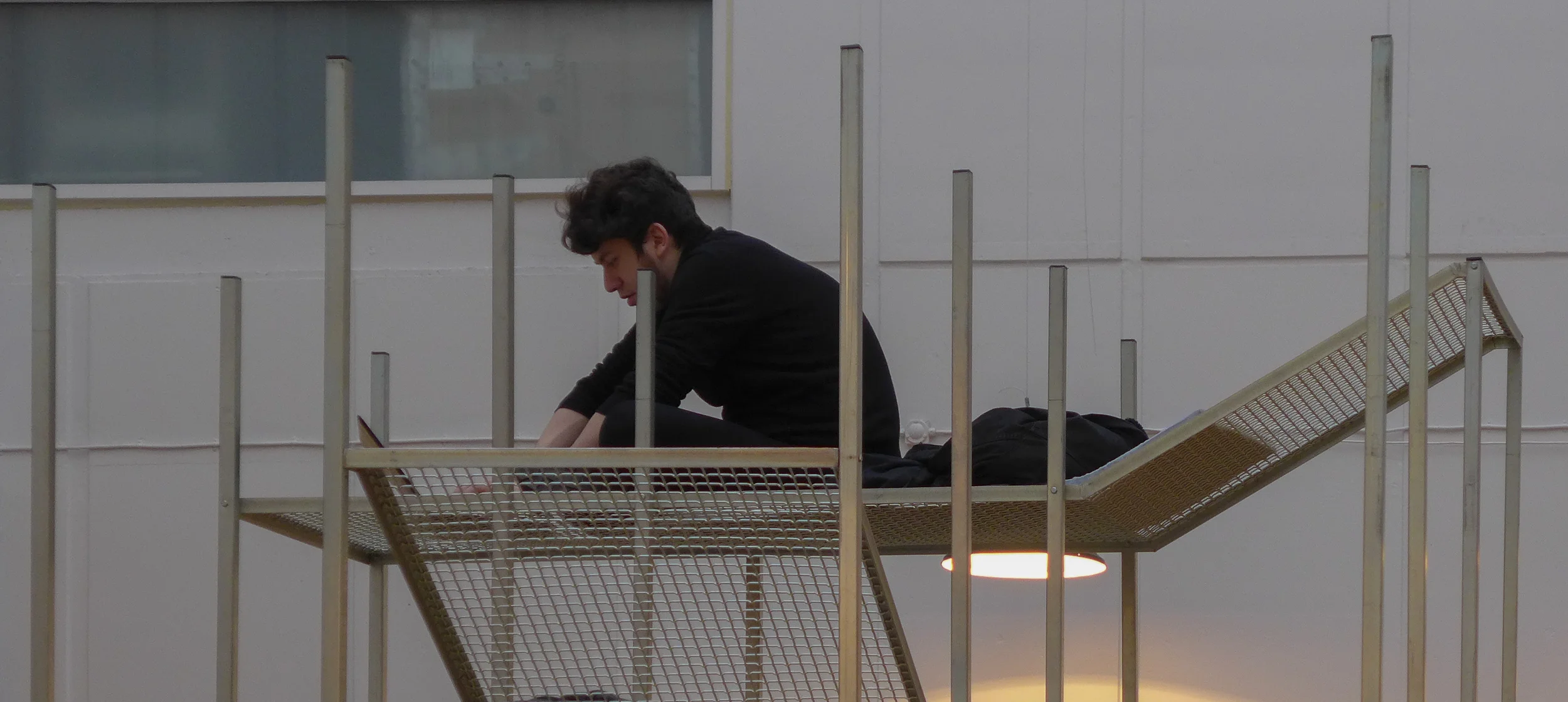
Observer was designed when Fritz Hansen provided a number of chairs in the Series 7 to the design school to encourage students to adapt and reinterpret the famous design by Arne Jacobsen to mark its anniversary. Jonas constructed a slim pyramid-shaped metal tower not to alter how we look at the chair but to alter what we see from the chair.

The catalogue to the Belgian section includes the fascinating information that by raising the chair up to take the eye level to 5.2 metres the distance you can see from the chair nearly doubles to 8 kilometres.

Pangea is described as a conversation piece with woven platforms or loungers at various levels on the steel frame. Jonas described how he had been inspired by looking at a jungle canopy and that the space between levels gets closer and more constricted at the lower levels. It was interesting to see who climbed up and how far up they went and as the loungers are set facing in different directions not only height but the view point changes as you work your way up the tower.


Both pieces and the works by Pierre-Emmanuel Vandeputte are one off and hand made. Talking to both designers it was clear that finding workshop space and materials was often a matter of trading off skills on a sort of designers barter system but this was seen by both as a very positive way to learn new manufacturing techniques and skills first hand and as an opportunity for exchanging ideas with other artists or skilled mechanics or craftsmen. Exploring and learning and adapting and manipulating ideas and materials was an essential part of the design process.

Jonas Van Put


Pierre-Emmanuel Vandeputte

Pierre-Emmanuel Vandeputte graduated from La Cambre in 2014 and showed some of his work at northmodern in August 2014 including the Cork Helmet … a way for the user to cut out from the noise and distractions around … and Belvedre … again a raised seat to encourage to user to take a different view point on the World. 

Ecco Freddo, shown this year, is a modular system in fired clay that addresses the problem of how we store and keep food … here using sand for root vegetables and double layers using the condensation of water to keep food cool and fresh without resorting to refrigeration. 

This approach … taking a step back and looking again at how we do day-to-day housekeeping tasks is reminiscent of the approach by the product design students from Lund who showed their project work at Form in Malmö last year in the exhibition The Tomorrow Collective.

It was interesting to listen to Pierre-Emmanuel describe how he worked with a potter to produce these pieces, adapting the design as he learnt more about the material and the techniques required … much like his approach to understanding how watching and learning from the methods of the glass blower meant he modified the design of his Wine Carafe.

Pierre-Emmanuel Vandeputte


Alain Gilles

Alain Gilles is an older and slightly more established designer although design is actually his second career as he changed to industrial design after studying Political Science and Marketing Management and after five years in banking.

At northmodern he exhibited three pieces … Grove, a group of low round tables, The Pure, a football table, and his leather and steel sofa called X-Ray. Visually, the three pieces are different in style but linked because they are all very much about how the user reacts with the piece.

The set of tables in different heights and with different finishes on the top are about how they are set in relation to each other. The football table is tactile and very much an adult play thing rather than a child’s toy. Brushed steel handles on the rods, the figures of the players, like steel skittles but with a look of spacemen, and the integral score boards set into each end are carefully refined.

It was the sofa that was really intriguing. It’s a good few steps away from traditional upholstery and seems to approach the design problems from an engineering perspective … what might be produced by an engineer if commissioned to design a sofa. 

The elements have been stripped back with a simple, exposed metal frame, a wooden top rail across the back, like a handrail on a staircase, to support the back cushions but swept round at each end to form arm rests and simple straight-sided leather cushions for the seat and back with smaller cushions at each end. Its success as a design is in the way it disguises just how much care has gone into the design of each of these parts so, for instance, the side cushions are upholstered around metal armatures that dropped down into slots in the base cushions so the leather had to be perfectly cut and sewn around these slots - an expensive and clever but hidden detail. 

Alain tried to convince me that the sofa is really comfortable by sliding down into the sort of slumped recline that most men adopt on most sofas to watch TV. But my problem with low upholstered chairs is that because I’m tall then seating designed for average-height people - particularly low upholstered seating like armchairs and sofas - makes my neck and back ache very quickly so I pushed the base of my spine right back into the seat and sat bolt upright. Alain presumably thought I was just being an uptight Englishman but actually I was testing the comfort and found that the carefully constructed and firm upholstery and the angles determined by the frame of the back and the frame under the seat cushions provide really comfortable support. Some designers and manufacturers seem to think that soft equals comfortable whereas in fact comfort comes from well-designed support … in the case of the back and neck, supporting the lower back well is actually what allows the upper body and neck to relax.

The sofa illustrates well another aspect of good design because, as so often, the Devil is in the detail and it’s a matter of knowing where a very carefully thought-out detail contributes to the whole - so here the rounded end of the legs rather than having them cut sharply square - repeats the termination of the wood back rail - and pulling the ends of the lower frame outwards to sit under the curve of the back rail creates the sense of the framework of a box containing the cushions. 

Red and dark blue used for the metal reinforce this idea of an outer box scaffold by consciously or sub-consciously picking up the way the artist Mondrian broke down and simplified his images to a strong frame and simple blocks. 


Heidi Zilmer at northmodern


Heidi Zilmer had a stand at northmodern to show her hand painted wallpaper. 

Her work may sound like a rather specialist or tightly specific area of design … one that depends on very high levels of craftsmanship to produce one off pieces … and that is true in part but what is important and interesting, in terms of general design theory and practice, is that her work is not about a designer trying to develop a recognisable or signature style. Just the opposite. What is astounding is the wide range of styles in the designs from those that take historic wallpapers as a starting point through to designs that are starkly and uncompromisingly modern and from designs that can be delicate and subtle, looking like shot silk, to designs that are strong powerful and uncompromising statements. 

A starting point can be a pattern found in nature; a pattern inspired by an ancient oriental or traditional Scandinavian motif, or from playing with a strong geometric pattern but all are seen with an amazing eye for colour but it is a wide-ranging imagination that is crucial and an open approach that sees an idea or a form for inspiration that is then developed into a unique design but with a keen awareness of what is appropriate for homes and interiors now. 

For this display a basic colour of deep blue was chosen to link the works but that was a starting point for ornate Japanese style motifs, Viking patterns or the starkest and sharpest geometric pattern of gilded crosses.


traditional colours and stains

Den Gamle By, Aarhus

Reading New Nordic Design, to write a review, one interview in the book in particular got me thinking. 

Erik Lith, Martin Lith and Hannes Lundin design and manufacture furniture from their workshop in Torsåker in Sweden under their label Lith Lith Lundin. Asked to talk about something they are proud of achieving they say they never give up ... and they go on to describe making the egg and oil tempera to stain their furniture. 

They began by sowing our own field of flax to make linseed oil, and tearing up old pine roots to make pigments. After harvesting, cleaning and pressing the linseeds and cutting, drying and burning the pine roots, we could start experimenting to find the best stain. *

Their web site sets out much more about the concept for their work and about the materials they use - materials that are sourced within a radius of 50 kilometres - and sustainability is a fundamental principle for their company. 

To quote from their web site, their aim is: 

To create trust and honesty towards customers and retailers, we work with complete transparency in all aspects of our operations. In this way we want to create an understanding of our enterprise and justify the price of our products. Our customers should feel certain that they are buying a sustainable piece of furniture at the right price, and to ensure that the planet’s eco system is kept in balance, the lifespan of the piece should reflect the time it takes for a replanted seedling to generate the same amount of material.

Go to the web site and you can see how each piece of furniture is numbered and it is possible to trace the source of all materials.

What seems particularly important here is that they are looking back to an earlier model for local or regional production using local materials. Although they are reassessing traditional techniques, they are applying them to designs that are without any doubt contemporary. This is not about returning to forms and styles from the past with a sense of nostalgia but is a clear and rational attempt to bring forward into the 21st century techniques and principles that, for many different reasons, were forgotten or ignored or deliberately abandoned in the last decades of the last century.

Linseed oil paint is still used in Sweden and has particular qualities. It usually has a soft matt finish on woodwork and for external use for barns and for timber houses and for doors it lets the wood breathe and with sun and rain and frost the colour slowly changes and mellows. The comparable finish in English vernacular architecture is to use lime wash over oak framing on cottages and farm buildings.

Open-air museums in Aarhus at Den Gamle By, at the museum north of Copenhagen at Frilandsmuseet, and the museum in Lund and the Stockholm open air museum all have information and displays about the use of traditional paints and wood finishes.

It is fantastic to see that young designers are reassessing their use for contemporary production. 

* Quote taken from New Nordic Design by Dorothea Gundtoft, published by Thames & Hudson


information about linseed oil paint from Den Gamle By, Aarhus

use and abuse …


Not that long ago, if someone said that they were a designer, you could take a quick look at the way they were dressed and have a fairly good idea if they were a furniture designer, an interior designer, a product/industrial designer or a graphic designer. Ok sometimes the stereotyping wasn’t reliable but usually pretty accurate.

And, more important, it was relatively easy to understand what they did and how.

Since Christmas I’ve read an article about “designing a personality” for an AI project and the Fast Company on-line design journal had an article about the 18 most important design jobs of the future which included among others Real-time 3-D Designer, Augmented Reality Designer and Human Organ Designer.

Perhaps designer, as a job description, is no more tightly defined than talking about someone being a musician when that covers anything from a busker, to a sessions musician, to an international performer and through to a composer who plays all their work through a computer.

But actually that doesn’t stop me feeling that the words design and designer are now over used and their definitions stretched. 

However, the most depressing newsletter to arrive in the New Year was from the Design Council in the UK offering papers on “insights on how design drives innovation and growth” and about manufacturing “businesses wanting to adopt design principles.” It was the hint of surprise in the first and the implication that it was something that might or might not be achieved in the future in the second that worried me. Surely this is not about design and designers but about failure in strategic management and the problem that senior directors at companies somehow do not appreciate the importance of good design at all levels of their business.

But then why don’t they understand that? The British were at the forefront of industrialisation … in both manufacturing and for marketing. In the 18th century Josiah Wedgwood knew all about technical innovation, quality control in production and about advertising, sales and efficient distribution: he used direct mailing, travelling salesmen, free delivery and illustrated catalogues and much more but at the core of his business was good design.

And of course he was not the first - simply one of the first to work on a truly industrial scale for mass production and become wealthy in the process. French silver workers and silk weavers who moved to England during religious wars of the 1680s understood completely the value of their designs and the importance of quality control although they tended to work for even more exclusive customers than Wedgwood but before them were potters bringing new designs and new techniques from Italy or Spain or the Netherlands to produce everyday wares and earlier still of course the glass workers of Venice established an International trade that depended on integrating technical knowledge and design skills.

Design is a process and not an ingredient. It’s not something that can simply be added to make an item more valuable or that can be left out to make something cheaper … although having said that good design is certainly something that can be compromised to keep unit costs down and profits high. Why do we seem to reduce design and the design process to surface and to appearance? That’s like judging an actor by their make up.

Design is the process of looking at what is needed, thinking about how something is used and how it works, deciding which materials to use and determining how to make something using those materials before launching into production. It is the designer who does that. 

but does the lid drop off?

I’m not sure why people get so engaged or so enraged by the suggestion that, in good design, form follows function. Maybe people assume it implies a hierarchy but it doesn’t actually mean that function is always more important than form. It is simply a reminder, particularly for industrial or product designers (or their bosses), that the starting point for any design is what the final product has to do or what you want it to do. Get that right and then start thinking about how it is to be made; the materials to use and what it should look like. 

It’s not even saying you need to fix all the function side first and you never need to return to that bit of the design process because obviously as a design is refined then it might present opportunities to add functions or simplify functions. It is also a reminder that because something has always functioned in that way and been designed like that, and everybody already has one anyway, it might still be worth just double-checking the function part again in case … before you decide that all you really need to worry about is some fancy new colours to make people buy yours rather than their’s. Everyone thought the best way to sell milk was by ladling it from pail to jug until someone came up with cheap strong bottles in glass and if designers thought that was as good as it could get and all you could play around with was the design of the lettering on the foil cap then the Rausing family might still be wondering what they should do to make a bit of money. 

Before designers send me emails asking why I am stating the obvious then remember I’m writing this blog for an interested reader who wants to find out more about design and might have heard the phrase or seen it in a magazine article but not stepped back to think about what it might actually mean.

Having said that of course it is worth pointing out that designers (or people working in design) can take opposing views. Some critics accuse Apple of placing appearance above everything but it is interesting that Steve Jobs is quoted as saying: 

“Some people think design means how it looks. But of course, if you dig deeper, it’s really how it works.”

But then very recently I came across an interesting quote from Sven Lundh of Källemo: 

‘If a piece of furniture is used day and night for two years without showing any sign of wear, but you cannot bear the site of it anymore, then it is bad quality …. good quality is visual quality.’

Another problem with talking about a design being functional is that often people leap to the assumption that you are talking about functionalism and then quickly move on to imagine designs that are starkly industrial and potentially brutal and certainly uncomfortable. But then tennis balls and knitted woollen hats get pretty close to being perfect designs for the job that they have to do.

Sometimes designers make their own lives difficult by trying to combine functions. One obvious example is the “spork” so either a broad shallow spoon shape but with tines or even more messy a single handle with a fork at one end and a spoon at the other.

Another combination piece is when a furniture designer combines a stool or a chair with a set of steps … for grand library steps for those with high enough ceilings and enough books to need them or more pedestrian kitchen steps for getting at something stored away in a top cupboard. Some combined functions in modern technology have surprised manufacturers and designers by the speed at which they have been adopted - so the camera in their mobile phone is for many people the only camera they use. 

45/90 by Salto & Sigsgaard and Møbelsnedkeri Kjeldtoft shown at the Cabinetmakers' Autumn Exhibition at Øregaard in 2015

With other everyday household items people are remarkably conservative so although square or rectangular plates are OK on a plane or train and plastic is OK for a picnic, most plates are still round and made from fired clay.

After graduating I spent a year on the museum diploma course in Manchester that was then directed by Alan Smith, who had worked at Liverpool Museum and with several other major gallery collections, and as a ceramicist he centred much of the practical work of the diploma course around what was then usually called the applied arts. In one lecture, and using a priceless 18th-century porcelain teapot to demonstrate, he pointed out that the way to decide if a teapot was well designed and well made was to pour out every last drop of tea. The spout should be set high enough up the pot so that tea leaves do not come out into the last cup but above all you should be able to tip the pot far enough over to drain it without the lid dropping off.

However beautiful the teapot do you really want to buy it if the lid drops off when you pour out the second or third cup? That’s about as simple as it gets to show that form should follow function. 


The tea pot above was made by the English potter Geoffrey Whiting (1919-1988). He trained as an architect at Birmingham school of architecture but then taught himself pottery and set up his first workshop at Avoncroft in Worcestershire where he was attached to the Adult Education College. He worked in stoneware broadly within a style established by Bernard Leach. He moved his workshop to Canterbury in 1972 and taught at the King’s School and at Medway College of Art and Design. 

He has been described as a potters’ potter and is also described, sometimes, as the master of the tea pot. This particular teapot only gets 9.5 out of 10 because the lid is just slightly too small so it’s a bit of a faff to get all the leaves out before you wash it.

variations on a theme …


Here, a juxtaposition of chairs on display at Designmuseum Danmark shows how a designer can return to a shape or, in this example, rework a design in different materials that have different qualities and dictate very different manufacturing techniques.

Shown together are a bentwood chair from the early 20th century - an arm chair from the Austrian company Thonet from 1904 - alongside two chairs from the third quarter of the century by the Danish designer Poul Kjærholm. 

Kjærholm's version of a bentwood chair PK15 is in beech and dates from 1978/1979, just before the designers death, and the steel and leather chair PK 12 was actually designed by him in 1964.

Both the classic Thonet chair and the version by Kjærholm use screws and bolts to fix the separate parts together and both use a bentwood hoop below the circular seat to give the legs strength and the chair some rigidity … in bentwood it’s not possible to use stretchers between the legs that are fixed in place with mortice and tenon joints as in a traditional chair frame.

The Austrian chair revels in the sharp curves that could be made with steamed and bent beech but Kjærholm refines and simplifies the curves to produce a design that is much more restrained although both chairs have long, high curved side arms - on the earlier Austrian chair swept back under and fixed to the side of the seat but on the Danish chair integral with the front legs. 

Both chairs have woven seats.

Again to strengthen the frame, the earlier chair takes the sweep of the back and the hoop of the back legs together. Kjærholm separates the two curves but has a small and simple spacer at the centre.


Initially, the steel chair appears to have the same shapes and curves as the later chair in beech but of course the metal dictates very different details in the construction. The strength of the metal tubing means that the hoop below the seat can be omitted completely as can the spacer at the back and the two curved sections of the inner loop of back legs and outer arch, with the front legs and the arms in a single piece, are attached to the rim of the seat by short stubs of metal with the parts welded together. The seat is not circular but rather like a distorted ellipse and the seat is a leather pad dropped into the seat rim rather than being woven.

A version of the PK 12 that was made by E Kold Christensen has the upper sweep of the back bound in leather, the strips plaited around the steel, and matching the leather of the seat. 


is an iconic design always a good design?


Nearly twenty years ago I bought an Eames desk chair … the soft pad executive if you must know … and yes … it is a Vitra chair made under licence from Herman Miller in the States. Not a fake.

When I bought the chair, it was a serious investment, but from 1997 I worked from home and most of my day was and is spent at the desk. It is still an extremely comfortable chair and I’ve never ever suffered from back ache so on those grounds alone it is a good design. It was certainly a good investment. Right now working out at about 13p a day and getting cheaper by the day and looking to last me out.

On the other hand, in the 1960s, when I was in my early teens, my father bought a couple of the side chairs in wire from Knoll that were designed by Harry Bertoia. I genuinely hated those chairs. 

At that stage, at grammar school, I had to wear short trousers, the compulsory uniform, and when I stood up after sitting on one of those chairs, there was always an angry red grid of lines across the back of my legs. Earlier wire chairs designed by Eames had used a double wire around the seat to hold in the cross wires of the seat and back but he took out a patent on that idea so Bertoia angled off the ends of the wires on his chair and welded them to the single wire of the rim leaving them sharp and exposed and capable of snagging and cutting into legs and clothes. If it’s possible to feel that a chair is out to get you then those chairs were a vicious trap to the unwary.

The odd form of the sledge-style base and the light weight of the chair meant that as you stood it tipped forward with you, so it felt pretty unstable, and there were small rubber pads on the underside of those runners which actually meant the chair skidded around as you sat down or stood up when it was on a smooth floor like wood or tiles. On carpet it felt more stable but left a weird groove of heavily compressed tufts to mark where it had been. 

They had a strap that went under the leather squab cushion, from front to back with a press stud to link the ends and hold the cushion in place, but over the years that stretched so as you sat down the cushion slid sideways and you found yourself part on the cushion and part on the wire basket and squirming around to get the cushion back under your backside. 

Finally the bucket shape of the seat was fixed to the base with small strips of metal that hooked over the base frame and were tightened down by a screw into the underside of the seat. In our chairs, over the years, most of those metal strips rusted and some snapped so the chair and the base began to separate and wobble making it feel even more unstable. 

An iconic design? Maybe! To a teenager in short trousers a good design? Very definitely not.

overlooking new water

looking across Peblinge Sø towards the city


Architects and planners in Copenhagen have appreciated the value of water in the urban landscape for centuries: the square in front of the old city hall, now Gammeltorv, was given an elaborate fountain in the early 17th century; in the first half of the 18th century royal gardens laid out on the site of what is now the Amalienborg palace ran parallel to the sea and had terraces and walks overlooking the water and were enclosed by a canal and of course the lakes to the west of the city, stretching for almost three Kilometres, in the 18th century much wider and more irregular and natural in shape, were given a regular outline in the 19th century with a promenade or walkway forming the edge and they are lined for almost the whole length and on both sides by apartment buildings - most dating from the late 19th century.

Some of the most recent developments around the city have been set against new stretches of water: just below the famous Gemini building on Islands Brygge new apartment buildings look down on a new basin; a long canal cuts down through the development of Ørestad on Amager is overlooked by apartments including The Mountain and at the south end, by the Vestamager station of the metro, drainage canals run into open water before the common land of Kalvebod Fælled - the Amager Nature Centre - but overlooked by large, new apartment buildings including the 8House and The Bow by Vilhelm Lauritzen Architects.

In the centre of the city new water channels and fountains have been added in the re-modelling of Israels Plads near Nørreport station and of Halmtorvet as part of the redevelopment of the Meat Market area in Vesterbro.


the basin and new apartment buildings just below the Gemini building on Islands Brygge

The Mountain apartment building on the canal down through Orestad with the raised track of the metro

The Bow by Vilhelm Lauritzen Architects looking over water towards Kalvebod Fælled

Israels Plads

the water and fountains of Halmtorvet

introspection and doubt?

Through the summer there have been a number of articles posted on the internet that appear to question the relevance of design and to criticise the direction in which some designers and some manufacturers are moving. What makes these articles significant is that they came from inside ... from designers ... and not from critics in the press.

Read More

our “obsession with the new”

Perhaps the most important of these papers on the internet was published back in April. Entitled Beyond the New, it was described as a manifesto for design. The authors were Hella Jongerius from Utrecht in the Netherlands - a teacher at Design Academy Eindhoven who, since 2008, has run her highly regarded and successful design studio in Berlin - and Louise Schouwenberg - head of the master’s programme in Contextual Design at Design Academy Eindhoven.

It was a very important piece but curiously few people have responded on the internet although there may be articles that I have missed in print journals and magazines. Nor was the manifesto published quietly in an obscure academic journal but Jongerius gave a widely publicised talk where she opened with the statement that “there is too much shit design” and rapidly moved on to identify one culprit as the insatiable drive for economic profit.

The over-riding message was that “It's time to rid ourselves of the obsession with the new.”

Some of the points in the manifesto seem to address underlying theory - and are actually close to calling for a stronger sense of ethics so, Design requires a constant research of new idioms, a battle against presuppositions, a push of the limits, and the continual refinement of responses to fundamental questions, like 'What can design add to the world of plenty?' and 'What is functionality in the here and now?’

Working with students, the next generation of designers, Jongerius and Schouwenberg can judge better than most a change of approach that design companies and larger studios might not be so quick to appreciate. So - 

Many design students question the role design plays in today's world, aiming to solve larger societal problems with their work, empower the users with surprising strategies, and entice passionate debate on the implications of the newest media. In the meantime professionals are ploughing ahead with business as usual, sending one egocentric design after another out into the world. Is the future generation naïve, or more in tune with the world around them? In any case: the gap between higher ideals and industry is too large.

Some points are even more aggressively critical. For instance the manifesto admits that “design is flourishing. But the field has not benefited. What most design events have in common are the presentations of a depressing cornucopia of pointless products, commercial hypes around presumed innovations, and empty rhetoric.

Other comments are incredibly revealing and show a sharp dissection, succinctly expressed, that opens the reader’s eyes to wider concepts. So for instance there is the observation that “Without play, there can be no design that inspires the user. Without foolishness and fun there can be no imagination.” Designers in the Netherlands and in Belgium more-readily play with conventional and restricting ideas of good or bad taste to provoke a reaction and that is not so obvious with restrained or conventionally-beautiful designs.

There is one point I would contest … although this is probably predictable given my views on craftsmanship and my belief that designers have to understand the character of the materials and the historic context of the techniques they work with.

That is an injunction to “Count the blessings of industry. Industrial processes have greater potential than low-volume productions of exclusive designs, which reach such a limited market that talk of 'users' can hardly be taken seriously. Industries can make high-quality products available to many people. We should breathe new life into that ideal.

The manifesto goes on to suggest that “We have lost sight of the higher ideals that were so central to the most influential movement by far in industrial design. The Bauhaus ideals - making the highest possible quality accessible to many people – were based on the intimate interweaving of cultural awareness, social engagement, and economic returns.” 

Surely through the 1920s, the Werkbund in Austria and, in particular, building work for new apartments under the Socialist government of Vienna after 1919 had a much stronger and much more immediate impact on creating affordable homes and affordable furniture for those who were not from the professional middle classes. And there were design projects like the Frankfurt kitchen by Margarete Schütte-Lihotzky from 1926 or the work of Danish furniture designers in collaboration with the Coop that had a more tangible influence on domestic design for ‘ordinary’ people; set standards for affordable design, and began the process of showing people that they should expect more and demand more from products they were buying.
 

Frankfurt Kitchen designed by Margarete Schütte-Lihotzky in 1926

Of course, the work of the Bauhaus was absolutely crucial in the development of both architecture and design in the 20th century and the influence of the school continues to be felt but, and here is the real irony, if you look carefully at the original furniture from the Bauhaus that is shown in Berlin, although those pieces were revolutionary and were designed with a vision of a better and more egalitarian and primarily industrial future, they were made by hand in the school workshops. In style, they are not what we would immediately associate with hand-crafted furniture but they were hand made. This might seem a mute point or seem rather pedantic but it means that they have a warmth and quality that reproductions and specifically cheap copies do not have: made too perfectly with modern machines, modern copies of Bauhaus designs can look cold and mechanical and lifeless when compared with the workshop-made originals.

Cantilever chair by Marcel Breuer and desk from 1935 in the collection of Designmuseum Danmark

Teaching staff at the Bauhaus

Look also at the photograph of the teaching staff of the Bauhaus. They were not scruffy Bolsheviks about to man the barricades for the right of the ordinary family to own a steel framed chair by Breuer. If you look at the villas built around the school for the staff or look at the interiors and the furniture in those houses, this furniture was not designed in anticipation of a company like IKEA with its large production runs although of course others did take forward the style and forms of Bauhaus furniture to revolutionise the industrial production of generally well-designed furniture at reasonable prices in the second half of the 20th century.

And before I am lambasted, I know that no one can assess how the Bauhaus students might themselves have changed commercial design at a popular level if the school had not been disbanded for political reasons in the 1930s but works by major figures from the Bauhaus, like Breuer and Mies van der Rohe, in the 50s and 60s were certainly designed for a wealthy elite.