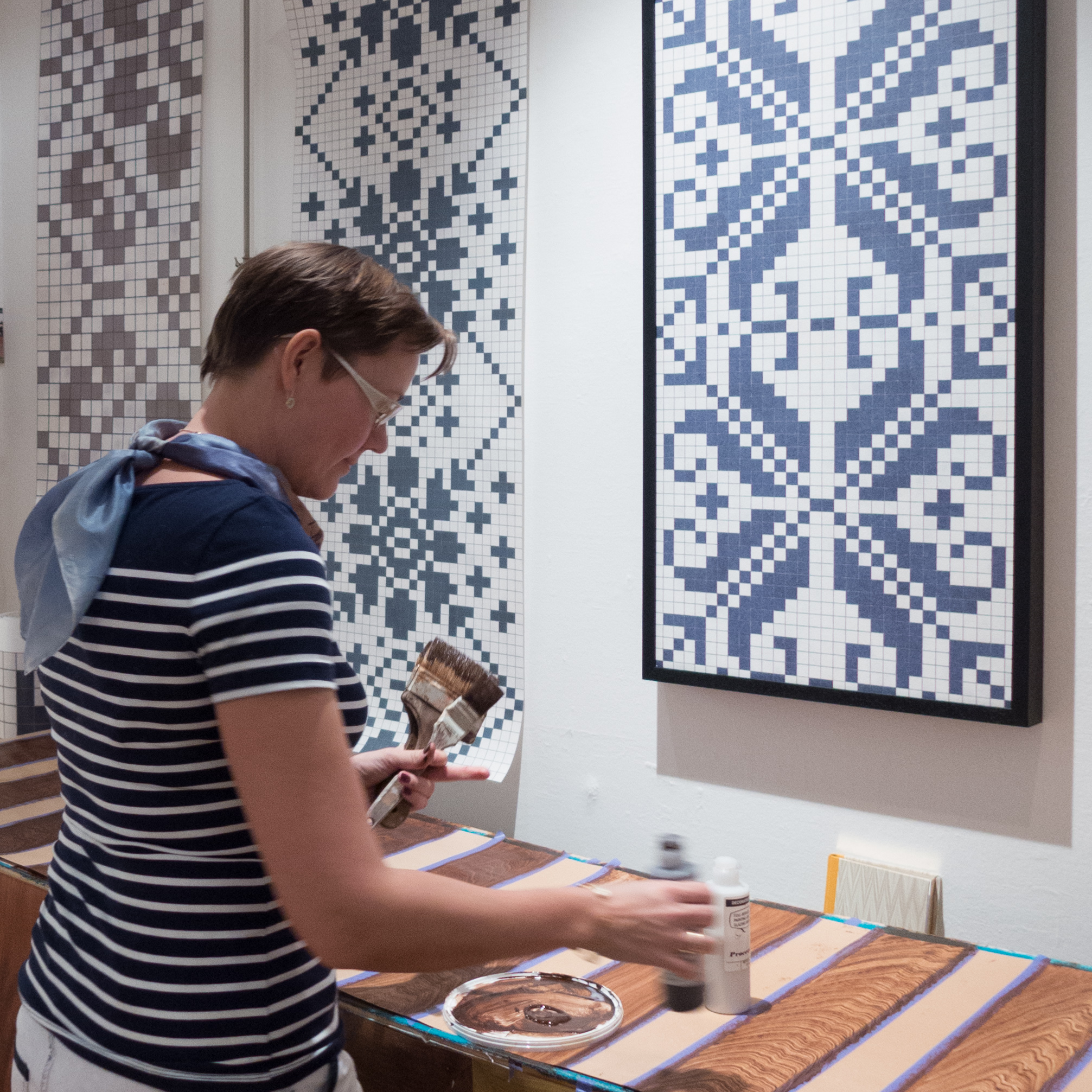
Heidi Zilmer at northmodern


Heidi Zilmer had a stand at northmodern to show her hand painted wallpaper. 

Her work may sound like a rather specialist or tightly specific area of design … one that depends on very high levels of craftsmanship to produce one off pieces … and that is true in part but what is important and interesting, in terms of general design theory and practice, is that her work is not about a designer trying to develop a recognisable or signature style. Just the opposite. What is astounding is the wide range of styles in the designs from those that take historic wallpapers as a starting point through to designs that are starkly and uncompromisingly modern and from designs that can be delicate and subtle, looking like shot silk, to designs that are strong powerful and uncompromising statements. 

A starting point can be a pattern found in nature; a pattern inspired by an ancient oriental or traditional Scandinavian motif, or from playing with a strong geometric pattern but all are seen with an amazing eye for colour but it is a wide-ranging imagination that is crucial and an open approach that sees an idea or a form for inspiration that is then developed into a unique design but with a keen awareness of what is appropriate for homes and interiors now. 

For this display a basic colour of deep blue was chosen to link the works but that was a starting point for ornate Japanese style motifs, Viking patterns or the starkest and sharpest geometric pattern of gilded crosses.


Zilmer’s - Hand painted wallpaper

Heidi Zilmer produces hand-made wallpapers using traditional and well-established techniques including hand painting and stencilling. Her work has been used in the restoration of historic buildings to recreate lost or damaged decorative schemes from evidence where it survives or she has produced designs in an appropriate style using the right colours and the appropriate technique for the period. She lectures and demonstrates these techniques including marbling, imitating the appearance of stone but in paint, woodgraining, used in the past to decorate plain wood and paper - usually to imitate expensive and exotic timbers, and trompe-l’œil, the art of painting so well and so realistically that it deceives the eye.

Demonstrating the technique of woodgraining at Museumsbyngningen

Hand crafting means that designs but can be adapted or scaled in an appropriate way and there is a strong element of mischief … in one scheme with rows and rows of stencilled bowler hats in silhouette, just one might be left out or one, in the most appropriate place, twisted or ‘cocked’ or, in one commission I was shown, just one bowler hat in the room was replaced with a teddy bear.

Clearly modern elements have been introduced in the designs so one of the stencil patterns incorporates in silhouette Danish classics including a PH lamp and the distinct shape of a Jacobsen chair.

But what is so interesting and so important about the work of Zilmers, Heidi Zilmer’s company, is that they do not see these techniques as an end in themselves or as only being essential for high-quality and authentic restoration work: they are skills and methods that have a role in contemporary designs in modern updated adaptation of the technique but also, and much more important, they are techniques that can evolve and be developed further - they have not simply been mastered and brought forward to now but are dynamic and will change and move forward.

The carefully observed studies, painted in minute detail, can even be printed and with modern techniques of printing there is the potential to print onto almost any material including glass and plastic so the hand-painting skills become the first stage of the design and production processes.

The techniques of hand painted designs can also be scaled up to create striking new patterns so this is essentially what has been done with the Nordic Antique range of wallpapers based on traditional Scandinavian knitting patterns. Here, with these wall papers, the clever trick has been to retain strong traditional colours … the classic Scandinavian steel blue … with a cream background which works with the existing features of a historic building … many of the publicity photographs have the papers pasted above dado panelling or with cornices … but the designs also work with both antique and starkly modern furniture.

My thanks to Heidi for giving me so much of her time to discuss her work at the exhibition at Museumsbygningen ... I even came away with a strip of ornately-grained plank ... paper plank.

Zilmer's

Wallpaper of its Time

Mangeløv by Preben Dahlstrøm manufactured in the 1940s.

An exhibition of Danish Artists’ Wallpapers 1930-1965 continues at the Nationalmuseet - the National Museum in Copenhagen - until the 14th of September. Included are original wallpapers, sample books and sketches and examples of some furniture from the period.

Many prominent Danish architects, designers, painters and illustrators worked with the wallpaper factories in this period with the aim of improving the standard of interior design in Danish homes and examples in the exhibition from these collaborations include wallpapers by Bent Karlby, Arne Jacobsen and Nanna Ditzel.

Although this exhibition represents a relatively short period, and one that was disrupted by the Second War, the development of patterns and colour ranges is striking from the earlier small geometric patterns through floral motifs, including the delicate botanical studies from Jacobsen, to very bold strong abstract patterns in the 60s. 


1 Majs (corn) by Bent Karlby from 1943
2 The red roofs of Montmartre from 1947 by Willy Mortensen
3 The Landmark of 1950 - designs by Bomand Utzon-Frank and Viggo Clausen and Liane by Vibeke Krause
4 Semi Abstract Patterns. The yellow rectangles set horizontally and diagonally divided is Klinker by Nanna and Jørgen Ditzel from about 1955, Pendul by Walter Hviid, a design by Jens Dall and the maroon design is Kontantinopel by Walter Hviid from 1955
5 In the Contemporary case Perpetum Mobile from 1955 was designed by Bent Karlby and the design in several colourways, Z-Stribe, by Ib Buch, was produced in 1956.

Atrium by Ebbe and Karen Clemmensen, 1959

Danske Kunstnertapeter 1930-1965, Vibeke Andersson Møller, Rhodos Internationalt Forlag for Vibenskab og Kunst (2013)

A major book accompanying the exhibition by Vibeke Andersson Møller includes photographs of many of the wallpapers in original interiors. One in particular, is a dining room with wallpaper in a bamboo design by Bent Karlby, and shows starkly how the present revival of interest in design from the period is very selective. In that interior the wallpaper is taken across the ceiling in a way not usual now and although all the individual fittings and pieces of furniture - including a Henningsen lamp, simple solid dining table with frame and square legs set flush and simple dining chairs with plain covers - might all be used now, the overall effect, with what appears to be walnut veneer on the door and architrave and a fitted sideboard in an alcove make the final effect distinctly of that period and presumably not one to be generally copied.

The book illustrates paired papers, again by Karlby, where a floral paper was set beside a simple but often large-scale geometric pattern in one of the main colours from the more complex design. This was for a feature wall … one wall or a chimney breast or the alcoves to be papered in a different but linked design.

Some bold designs, such as the broad vertical bands of Stribe by Ebbe and Karen Clemmensen from 1947 have a restrained tone range that could easily be used today but others have giant patterns in bold and strident colours where most furniture and some people would struggle to survive.


Information about opening times can be found on the site of the Nationalmuseet.


design classic: PJ149 by Ole Wanscher 1949


The PJ149, also known as the Colonial Chair, was designed by Ole Wanscher (1903-1985) and was made by P Jeppesen Møbelfabrik from 1949 onwards. The company later changed its name to PJ Furniture A/S.

Wanscher came from Copenhagen, from a well-established, middle-class, academic family … his father was the art historian Vilhelm Wanscher. Initially Wanscher trained as an architect, first at technical school and then at the Royal Danish Academy of Fine Arts, but moved almost exclusively to furniture design. In the 1920s he worked in the office of Kaare Klint and it was Wanscher who produced the first drawings for Klint for the Red Chair for the Danish Museum of Art and Design. For Klint, as part of that project, he produced detail drawings of a Chippendale chair in the collection of the museum and the influence of 18th-century English chairs with arms and the inspiration of more vernacular English ladder-backed chairs can be seen in the design for Jeppesen.

The chair is remarkably light, with the cross-section of the legs and stretchers reduced to the minimum but the chair retains strength through the careful design and position of mortice and tenon joints. Where the arm meets the back post it is swept up which not only makes the profile much more elegant but allows for a thin but tall tenon, to compensate, and the front post of the arm is taken down across the side frame of the seat to be housed into the rail between the front and back leg. This reinforces the side and provides extra strength where most needed … when standing up people instinctively put their hands down over the ends of the arm rests and push up meaning that the end of the arm takes all the weight. The vertical post is expanded below and behind the side rail of the seat without appearing to compromise the slenderness of the frame.

Despite its appearance of refined elegance, the chair is carefully designed for commercial production: the woven cane seat is on a frame that is constructed independently and then dropped in when the chair is finished or assembled.

Slender slats of the ladder back and the separate covered cushion for the seat and back also mean that not only does the chair appear to be lighter and simpler but it avoids a separate and, for many chairs, a complex stage of traditional fixed upholstery. 

Features such as the turned tops of the front legs and the back uprights and the simple loops of leather over the uprights holding the back cushion in place show how every detail of the design of the chair was refined.

Colonial chairs in the Library/Meeting room of the hotel, SP34, in Copenhagen


The Colonial Chair is still in production - made for Carl Hansen & Son and in their catalogue as OW149.

dimensions

  • maximum width: 650 mm
  • overall height: 850 mm
  • height to front edge of seat: frame 360 mm / cushion 440 mm
  • overall from front to back: 685 mm