Krøyers Plads by COBE

As at the Pakhus by Lundgaard and Tranberg on Langeliniekaj, the development designed by Cobe and Vilhelm Lauritzen Architects at Krøyers Plads takes the historic brick warehouses along the inner harbour in Copenhagen as inspiration but the interpretation could hardly be more different.

Where the starting point for the Langelinie Pakhus was the scale of the earlier warehouses but otherwise the site was open with few other buildings to take into account, the Krøyers Plads site is at the centre of the harbour and within the historic district of Christianshavn and previous designs by a number of different architects for the development have been much more difficult and controversial.

read more


progress on major projects along the inner harbour in Copenhagen

Amager Bakke

The incinerator plant designed by the Bjarke Ingels Group is still not up to its final height of 90 metres but much of the framework is in place. It is at least possible now to see just how high and how steep the ski slope will be on this man-made mountain.


Papirøen - Paper Island 

It has just been announced that the architectural company COBE has won the competition to produce the master plan for Paper Island, an important area on the south side of the harbour, opposite the National Theatre, that was originally part of the naval dockyards and then warehousing where Danish newspapers stored paper for their printers, hence the popular name for the island, and more recently those warehouses have been the venue for a very successful food hall, Copenhagen Street Food, and the science centre for children, Experimentarium, along with covered car parking, offices, studios and display space for designers including Henrik Vibskov, &Tradition and the offices of COBE themselves.

Initial proposals for the island include a large central square, a swimming pool, apartments, a gallery with the island ringed by a public boardwalk or promenade.

illustrations of the proposed development from COBE and Luxigon 


Kroyers Plads

Some of the apartments in the south block at Kroyers Plads are now occupied and the other blocks are being fitted out. Designed by Vilhelm Lautitzen and COBE the overall design appears to be a reinterpretation of the historic warehouses along the harbour.

A large, 18th-century, light-coloured brick warehouse to the east includes the restaurant NOMA although they are about to move further back into Christianshavn. 

Originally to have been completed in 2013, but delayed by technical problems, the new cycle and foot bridge - Inderhavnsbroen - appears ostensibly to be finished but is not yet open - or rather it is permanently open and not opening and closing. Extensive new areas of landscaping are being completed on the quays on both sides. This is the first ‘retractable’ bridge in Europe … rather than swinging or lifting out of the way, the two sides will slide apart to let taller shipping through. 


Bryghusprojektet 

Bryghusprojektet by Rem Koolhaas bridges a main road and one function is to link the city and the quayside. To be faced with large areas of green and clear glass, when completed it will provide exhibition and conference spaces for the Danish Architecture Centre, now in a warehouse on the other side of the harbour and there will also be shops, a restaurant and apartments in the building.


It might not look like it but all the photographs were taken on the same afternoon this week on a stroll down the harbour … in the late afternoon the cloud began to break up and by the time I got down to Islands Brygge there was at least some blue in the sky.

Copenhagen Metro


Copenhagen Metro can be seen as a single design project - be it a complicated, ambitious and well-integrated design project - that has brought together design skills in electrical and mechanical engineering for the systems that control the driverless trains; advanced civil engineering for the construction of the tunnel system; engineering and industrial design in the trains themselves; architecture and structural engineering in the elevated tracks, the stations, and the canopies over the tracks and of course landscape and urban design and planning in the setting of the stations and tracks above ground along with graphic design and typography to give the whole transport system a strong and clear visual identity.

There have been a few mistakes and so some things have been changed … for instance fixed glazed barriers along the edge of platforms with doors that line up with the carriage doors have been added for safety as the number of passengers has increased or the changes that have been made as the ticketing system has moved on from clip cards to the credit-card style Rejsekort or to passengers using travel passes on their smart phone which effects how groups of people move into and through the lobby and escalator areas and determines the number of ticket machines and scanners needed and their position.

Often, of course, what initially determined design options might not be that obvious now.

Compared with many metro systems, the stations in Copenhagen are further apart so, in what seems to be a counter-intuitive piece of logic, the trains can be smaller and run closer together. That’s simply because there is a greater distance between stations for the train to get up to an efficient speed and still keep within safety margins if the train in front should be held up by people taking longer to get on or off. Slower trains are more efficient if they are longer whereas faster and more regular trains can be shorter. Having made that decision, the size of the train with a standard unit of three carriages then determined the design of the station. 

In Copenhagen for below-ground stations there are a sunken rectangular box built in concrete and are the same length as a train and the width is the width of the single central platform between the two tracks. The main space for tickets and so on are below ground, reached by external uncovered steps down from the pavement and the roof at pavement level, over this space, has distinctive triangular glass pyramids to throw natural daylight down through the construction to the platform below … although electric lighting is also needed because of the depth below ground of the platform level and because intermediate landings and the escalators cut across the space and block some light.


Just to focus on one interesting design problem and solution, the layout of the escalators at the main below-ground stations seems to be particularly good … well designed in terms of managing the movement of people in a safe and relatively rational way … relatively rational because it makes sense for regular users but can be confusing initially for visitors.

Escalators are inset from the outer walls and have glass sides to allow as much light as possible to get down to the platform from above. A common arrangement in other metro systems is to have pairs of escalators side by side with one going up and one down and with the same arrangement repeated at either end of a long platform. In the Copenhagen system, within the tight space of the box, there are two escalators going down at one end and two moving up at the other. To go down you start at the outside edge of the space and go down to a landing where you move towards the centre and double back with two escalators together side by side going down to the centre of the platform … if it was laid out the other way, with the two upper escalators together, the lower flights would be on the outside against the track. Passengers familiar with the layout use the landing to swap to the right side for the platform they want to use below. The escalators also act as a barrier along the centre line of the platform separating out people taking trains in different directions. There is the same arrangement at the other end of the station with two sets of escalators rising up to the ticket hall. The only slight problem for the passenger is if they get off a train from doors towards the middle of a train when it may take a couple of seconds to work out which pair of escalators are going up and which pair are coming down.

concept sketch for escalators from KHR Architecture


The Metro has been constructed in phases starting with the 1992 Ørestad Act that was necessary to organise the programme, acquire land and give the development a legislative and financial base.

Construction work started in 1994 and the first section opened in October 2009 to run from Nørreport to Vestamager. Almost immediately after that, in May 2003, the extension of that line out from Nørreport to Frederiksberg opened. 

A crucial line was constructed out to the airport and that opened in 2007 giving the metro plan it’s distinctive inverted Y arrangement with the junction at Christianshavn and two lines running down through Amager with one to the west serving the new town of Ørestad and the other to the east following the coast of Amager to the airport. Both the southern lines emerge from tunnels south of Christianshavn and continue as raised section above street level. In the opposite direction, beyond Fasanvej Station, the rail is again elevated. The Metro has major interchanges with the suburban rail service at Nørreport and Flintholm.

The next and certainly the most complicated addition in terms of construction will be the Cityringen - City Circle - where work began in 2009 and is due to be completed by 2018. That leaves a relatively short spur out to the North Harbour that is to be opened in 2019 and a line out the South Harbour to be completed by 2023 with the possibility of further lines. This Cityringen will establish further major transport interchanges for the Metro at the central station, at Kongens Nytorv and at Østerport with links to suburban and regional trains.


Sundby Station

Bella Centre Station


the elevated track between Bella Centre and Ørestad


Presumably, as the Metro expands, signs and colour coding will become more important so that people who are unfamiliar with the system or distracted by the press of people around them don’t find themselves heading in the wrong direction on the wrong line. This is a more general design problem that effects not just the lost individual but the system could start to clog up if people freeze to look at maps or guides or start asking people for help while blocking a crucial area at the top or bottom of staircases or blocking exit doors … then bad design could actually foul up the smooth running of the operation and be dangerous. In those cases designers and planners try and avoid problems but it’s quite a challenge to design something to deal with the amazing ability for some humans to be lost, short-sighted, stupid and selfish all at the same time. As with the extensive remodelling of the transport interchange at Nørreport station, good design works best when people do not realise just how much they are being directed and manipulated by a successful design.

the interchange with suburban train services at Flintholm


 architects for the Metro were Vilhelm Lauritzen Arkitekter, Nille Juul-Sørensen and KHR Architecture
design for station furniture and fittings by Knud Holscher
engineering by Rambøll A/S, Grontmij I Carl Bro A/S and Cowi


Musikkonservatorium, Copenhagen


On Friday afternoon the light across the front of the Musikkonservatorium on Rosenørns Allé was sharp and clear so it was a good time to take some photographs. 

This building was originally Radiohuset, the recording studios and concert hall of Danmarks Radio - the Danish Broadcasting Corporation. 

Work started in 1937 but it was not opened until 1945 when a large concert hall was completed. 

The architect for the work was Vilhelm Lauritzen who was born in 1894 so he was slightly younger than Kaare Klint and Mogens Koch who were both born in 1888 and Lauritzen was slightly older than Arne Jacobsen who was born in 1902. The dates are only significant in that it is important to see Lauritzen within a time frame of contemporary architects and designers. He studied at the Royal Danish Academy of Fine Arts and, after graduating in 1921, he founded the practice of Vilhelm Lauritzen Arkitekter. 

His earliest works were designed in what is generally described as a classicist style but after traveling in central Europe, where he looked at Functionalist architecture, his designs became much more identifiably Modernist. His first major work was the Daells Varehus department store from 1928, in the centre of Copenhagen on Krystalgade and now the Hotel Sankt Petri. The first designs for the new buildings for Danish Radio are dated 1934 and three years later he won the competition to design the first Copenhagen Airport. So, within a few years, a department store, the headquarters of a national radio broadcasting company and an airport … possibly the three major new building types of the 20th century.

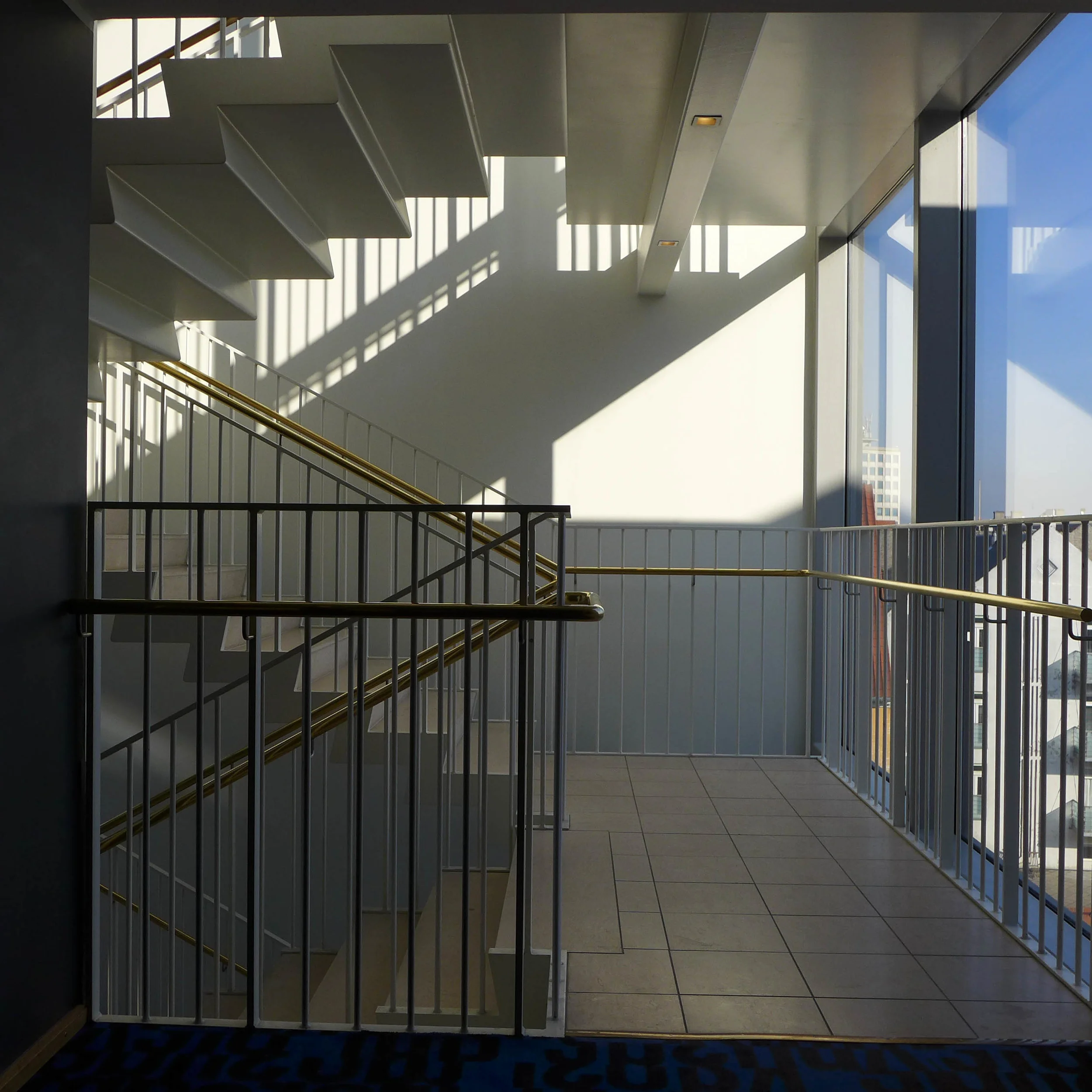
At Radiohuset there were originally two blocks running along the main street frontage and facing south onto Rosenørns Allé with the Lav Fløj (Low Wing) of three main floors over a semi basement that is hard up to the pavement. It is a deep range with a central corridor lit from the ends and offices on both sides. To its west is the Høj Fløj (High Wing) of six storeys in line but set back from the raod and with the canopy of the entrance towards but not at the junction of the two ranges. To the east of the Low Wing and set even further back is the concert hall, a complex trapezoid plan with the entrance into the concert hall from the side street, from Julius Thonsens Gade, and with an open public square at the corner. 

The exterior of the buildings are marked by long continuous runs of window with unbroken horizontal bands of wall above and below and few horizontal or vertical features that project or cast a shadow - so no sill bands, cornice or pilasters - which gives the building its simple, clean,‘modern’ look. If anything rather mundane if not stark now but of course it would have been novel and possibly controversial in the 1930s. A main feature of the exterior is the facing with rectangular, pale yellow, glazed tiles set vertically and set with each row off-set by half a tile from the row below and above … so like brickwork.

The main building material is concrete to create wide unbroken internal spaces. In the area behind, in the angle between the blocks on the street and the concert hall, there are studios and practice rooms on the lower level but an important and early roof garden above.

For lamps and fittings in the new buildings Lauritzen worked with Finn Juhl.

There were further works to enlarge the building in 1958 - when a new wing, the Ny Fløj, was built along Worsaæsvej at the west end - as DR expanded the area used for television. Further work was undertaken in 1972 although by that stage much of the television side had been moved to Gladsaxe to a new TV-Byen buildings.

When new buildings and a new concert hall, DR BYEN, were constructed in Ørestad, both Danish Radio and Danish Television moved to that site in 2006 and in 2008 Kongelige Danske Musikkonservatorium, The Royal Danish Academy of Music, took over the concert hall, studios and practice rooms on Rosenørns Allé after work to update the building were completed, appropriately, by the practice of Vilhelm Lauritzen Architects that continued after the death of its founder in 1984.

The bronze sculpture at the main entrance called, I believe, Radiofonifigurgruppen, was created by Mogens Bøggild, Professor of Sculpture at the Royal Danish Academy from 1955 until 1977. Bøggild, who is known for sculptures of animals, worked slowly and this complex group was started in 1945 but not completed until 1950. It has a naked woman squatting down and placing a small child on the back of a swan that is dropping down, presumably into water to swim away, and a large eagle, carrying a fish, swooping down and over and away from the woman and child.

Hotel Skt. Petri, Copenhagen

The Hotel Skt. Petri on Krystalgade is a member of the Design Hotels group. The building dates from the 1930s and was a large department store called Dælls Varehus, that was designed by the leading Functionalist architect Vilhelm Lauritzen (1894-1984). The store closed in 1999 and extensive rebuilding work, to convert the building to a hotel, was directed by Erik Møllers Tegnestue. Features of the original building were retained but a new entrance lobby and moving staircases up to the reception on the first floor were added along with a new large high dining room where a courtyard was glazed over.

Normally I do not like large international hotels but for a start this hotel is very conveniently situated close to the old university buildings, within walking distance of Nørreport metro station if you are coming from the airport and within easy strolling distance of the main sites of the centre of Copenhagen.

Although the hotel is very large, the corridors are relatively low and carefully divided into shorter sections by light, bright staircases so moving around the public areas the hotel is not actually dauntingly extensive. The upper rooms to the street side and the upper rooms to the courtyard have large balconies … my balcony was probably around 3 metres by 3 metres and looked west across the roof tops of nearby houses so was fantastic for sitting out to catch the evening sun … even in late March.

Room fittings are simple and sensible. My only complaint was the bedside lighting. There was a light box on each side of the bed, which admittedly threw out a nice light in the evening but there were also odd lights on each side on curving metal umbilical cords. It was not the lights themselves that were the problem but the weird way the light switches were awkward and fiddly. Not the best idea if you wake in the middle of the night in a strange place and have to be absolutely and completely awake to work out where and how the light turns on. 

The only thing worse than odd lights in a hotel room is this crazy habit, in many hotels, of covering the bed with cushions. Last summer I stayed at the Thief in Oslo (also a member of the Design Hotels group) and there were cushions of various sizes and shapes and colours in two ranks from the head board covering the bed and tumbling over the foot. If I was a Hollywood diva entertaining in my room and wanted to be seen seductively draped over the cushions, they might have a use. But then I’m not … so the only place to put them all was piled up in a high precarious stack in the corner. Do designers in Oslo have such a ridiculously high budget that all they can find to spend it on is more cushions?