brick cladding


Out near the beach on the east side of Amager there are large new apartment buildings that are going up and at an incredible speed because of the method of construction being used with large panels of preformed concrete lifted into place by huge cranes before then being fixed or linked together. 

Then, on the outer face, goes insulation and a veneer of brick in large sheets made in a factory …. and that is where I begin to have reservations.

There is nothing wrong with the building method - and the advantage is that very speed of building - but then my inner puritan kicks in. I notice the long straight joins between the panels and think that this really has little to do with real brickwork … basically because brickwork isn’t, curiously, just about bricks but also about the mortar and the courses and the patterns - created by how the bricks are laid - and how different colours of brick and how different colours of mortar effect the appearance.

Then there is the thing about honesty … that’s not honesty as in money and value but honesty in design so about using building materials in an appropriate way that reflects and uses the intrinsic qualities of those material. Here I can see that brick facing is used for these modern apartment buildings because people like it - it’s somehow more reassuring and warmer and more comforting than concrete or glass - and because it can be a good attractive colour and, at least, brick does provide an element of texture that can be missing from many cladding materials. 

Which is sort of part of the irony here … it is a factory made product - manufactured - but it appropriates the qualities of something made by hand. On Grundtvigs Kirke every brick was laid one at a time by hand … is that one of the reasons that makes it such an amazing building?

Obviously the apartment building is a very very different type of building so is that voice of my inner puritan wrong and misplaced? Is it perfectly OK to use current technology to achieve some of the benefits for none of the skill or effort?

But Copenhagen has a long and well-established tradition using brick in its buildings and it’s not simply a practical solution simply because these new apartments are very tall blocks so traditional brickwork would not be appropriate …. just look at the huge power stations in the city from the 1930s or some of the very large brick apartment buildings from the 1920s and 30s and you can see good traditional brickwork on very large buildings.

I guess in the end it comes down to thinking that the finished buildings look a bit mechanical because it’s all rather too flat and rather too regular. Presumably the developer would argue that the cost benefits outweigh any quibbles about trying to keep alive traditional building methods and they would probably tell you about 19th-century apartment buildings with thin walls a single brick thick where cold and condensation and noise were and are a serious problem. 

So do cost and comfort always trump aesthetics and rapidly-disappearing craft skills? 

select any image to open the photographs in a slide-show gallery ….

it really is interesting to look at how the concrete and insulation and brick panels are sandwiched together


concrete and steel in the 1930s

L1180329.jpg

The Deutscher Werkbund - the German Association of Craftsmen - held an exhibition in Stuttgart in 1927 that included houses and apartment buildings - the Weissenhof Estate - designed by German architects but also by architects from Belgium, France and the Netherlands. New construction techniques for domestic buildings were shown … here an open steel frame infilled with concrete blocks for an apartment building designed by Mies van der Rohe


Arne Jacobsen at the SAS building during construction with Copenhagen City Hall in the background

Until the 20th century, the main materials for building construction in Europe were natural … so stone as a strong but usually expensive walling; timber for wall framing, roofs and architectural fittings including windows and doors. Natural materials were not of course always used in their found state but were modified or transformed by builders so sand for glass; plaster for covering internal and external surfaces; clay fired for bricks and roof tiles and, of course, lime for mortar and for cement. Perhaps the biggest change to the structural form and then, as a direct consequence, to the appearance of buildings in modern Denmark came with the more and more frequent use of concrete and steel … not just for industrial buildings but for housing and apartment buildings and for new large building types and particularly where high or wide and open enclosed spaces were wanted that were unencumbered by walls or internal supports.

The use of concrete and steel are now so common for building that we rarely stop to consider that both can be used in many different ways. Someone might say “… oh it’s a glass and steel block …” but that’s about as useful in helping to conjure up an impression or mental image of a building as saying that a meal was meat.

In the 1920s and 1930s steel was not always used for a complete frame of a building but could be used as simply a reinforcement for lintels and supports for wide openings but with traditional building materials for the wall itself and similarly concrete could be used for piers and frames to support large open floor spaces or it could be used poured into shuttering for panels for walls that could support considerable weight or concrete could be used cast in moulds for building blocks, used with mortar like stone or brick, or used for ornate features that could be reproduced easily and much more cheaply than when previously such features of a building were carved in stone. Above all, in terms of how the appearance of everyday buildings changed, reinforced concrete can be used with minimal support or can be cantilevered out from the facade for thin canopies or for balconies.

Arne Jacobsen’s own house in Ordrup should be seen as an important building at a pivotal stage in house design. Completed in 1929 it appears to be a modern and ground-breaking house with plain smooth white walls in the International Style that was then becoming fashionable but in fact, at that point, Copenhagen regulations did not allow concrete to be used in house building so the walls are actually built in brick and were then rendered and even the apartments at Bellavista completed in 1934 - perhaps the most iconic representation of the modern style of the 1930s in Denmark - are again brick rendered with plaster. 

Jacobsen did use concrete in the Mattsson riding building just north of the apartments - also completed in 1934 - to roof over a wide high space and concrete became more and more important in his work in housing but more frequently for the industrial and commercial buildings he designed.

There is an amazing photograph taken of Jacobsen with others at an upper floor of the SAS Hotel in Copenhagen looking out over the city before the tower was clad in glass. The impression of the building now, for most people, is of a light and thinly elegant block but the outside cladding and the internal fittings cover the underlying structure and this photograph and photographs of the tower under construction show clearly a massive and robust concrete structure. 

With potential problems with transport and access to the site, the concrete parts were not formed in a factory and brought to the city centre - a later and the more usual method - but the floors and cross walls were cast on site.

One obvious benefit from this substantial sub structure and the substantial internal supports is that there are no corners to the building … or rather the corners are formed by the windows and panels of the adjoining fronts being abutted to form a thin and almost invisible corner.


Hal C Arsenaløen - Christianshavn sports hall


from Værftbroen - looking along the canal towards the sports hall

On the opposite bank of the canal to Kids' City in Copenhagen - the school designed by COBE - is a local sports hall called Hal C that was designed by the architects Christensen & Co and completed 2013.

There is a large sports hall open to the roof at the east end that is lit by large tall windows on both sides - to the canal and towards the playing field to the north - arranged in pairs. All these opening have large plain shutters that open outwards and these and the deep red timber cladding are inspired by the 18th-century mast sheds nearby.

The west end of the sports hall is on two floors with an entrance lobby at the corner, glazed on two sides, and offices and changing rooms on the ground floor and a small hall or meeting room on the first floor.

In keeping with the beautifully simple exterior the interior has large area of plain panels much pierced and a very simple straight staircase with a plain solid side panel but the railings of the landings are rather more complicated open grill.

The building makes really good use of natural lighting inside. The sports hall has areas of top lighting. On both sides of the sports hall are wide wood step where spectators can sit and on the canal side there are steps along the length of the building where people sit and a series of landings down to the canal.


Christensen & Co

a new bridge across the canal from Kids' City

the windows and shutters of the main sports hall from the other side of the canal

entrance at the south-west corner

large windows to the sports hall on the side towards the canal with pairs of shutters

windows and shutters of the main sports hall from the playing field to the east

testing alternatives

At an early stage in a building project, a trial section of wall can be constructed on the site to get a clear sense of the colour of the main material in the actual location and it is also a chance to judge the effect of different colours or different textures of mortar which can have much more of an impact than many people would expect … dark mortar tends to act rather like the black leading in a stained glass window by making the colours of the main material, stone or brick, darker and will certainly emphasise any pattern in the bonding.

The appearance and the character of a facade will be modified by the light as it changes through the day and materials will certainly look very different from their appearance in the studio or even as seen on an another building. And colours and textures look different if they are in shadow, on a side away from the sun, or face towards the sun and are brightly lit and architectural details can look very different in bright light reflected up off water… bright light can make even strongly-projecting features look thin or flat or bleached out.

ATP Pakhus by Lundgaard and Tranberg on the Langelinie Quay in Copenhagen has just been completed but trial sections of wall were built at the construction site on the quay. Clearly two very different colours of brick were considered. Perhaps the deep orange brick was chosen rather than the very dark brown because a heavier tone, for such a large building, could have looked oppressive. It is interesting to compare the brickwork on the finished building with the appearance of the historic brick warehouses along the inner harbour and in Christianshavn.

ATP Pakhus, Langaliniekaj (2016)

Nordatlantens Brygge, Strandgade (1767)

copper and Copenhagen buildings


Copper and the copper alloys of bronze and brass are amazing metals with a long history of use in Denmark for a wide range of uses including making domestic vessels; for coins; for making weapons, particularly ornate weapons for ceremonial use or to display status, and copper and bronze, because they are relatively easy to work, have been used in jewellery and in the decorative arts, particularly for cast sculpture. From the late medieval period onwards copper and bronze have also been used on a much larger scale in architecture, for covering and protecting the roofs of important buildings and, again, because the metals are durable but relatively easy to work and because they can be used as thin sheets that can be shaped and joined together, copper is particularly good for covering domes and spires where the metal layer can be supported by a strong formwork or framework.

read more

early modern ... Vesterport, Vesterbrogade, Copenhagen

Vesterport - a large copper-clad office building on Vesterbrogade and close to the central railway station in Copenhagen - was designed by Ole Falkentorp and Povl Baumann and was completed in 1931.

It fills a complete city block with the building running back from Vesterbrogade to Gammel Kongevej with a side elevation towards Meldahlsgade that is over 110 metres (365 ft) - and there are three service courtyards.

This was the first steel-framed building in Copenhagen with reinforced concrete floors and is the first truly modern building in the city but if anyone notices it today then it is probably for the striking colour of the cladding which, with patina, has turned a sharp but pale acid tone of green. When new, before the copper changed colour, the building was known as the penny.

At street level there were shops so, again in a modern way, this was very much a commercial building and it was in what was then an important commercial area of the city.

The principle tenant was an English insurance company but the open-floor construction meant that it could be subdivided with non-structural partition walls depending on the requirements of any tenants.

But it is not just the method of construction but it is the scale of the block with its flat roof line and the grid-like division of the facades with continuous lines of windows above panels of cladding that is distinctly modern.


Signs for the road names as part of the canopy survive as an example of good typography from the period and brass doors at the entrances with heavy brass handles have been retained.

The building has a significant place in design history for another reason because Den Permanente, an influential design gallery and furniture shop, opened here in 1931 with display space over two floors. It was at the south-west corner of the building with large windows to Vesterbrogade and to Trommeshalen but closed in the 1980s.

note:

The photograph of the ironwork of the building at an early stage of the construction is from the city archive - Historie & Kunst, Københavns Kommune, Stormgade 20


copper after Vesterport

government buildings between Christiansborg and the harbour in Copenhagen by Thomas Havning 1962-1967


In terms of style, Vesterport can hardly be said to have set a fashion as few buildings copied the use of copper cladding although through the 1930s and well into the 1950s many did have brass window and door frames and brass architectural fittings including handrails for staircases.

Superficially the government buildings in Copenhagen at Slotholmgade and Christians Brygge designed by Sven Eske Kristensen and Thomas Havning and built in the 1960s are reminiscent of Veserport. The blocks have the strong colour tone dominated by green and of course with the continuous lines of windows and very regular lines of panels divided by ribs forming a regular grid but only the roofs and certain fittings are copper or brass … the panels below the windows and vertical divisions between the panels are in a dark green polished stone or slate.

However, more recently, the offices and tower at Pakhusvej near Amerika Plads by Arkitema has facades in copper. It was completed in 2004 and although now darkening in colour there is no sign yet of a surface patina of verdigris which shows how slow the transition can be even though this building, opposite the terminal for ferries from Oslo, is subject to winds off the sea.


the main tower and a detail of the copper cladding at Amerika Plads by Arkitema 2004


Most recently the Axel Towers in the centre of Copenhagen, close to Tivoli, by Lundgaard and Tranberg and nearing completion have been faced in tombac- a copper zinc alloy -and again it will be interesting to watch as this prominent, building - close to the City Hall and very close to the SAS Hotel by Jacobsen and two blocks from Vesterport, changes the visual dynamics of the area as its colour changes.


Axel Towers, Copenhagen by Lundgaard and Tranberg ... work nearing complettion

shouldn’t we talk about architecture more?


What a building looks like is important but in the end a building has to be judged by how it works - judged to see if it is doing what it was meant to do - not judged just by how it looks in a presentation drawing or in a beautiful photograph taken in exactly the right light. We judge a building by how it relates to either the crowded busy street in which it stands or to it’s landscape setting.

To understand a building you need to walk up to it, walk around it and walk through it, and, if possible, see it at different times of day and in different seasons.

And it helps if you can look at a number of buildings by the same architect to put the work in some sort of context … it’s that old ‘compare and contrast’ exercises we had to do in English lessons when I was at school though I’m not sure if that sort of thing is still on the curriculum.

Leaving aside the obvious problem of access to a building, it can also be difficult to get an overview of the work of a major architect because, for many, their stomping ground is global … in the past a successful architectural practice might open a regional office 200 miles away, if a long-term project justified the expense, or a second office sorted out some of the headaches of logistics, but now most of the big-name architects, at the very least, have offices in New York and somewhere in China and possibly in the Middle East as well. Architectural practices are truly trans Continental. Star architects can work … and tragically some die … anywhere in the World.

That makes the compare and contrast exercise for major works by major architects almost impossible for any writer or historian or photographer. Of course there are retrospective exhibitions with their catalogues and published monographs but many of those have to use stock images and they inevitably cut out the noise of the traffic, the hot dog stand in the wrong place and often cut out those inconvenient things called people so it becomes really very difficult to judge how a building works day to day or looks in the rain or functions at the end of a busy and hectic day as people try to get away in a hurry. Very few reviews of major buildings look at how many toilets there are or how easy it is to find your way around but surely that is exactly the sort of thing a good architect has to resolve … all that stuff that is important after the wow factor has begun to wear a bit thin.

Of course I admit that I try to take photographs on a good day … not least because I don’t function well in the cold and wet and cold and wet are not much good for the camera either … and I try to adjust the angle of view slightly if it avoids the overflowing waste bin in the foreground and I will wait for the delivery lorry to sort itself out and move on.

One new way of looking at buildings - and certainly a good way to judge a wider setting in a town or city - is to use Google Maps with their satellite and street views although obviously it is better for buildings that are on or close to a road rather than set back in private gardens or in an inaccessible landscape. 

Some major public buildings even have internal coverage by Google so you can explore and pan around the main rooms but that is still relatively rare. Some architects produce very swish, carefully rendered and highly realistic CGIs that are often included in major exhibitions or are published on their web sites but for obvious reasons these are not warts and all. At the very least architects have to admit that those presentations have been sanitised.

Does a detailed assessment for a building matter? In part it’s a done deal, once the building is there and signed off, with all snagging done.   

But isn’t it a bit odd that there are endless reviews of new cars in newspapers and magazines; new restaurants have to face criticism of everything from the size of their plates to the manners and appearance of the waiters and half the internet servers in the World must be straining under the load of hotel reviews good, bad and indifferent, but people buy their next home armed only with an A4 sheet from the estate agent or, worse still, buy ‘off plan’.


Exhibitions in museums and galleries that profile the work of an architect or of a studio are popular and certainly a print run of exhibition catalogues can far exceed what might sell as a monograph through a book shop … the current exhibition at the Danish Architecture Centre - Our Urban Living Room about the Copenhagen architects COBE - have sold out of their first stock of catalogues just half way through the exhibition which proves how much interest there can be in contemporary architecture.

The Infinite Happiness, by Ila Bêka and Louise Lemoine, is a fascinating film profile of the 8House  - the large block of apartments in Copenhagen designed by Bjarke Ingels.  It is in their Living Architecture series and looks at the building by talking to people who live and work there … so the best people to understand and appreciate or criticise the design. The film was screened recently by Arch Daily and the series has been acquired by the Museum of Modern Art in New York.


just how difficult can it be to design a staircase?

the recently remodelled staircases in the Illum store in Copenhagen


Well, actually, quite difficult.

A staircase is not just a major feature in any building but it can also be a particularly difficult part of the design to modify if other parts of the scheme are changed as the plan develops. It becomes a difficult game of consequences - change one part and another no longer works.

It might sound like stating the obvious but a staircase really does have to function well. A doorway can be slightly too narrow or a window sill too high and people grumble. If a staircase is too steep or too dark or the steps are irregular or too small then it is difficult to use easily and it might even be dangerous. 

A design for a staircase normally has to start with the dimensions for the height and depth of a step - the tread and the riser - fixed by the average foot size and the average stride pattern so a tread of at least 300mm and a step up or riser of between 150 and 200mm. These can vary slightly from one staircase to another but not by much and they have to be consistent and ideally consistent through the full height of that staircase. Just watch how many people stumble at the top and bottom of an escalator if it has stopped moving so after a number of abnormally high steps you get into a rhythm for the stride and then hit two or three very shallow steps at the end. It is interesting that even though people clearly understand the escalator has stopped many still stumble.

The number of steps in a flight or often flights, if there are intermediate landings, is determined by the height between a floor and the levels of the floors immediately above and below. Curiously, of course, the thickness of any floor or ceiling structure is irrelevant … you climb not from the floor to the ceiling but from the floor to the level of the floor above. 

Then there are general ideas about the acceptable width of each flight that have to be taken into account - narrow is fine on a back staircase but looks and feels inadequate or mean for a main staircase in a public building - and the need for handrails or not will influence a design and in many countries handrails are required to comply with planning laws. 


the spiral staircase to one end of the atrium at the centre of the Copenhagen Business School - CBS Kilen by Lundgaard & Tranberg 2005. Elegant and complicated with wedge-shaped landings bridging across from the stair to the galleries. Note the leather covered handrail and the zig-zag of wire rather than rails or balusters as a clear appreciation of forms and style from the mid 20th century  


The form of construction of a staircase has a major impact … so if the staircase has single straight flights, or has intermediate landings, or has an open stairwell or is built around a solid core these features of the plan and the implications for the way each type of staircase is constructed and will influence how the staircase looks and how it is used. 

All that may sound very obvious but then the whole business becomes much more complicated when the position of the bottom and top steps of a staircase are determined by the position of doorways or there might be certain major alignments through a sequence of rooms in moving from the entrance to the main space within the building so, for instance, it is generally better to look up the first flight of the staircase as you approach from an entrance rather than going under the staircase and then doubling back although that can be more dramatic. 

Finally, in terms of the staircase in the plan of a building overall, the staircase might be a circulation space, might be on an important route through the building and may be important simply because it has a role as a symbol of status. There are town houses and palaces with grand staircases that go up to humble and badly-designed rooms never to be seen by the public but a guest walking across the foot of the staircase and looking up is not to know that the primary function of the staircase is to impress them with what they think might be up stairs rather what is actually there. The architecture of deception is a whole subject in itself. 


At the centre of the addition to the Royal Library by Schmidt Hammer & Lassen from 1999 is a dramatic double flight of moving pavements to get from the street level to the main first floor but from there up through the levels of the reading rooms are superbly designed 'secondary' staircases ... engineering design at its best. Note the precise cutting back of the glass at the end of the handrail because you might want or have to hold the end of the rail as you turn onto or come off the steps


Inevitably, any later modifications to the plan of a building will have an effect on the function of the staircase - many buildings have a long life and can be altered significantly as change of use or fashions mean that changes to staircases are necessary - so increasing the height of rooms on one floor will mean extra steps in the staircase that might mean a different position for the top or bottom step or both and having to move a doorway could mean it now lines up with the middle of a flight rather than a landing. So if the change to a room or sequence of rooms is more important than keeping the existing staircase then it is the stair that has to be altered or rebuilt. 

To return briefly to the business of handrails, one way of judging the design of a staircase, as you walk up or down, just move your arm and hand out to the handrail. If you have to bend your elbow to move your hand upwards to reach the handrail or, worse, have to stoop down then there is something wrong with the design or, in some very interesting but relatively rare examples, you have proof that the steps were altered but no one got around to adjusting the position of the handrail. Judge an architect by how they deal with the handrail at landings or with the handrail when there are winders. 

As the staircase is often the most expensive single fitting then replacing a staircase is rarely undertaken casually although having said that, staircases do follow changes of fashion and certainly reflect advancements in building technology so often updating a staircase and simply redecorating the rooms off a staircase in a more up-to-date style can transform a building even when the basic structure and layout remains much as built.

And one other problem, one that few people, other than architects and carpenters and builders, will appreciate, until it is pointed out, is that it is rash to see a staircase simply in terms of its plan … it has to be designed in three dimensions because there has to be adequate head room above anyone at all levels as they walk up and down.

Designing a staircase is always a complicated 3D puzzle. 


Town Hall Lyngby by Ib Martin Jensen and Hans Erling Langkilde 1938-1941.


The staircase can also be the most difficult part of construction work as omitting or removing floor beams for the open space of the stair hall means weakening structural integrity and flights of steps and landings have to be properly supported. That is particularly important in a public building, where a large number of people can be on a staircase at the same time and curiously insist on walking on the outer edge of a flight to look up and down the stairwell rather than perhaps more sensibly walking close against the wall where any load can be best supported. 

Theatres and opera houses usually have complicated staircases - not least because nearly everybody in the building is arriving and leaving at the same time and the main space is usually not a level floor but is sloping or raked. Do you come in at the bottom and walk up aisles to your seat or enter at the top row and walk down to your seat or are there entrance points at several levels? 

A grand theatre will have grand staircases to take grand people up to private boxes or to a circle at first-floor level while lesser mortals will have to get up steep, narrow and often strictly functional staircases to upper levels and very often those staircases are accessed from a side street and not from the posh entrance foyer and of course there have to be staircases for performers to get up or down to the stage from dressing rooms or rehearsal spaces. Cinemas have similar problems but are usually more egalitarian although multi-screen cinemas create some interesting problems with controlling access to staircases. 

One of the most interesting historic buildings I surveyed was a very early cinema in the north of England. It was interesting mainly for being one of those I-had-never-thought-about-that moments. The main public staircases were much as you would expect. It was the projection room that was interesting. The film was projected out through a narrow slot just above the heads of the top or back row of the balcony. The projection room was like a concrete box … well not like a concrete box … it was a concrete box … and the flight of steps up into the space was narrow with bare concrete steps and walls and being there felt like being in some sort of war-time bunke. And then I remembered that of course early film was nitrate celluloid that was highly flammable and serious accidents did happen if a projector - basically a large hot bulb - overheated. People did die in cinema fires. At least that is one problem that architects do not have to take into account now when designing the staircases in a new cinema.


Ny Carlsberg Glyptotek in Copenhagen was built between 1892 and 1906. The museum and gallery was extended in the 1990s when Henning Larsens built new galleries for the French collection almost as a free-standing building within a courtyard. The staircase to the galleries was constructed in the space between the new building and the external walls of the courtyard retaining arches and other features. The space is top lit so has a sense of ambiguity half interior half the feeling of being outside and the steps are shallow controlling the speed you walk up and down. Visitors slow down and tend to talk quite quietly so the design of the staircase sets a tone ...


Finally natural light on staircases can be difficult … if a stair window is behind you as you walk up a flight then it will throw a potentially dangerous shadow across the steps and if it is in front of you, shining down the flight, then people on the staircase can be momentarily confused if walking towards a bright light … and of course … in a building … any windows also have to fit with any wider and important design principle for the facade for the pattern or arrangement of the fenestration.

But get the design and the lighting right on a staircase and the experience of walking up and down the flights can lift not just the feet but the spirit as well.

So no … staircases are not easy to design.


note:

For a particularly good example of how you design staircases to get people up and down as quickly and as safely as possible … see an earlier post on the design of metro stations in Copenhagen.

Lundgaard and Tranberg


CBS Kilen, Kilevej 14, Frederiksberg 2005


For a city of its size, Copenhagen seems to have a disproportionate number of top architects. Some, like Bjarke Ingels, with his rise to international prominence, may now work as often on buildings in New York or London or Dubai or Shanghai as in Denmark but actually, over the last 20 years, there has been so much building work in the city - so much new and high-quality architecture commissioned and completed - that one aspect of the city that might not be more widely appreciated, is that here you can see not just several but many buildings by each single practice or design studio and you can trace, within a tight and accessible geographic area, how their careers and how their ideas have evolved. 

That means for the student, or for anyone interested in architecture and buildings, because the city is still relatively compact, you can get to see these buildings quite easily. And you begin to see that within that broad group of contemporary Copenhagen architects you can discern very different interests, even obsessions, or, more politely, to see how each architect can have a different focus that becomes not so much a specialisation but in effect a signature. 

Walking around Amager to look at the works from the first ten years or so of the designs by Bjarke Ingels, I think I see a man who loves the city - so he often uses well-established themes or planning forms - but he hates the fact it is so flat. He wants to be a downhill skier - actually literally at the Amager incinerator - in a place that does not even have that much chance for cross country. So he twists and tilts … if you can't build on a mountain you build a mountain under the building.

Buildings by 3XN in the city seem to focus on an open core for the circulation through a building that comes back to an atrium and often a phenomenally complicated staircase - so these are inward looking, cerebral building - while the architects at Cobe appear to work in absolutely the opposite direction to bring the outside in so barriers or boundaries become blurred but they also give the outside space fittings and functions of the interior but just without a ceiling.

With the buildings in the city by Lundgaard and Tranberg, some of those same features appear - obviously - so the Kilen building at the Copenhagen Business School has an amazing atrium and staircase as the main internal circulation area - the point everyone comes back to - but they have also opened up the entrances on both sides to welcome people to walk straight through so that the atrium becomes a public square on the way from one place to another. 

But if there is one clear and essential quality with all their buildings in the city, it seems to be a focus on the colour and the surfaces of the exterior in a very thoughtful, very careful and very sophisticated way. They play with and control texture and colour and tone and reflection in very different ways in each building. It's a subtle approach and not something tangible - a form or plan or feature - in common between the design and appearance of different buildings. It’s not even a style, as such, but an astute awareness of the quality of the natural light in the city that is the constant.

Lundgaard & Tranberg Arkitekter


CBS Kilen, Kilevej 14, Frederiksberg 2005. The building appears to be raised above street level on a grass mound. Approaching from the south the entrance is at the centre and gives access to the central atrium with doors out of this public area on the opposite side. The atrium is at street level but on either side there are steps and blocks up that can be used for seating where people sit and have coffee or sit and talk and the main rooms at either end of the building are at what is, in effect, a raised ground floor level. The internal steps of the atrium are continued on the outside on either side of the entrance to form seating areas that are presumably used in the summer.


CBS Kilen, showing the entrance from the south and showing clearly the columns of the floor structure set well back from the windows and panels of the exterior. The atrium with its dramatic staircase is not only a central space for circulation within the building but the central area on each long side seems to drop down through the line of the embankment that forms the base of the building to make the opposed doors a cross route through the building. 


Tietgenkollegiet, Rued Langgårdsvej 10-18, Copenhagen student housing from 2006. Student accommodation around a circular courtyard. Student rooms are on the outside and look out over the campus while common rooms and balconies look inwards to the courtyard to reinforce a sense of community.


Skuespilhuset - The Royal Danish Playhouse - Sankt Annæ Plads 36, Copenhagen 2007. The large tower is the fly tower above the stage. Long thin, dark grey bricks used for the main facades were developed specifically for this building. The east wall of the theatre looks out over a broad board walk or jetty and the harbour beyond ... this area is the restaurants and the foyer to the theatre itself, which is at the centre of the building. The band of glass above that is jettied or cantilevered out is actually dressing rooms and offices with lower levels and seating immediately on front of the glass so actors and staff retain a strong sense of the outside world. The glass is tinted but also picks up the strong colours and reflected light that comes up off the water


Charlottehaven, Strandboulevarden 76-88, Copenhagen 2002. The design here is more conventional ... certainly more regular with clear references to the style and form of Copenhagen apartment buildings from the past ... from the 1930s and 1940s and 50s. The courtyard is large - long from north to south and enclosed on the east side by a series of detached blocks although buildings at ground level are continuous and maintain the sense of enclosure and privacy. Here the colour palette is soft greys and mauves. The planting of sedges and grasses and pines is particularly good but there are still the bike sheds and play equipment you would expect but carefully integrated onto the arrangement of paths and open areas  


SEB Bank and Pension, Bernstorffsgade 44, Copenhagen 2010. Between the two blocks is a steep slope of paths that zig-zag up and the area is densely planted with conifers and larches to form an urban woodland. The cladding of the building has a vertical accent with the panels and windows being of various widths but with the width consistent for the full height. Colours are the deep blues and turquoise greens that go back to the period of Arne Jacobsen and earlier in the city 


Pakhuset På Langelinie, Langelinie Allé, Copenhagen 2015. Here the use of red brick was determined by an over riding scheme for the quay where the new buildings are very deep, substantial blocks, that pick up the scale and the simple form of the massive brick-built historic warehouses of the inner harbour. The trial section of the roof that was built on the quay adjoining the construction site offices is a fairly common requirement for planning where the architects and the builders show what the building really will look like and it can be used as a clear guide to what was agreed in case finishes or designs are modified as work actually proceeds. 


Axel Towers, Axeltorv 2, Copenhagen ... nearing completion. The cladding is copper. This group of circular towers is close to the north side of the Tivoli Gardens but not far from the large copper-clad building on Vesterbrogade by Povl Baumann and Ole Falkentorp from 1932 so the new building will pick up a well-established material and colour tone for buildings in this part of the city


to clad or to cover …..

DR Koncerthuset, Copenhagen by Jean Nouvel 2009


Cladding, the general term for the external skin of a modern building, comes from the word to clothe - to clad - and with that meaning can be traced back in written English to the 1570s but the use of textiles or, more specifically woven materials, is conventional for clothing but on the exterior of buildings is still relatively unusual in European architecture.

Of course textiles are used extensively inside buildings to control how much sunlight comes into a room or to cover windows for privacy, to stop or at least restrict people outside from looking in, and textiles are used for heat insulation and to dampen down sound, particularly in a large space, but it is less conventional and less common, for some fairly obvious reasons, to use woven materials on the exterior.

Robust canvas is used for temporary structures such as tents or large marquees and for awnings but for more permanent use, throughout the year, then synthetic materials are better at resisting water, should be less susceptible to mould and should have less problems with shrinking or stretching or fading in bright sunlight.  

A summerhouse in Jørlunde, designed by Dorte Mandrup 2004, has terraces within the overall outer shell of the building and these can be closed off with large sliding screens or panels of synthetic textile for privacy or for shade or to form internal but unroofed spaces so these are like external curtains or blinds. 

But in some buildings woven materials have been used on a larger scale in what appear to be more structural ways.

DR Koncerthuset - Concert House - at DR Byen to the south of the city centre in Copenhagen or rather at the north edge of Ørestad, is one of four large new buildings for the Danish national broadcasting corporation. Designed by the architect Jean Nouvel, it was completed 2009.


It is a substantial and complex building with concert halls and a large entrance hall but it is encased in a striking and visually simple blue box of PVC coated polyester mesh. With an extensive metal framework, the woven outer face is supported well in front of windows … in fact so far forward that there is a walkway between the outer box and the walls of glass of the building itself. This woven outer cover shields the interior from direct sunlight to reduce heat gain on sunny days and prevent glare. There is a view out from the inside but during the day the mesh obscures the view into the building from outside. On this scale it might be assumed that the woven outer box would be held taut but actually sections can be raised like giant Roman blinds giving the building a slightly domestic feeling - be it on a giant scale - but at night there is real drama as the raised sections create patterns of bright light and sections of the facades can be used for the projection of images. 


Frederiksberg immediately to the west of Copenhagen, has a large shopping centre - Frederiksberg Centret or FRB.C that was completed in 1996 as one of the first major buildings that were part of an extensive new development on the site of railway yards and also part of the construction of the new metro. Around 2000 a broader area plan was drawn up by the Copenhagen architects Henning Larsen. That initial shopping centre, in brick, faced directly onto the main street Falkoner Allé with service roads on the north and south sides but was rather lower than adjoining buildings in what is a fairly densely built-up street scape and, in that intervening period, the shopping centre has become part of a more extensive pedestrian area of squares to the west with major new or remodelled civic buildings including a school or Gymnasium, the remodelled main library and, most recently, new law courts and, further west, new buildings for the Copenhagen business school.

The shopping centre has been extended and remodelled by the architectural practice of Krohn Hartvig Rasmussen with the work completed in 2015. The long north and south sides have become much more important, the south side in particular with surviving buildings from the old railway station on the site and the external steps down to the metro station and connects Falkoner Allé to the east with the civic buildings and squares to the west. The shopping centre has been raised in height and new shops added and the exterior of the two long sides have been covered with a taut membrane that is tensioned over a frame to create bold faceted geometric shapes that project out above the ground floor. That structure would not have been possible in more rigid materials because of weight but, as it also covers existing windows to staircases and offices, it has to be in part transparent.

The shapes project out from the original facade to form a series of shallow triangular canopies and the area of the long narrow public space will be used for outdoor markets and other events.


street view from Google recording the construction of the woven panels that now screen the upper part of the shopping centre

good proportions and a sense of scale


the dome of the Marble Church in Copenhagen

Understanding how architects use proportions and scale … or rather looking at how good proportions, used properly in a design, and the construction of buildings with an appropriate scale … is essential in trying to appreciate architecture. 

Appropriate proportion and scale are not just just significant in the design of an individual building - having a strong impact on how good or how bad, how attractive or potentially how ugly, the facades are in isolation but proportion and scale are important in the relationship of the building to its setting … and not just for building in an urban streetscape but also for the way a building relates to its setting in a garden or in a natural landscape.

 In part, this is because we seem to respond instinctively to the scale of a building and can decide quickly if it looks wrong or looks right. Often this comes down to judging a building against our own human scale and normally that means deciding if it is right or wrong depending on if we feel comfortable or uncomfortable with the size of the building. 

It’s a difficult balance to get right. We can easily feel overwhelmed by a large building but we can also feel that a building is mean and too small if it’s not an appropriate scale for its function, particularly if its a civic building or a building of wider national significance. 

And what is right or wrong, in terms of the scale of a building, depends on its actual location - so a multi-storey car park, however useful, is wrong when it looms over a shopping street of historic buildings but usually quite acceptable in among office blocks.

We also have expectations for the size of buildings so many like the idea of a small cosy holiday home but we expect rich or important people to live in big houses and we are surprised or curious if they don’t. Consciously or subconsciously we make a calculation that balances scale against status. 

If scale is something we judge intuitively then an appreciation of proportion might seem rather more esoteric or at least rather more intangible. 

At its simplest, proportion is about both height and width and their relationship and also of course depth and therefore the proportions of volume or space, feeling right and appropriate whatever the size of the building and again our judgment of a building or of urban spaces is often judged against human proportions. 

But scale and proportions also have to be appropriate to the function of the building … so, for instance, in a busy airport a corridor might well be wide enough to take all the people passing through but if the ceiling is too low, little more than the height of a normal room, then it can feel crowded and noisy and unpleasant - simply because the proportions are wrong. The opposite can be true where, for instance, a high atrium at the entrance to a building can make visitors feel lost and insignificant and, of course, banks or government departments can use that effect quite deliberately in their buildings to keep people in their place. Buildings that are overbearing are often like that for very clear and specific reasons.

But proportions have a more important role when it comes to aesthetics … when trying to decide why a building is beautiful or ugly. Again it is something that we seem to respond to instinctively, even if we can’t explain exactly why it is that something doesn’t look quite right if the proportions are wrong, meaning something is too narrow for its height or the parts of a facade or the features in an interior appear to be badly related to each other in terms of their shape and their size. 

Look carefully to see why a beautiful 18th-century facade looks beautiful and it is often possible to discover an underlying geometry that determines the shape of windows and doors - the height related to the width in each - but also often a carefully set out relationship between the openings and the amount of solid wall along with the grading of features … so less important floors are lower in height but the windows, although smaller, can still relate to a grid of invisible construction lines across the whole facade.

Where it becomes more complicated is where scale and proportions that work for a building seen straight on and approached on the main axis will almost certainly not work for a similar building set in a street, only seen at a sharp angle from the side, and as well as the angle of the view, proportions have to take into account the overall height of a building … so features that appear to be quite reasonable in their proportions at ground level, if repeated higher up a facade can look squat because of the sharp angle of view.

A really good example of how these problems have to be resolved by an architect is when a building has a dome. The profile of a dome that works well inside - often something approaching a half sphere - would look too low on the outside - as if it is sinking into the roof - while a dome that looks elegant and well-related to its drum and the building below, when seen from the outside, will appear to be too narrow and much too high - almost pointed - from the inside. Normally, the solution is to build two domes - one inside, to be seen from below, and an outer dome, related in scale and proportions to the facade, with often a considerable gap between the two. It’s always interesting to find out if people looking up and admiring a dome above them realise that actually it is not strictly the dome they looked up at as they approached the building.

Of course deciding on an appropriate scale and designing something with good, basically pleasing, proportions is equally important in the deign of furniture, interiors, ceramics and glassware.

And for the clever designer, subverting what is generally seen as right for scale and shape can be made part of an intellectual game by designing buildings that challenge convention or shock the user into seeing the work in a different way. 

There are no hard-and-fast or easy rules about scale or proportion. The examples here - buildings and spaces in Copenhagen - were in part chosen because they seem to defy or at least play with ideas of scale and proportion and they also show just how easily the eye is deceived when we try to judge scale. That’s maybe the irony. Scale appears to be simple … just how big or how small something is … but curiously our eyes are often deceived whereas proportion seems all a bit theoretical and and a matter of taste but actually our eyes quickly work out if a shape is oddly squashed or elongated or just not quite square when it is meant to be and people respond instinctively to a beautifully-proportioned classical portico or the soaring spaces of a medieval cathedral where the masons used geometry to set out their work and to ensure the stability of its structure even if that geometry is not obvious when you are standing in the building. 


the Armoury ... the naval store built for Christian IV in the early 17th century close to the castle in Copenhagen. This is one of the most amazing spaces in the city. From outside the brick building looks large but not exceptional among other large buildings along the harbour but inside this space on the first floor is amazing ... simple in architectural terms but well built, in part because of the loads the floors had to carry with supplies for the navy, but an absolutely incredible size ... the black speck against the wall at the far end of this aisle is actually an adult and this photograph was taken from about a third of the way from the north end. Scale can be difficult to judge.


Grundtvigs Church in Copenhagen by Peder Vilhelm Jensen-Klint completed in 1940. Again an absolutely amazing space where again the scale is so impressive but here, unlike the Armoury, the proportions are vertical ... virtually all horizontal lines that might divert the eye are removed so there are no bases or capitals to the piers ... nothing to distract from the height, the light and the important diagonal views through the space as you walk down the nave or, here, down the aisle of the church. It is only the people that give a real sense of the height of the building


another image chosen to show how the eye can be deceived when judging scale ... this is a building on the new university campus in Copenhagen south of Christianshavn on Amager. It is difficult to judge the size of the stone blocks ... they could be bricks ... until you realise that the figure at the bottom is a student ... a student of average height ... sitting in the sun with his back to the wall to read  


Israels Plads in Copenhagen ... stone steps at the south-west corner of the recently remodelled square. The blocks read initially as a staircase until you see the figures in the distance. The risers of a staircase are normally around 15 centimetres high whereas these blocks are 36 centimetres high


a series of posts on the architecture of Arne Jacobsen


The National Bank of Denmark, Havnegade 5, Copenhagen - winning design in the closed competition of 1961, built in two phases and completed in 1978


Arne Jacobsen was the most important and the most innovative Danish architect and designer of the 20th century. Certainly he has a well-established International reputation but perhaps some do not automatically associate the work of Jacobsen with the idea of innovation, in part because many of his buildings are well-known and familiar and probably half the homes in Denmark have at least one Jacobsen chair but also because we are all now so used to seeing buildings that are taller, bigger, more exciting or more dramatic. That is unfair … obviously it's not, to use an English phrase, a case of familiarity breeding contempt but his buildings have to be seen and judged in the context of the period through which he lived. It is then that you can see just how innovative and important his buildings and his furniture designs really were. 

Jacobsen trained as an architect in the 1920s, established his own office in 1929 and continued to work on major projects through to his death in 1971. Born in Copenhagen at the very beginning of the 20th century, the buildings of his child hood were cluttered middle-class apartment buildings and grand new, or then relatively new, public buildings in red brick that piled together motifs from Renaissance Germany, French palaces and Danish buildings from the 17th century. At the end of the road where he grew up was a new dock, the Free Port opened in 1904, that had huge warehouses and administrative buildings that owed more to pattern books of bits from north European baronial halls than to anything we would now see as appropriate for industrial buildings yet little more than 20 years later, as an ambitious and recently-qualified young architect, Jacobsen was designing a house “for the future” that was circular with a garage on one side - at a time when few owned a car - and with a boat house on the other side for a swish motor launch and a landing pad for a sort of helicopter, an auto gyro, on the roof. A fantasy of sorts - a winning entry for a competition organised by the Federation of Danish Architects in 1928 - but actually realised if only for a short time in 1929 for an exhibition on housing at the Forum in Copenhagen.  

Through the 1920s and into the 1930s Jacobsen trained with and then worked with the young Danish architects who were looking at architecture in a much more rational way - the Functionalists - building new and better and more practical versions of all those apartment buildings of the late 19th century but trying to improve the quality of mass housing. Many of those buildings, despite many ‘modern’ features seem rooted in the 1930s but Jacobsen developed a sharper, cleaner aesthetic - a remarkably refined use of new technologies and new building methods that exploited and developed to the full the relatively new combination of concrete and steel and he made the use of standard windows and doors and fittings, produced in a factory rather than on site, into a positive and strong characteristic of his buildings. In essence he designed modern buildings that from this view point, well into the 21st century, look good but nothing special but when they were built must have been astounding. Perhaps, in a curious way, Jacobsen’s building look less significant than they really were because we have finally caught up with him.


Housing for young couples, Ved Ungdomsboligerne, Gentofte 1947-1949

And he designed a remarkable range of buildings from a large number of compact family houses, mostly in brick, larger villas, apartment buildings, theatres, factories and town halls, buildings for sport and leisure, including an indoor riding school, and what was, at its completion, a groundbreaking hotel and air terminal for SAS in Copenhagen, along with major international commissions and of course his design of the National Bank in Copenhagen, one of his last works. 

He was and is equally well known for his furniture - many of the designs still in production - and that is where you begin to see the intriguing contradictions in his work. It seems difficult to reconcile, as the work of a single imagination, the elegant but flat, almost-mechanical and certainly graphic and strictly geometric design of the exterior of the SAS hotel, the product of precise lines on a drawing board, with the sculptural boldness of the Egg Chair and the Swan Chair designed for the same building and then see the same hand, let alone the same design aesthetic, in the water colour drawings he produced and the floral wallpapers he designed when he was in exile in Sweden in the mid 40s … just a few years before he designed the hotel.


3316, The Egg, designed for Fritz Hansen in 1958 and displayed here at their showroom at Pakhus 48 in Copenhagen

What is also remarkable - in a period when major architects seek and win commissions all over the World - is that Jacobsen remained in Copenhagen, the city where he was born, and so, within a relatively small area, it is possible to see a large number of the buildings he designed. He worked on the town hall in Århus, designed factories in Germany and designed a complete college in Oxford but even for those projects he had a small team in his office and they worked from his studio in his home, first in Ordrup, on the north side of Copenhagen, and then after the war, less than 2 kilometres away, in a new house that was one of a row that Jacobsen designed just above the beach and overlooking the Øresund at Klampenborg.

With relatively good weather and the sharper light of the Spring, this seemed like a good time to look at and photograph a number of Jacobsen’s buildings in and around Copenhagen and to produce a number of posts for this site and also a pretty good excuse for the first trip of the summer to the Bella Vista beach.


Over a period of a month or so, it was clearly not possible to do a lot of detailed or original research for a series like this but a good time to look and think and the advantage of an online format is that it’s possible to present a lot more images than in a magazine article or a book and, if it is possible to get access to more buildings or return to buildings in better weather or different light, new photographs will be added to these posts.

all in the detail … geometry and proportion in buildings by Arne Jacobsen

Towards the end of his life, in an interview that was published in Politiken in 1971, Arne Jacobsen explained that “the main thing is proportioning. Proportioning is what makes the beauty of old Greek temples classical. Like great blocks from which the air is literally carved out between the columns. And whether we look at a building from the Baroque, from the Renaissance, or from our own time the ones we wish to look at, the ones we admire - they are all well-proportioned: this is what is decisive.”  1

It is a comment that reveals much about an underlying aesthetic principle that was at the core not only of his architecture but also his designs for furniture and interiors … an aesthetic that can be seen in major works of this late period of his career such as St Catherine’s College in Oxford or his last major commission for the National Bank in Copenhagen. Not just buildings designed with elegant proportions but buildings that are calm and monumental in a way that is closely reminiscent of the best classical buildings.


That vivid and evocative description of “air carved out between the columns” provides one key to understanding buildings like Søllerød town hall but, equally, carefully resolved proportions are elemental to the design of small houses, in Jacobsen’s designs for gardens and as a key characteristic of his furniture.

He clearly saw the design of an elevation - the arrangement of doors and windows, their relative size and their spacing with an appropriate balance between the openings and solid wall - as an opportunity to use a rational grid as the underlying framework and he used geometry and mathematically determined proportions, not just for the overall outline of a facade but also for the features or the constituent parts of a design.

To some extent, the use of standard and repeated units for the elevations of large modern buildings and regular and equal floor heights repeated up the building would have created a grid pattern in any case but Jacobsen applied a system of proportions to the facades in buildings through the 1930s and then on into his post-war works, trying different arrangements for each design but becoming more complicated with each project.


Nyropsgade 18, Copenhagen  building for A Jespersen & Son,    completed in 1955


The City Hall, Rødovre Rødovre Parkvej 150 1956


SAS Royal Hotel, Hammerichsgade 1-5, Copenhagen 1960


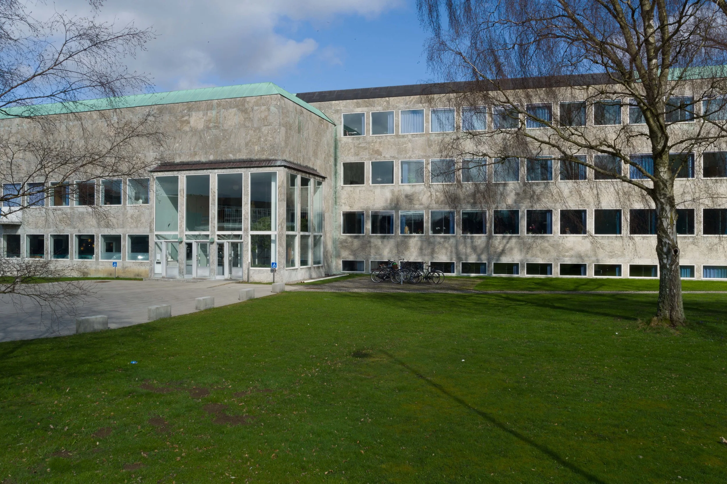
A careful use of geometry and proportion is less obvious in smaller brick houses simply because, when compared with the front of an office building like the Jespersen block, the use of a design grid is clearly less pronounced but in the design for his own house at Gotfred Rodes Vej, the plan of the main room on the ground floor has the proportions of a golden rectangle and although ceiling heights are not given on the plan used for writing this post, a height of 2.5 metres, which is quite reasonable for a house of this size, would mean that it is possible that heights and therefore the volume or space within the house were also determined by golden proportions. The side block of that house, including the staircase, kitchen and dining room on the ground floor, is certainly a golden rectangle externally, and interlocking with that space, the staircase, the entrance hall and the small room to the right of the entrance in their overall dimensions define another golden rectangle so, at the very least, the starting point for the plan of his own house in 1929 was a geometric framework based on the golden section which was then developed into the final design even if every room and every feature did not fit precisely into a proportional straight jacket.

Jacobsen’s later home at the east end of the row at Strandvejen is even less obvious as a design based on geometry because there rather than the simple blocks and flat roofs of the first house, obvious geometric blocks, his post-war house is in a terrace or row and has a long narrow footprint and sloping roofs but even there the starting point appears to be a grid based on golden rectangles. The main part of those houses is a long block running north south and, starting with the width of that block, then it’s length is two golden rectangles set end to end and the main room on the top floor has the proportions of a golden rectangle. In Jacobsen’s own house in the terrace, because it is at the end of the row, it has space for an additional block on the east side that contains rooms on all three levels and that is based on a square with the dimension that is the starting point of the two golden rectangles of the main block.

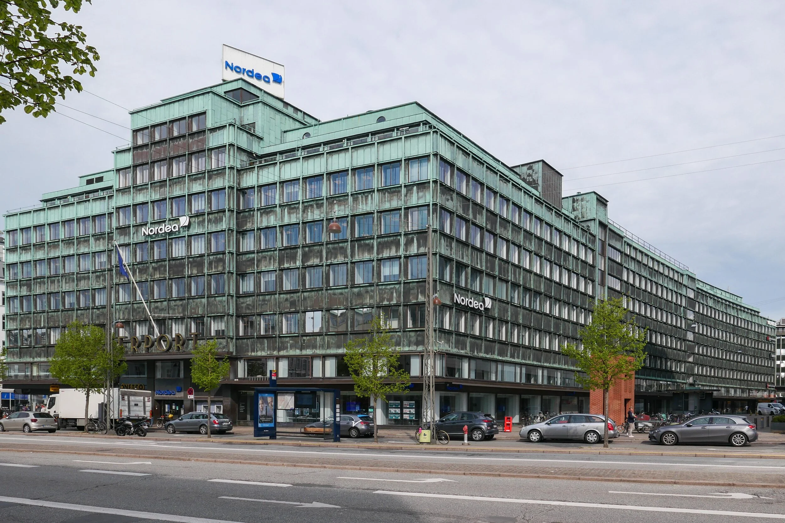
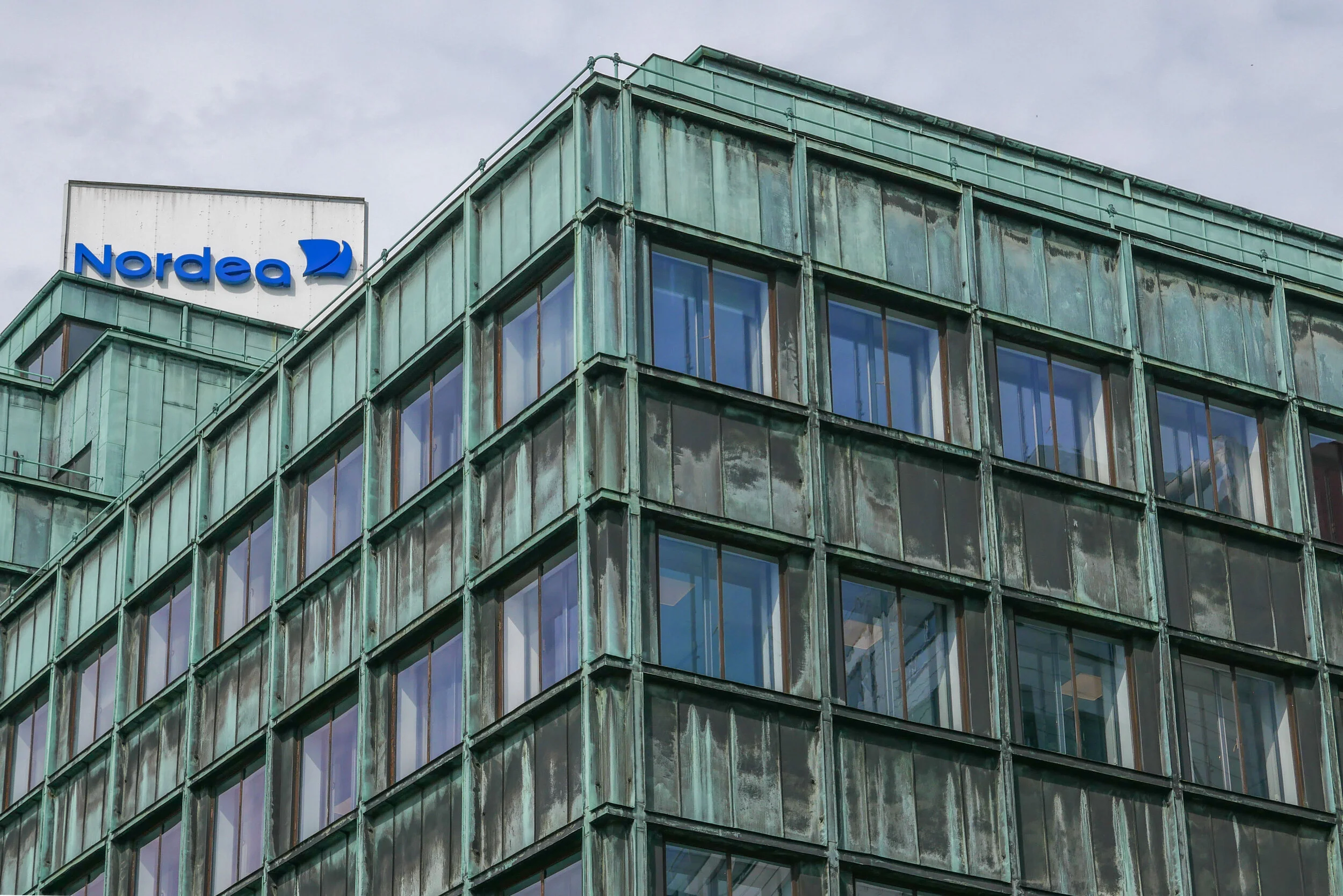
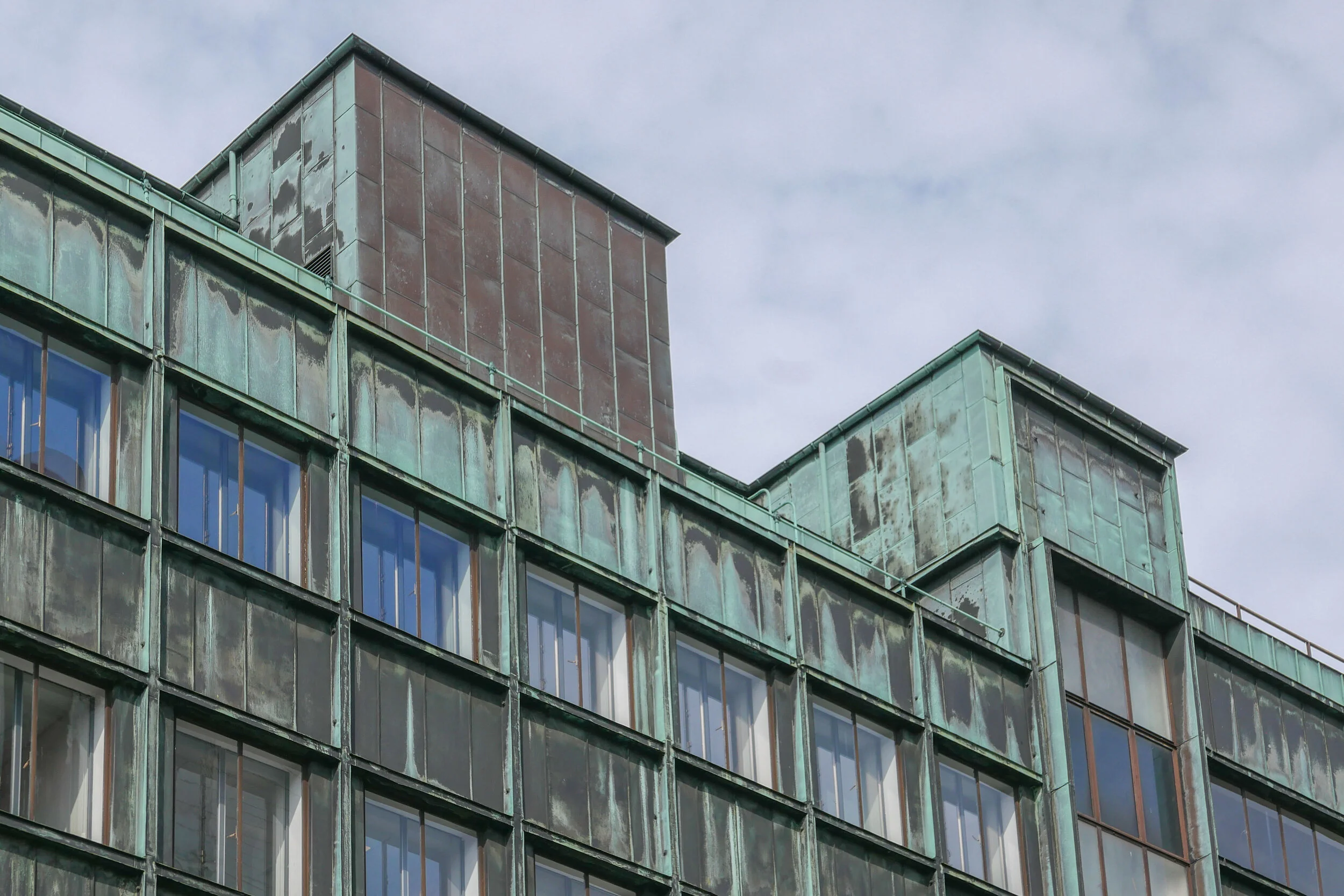
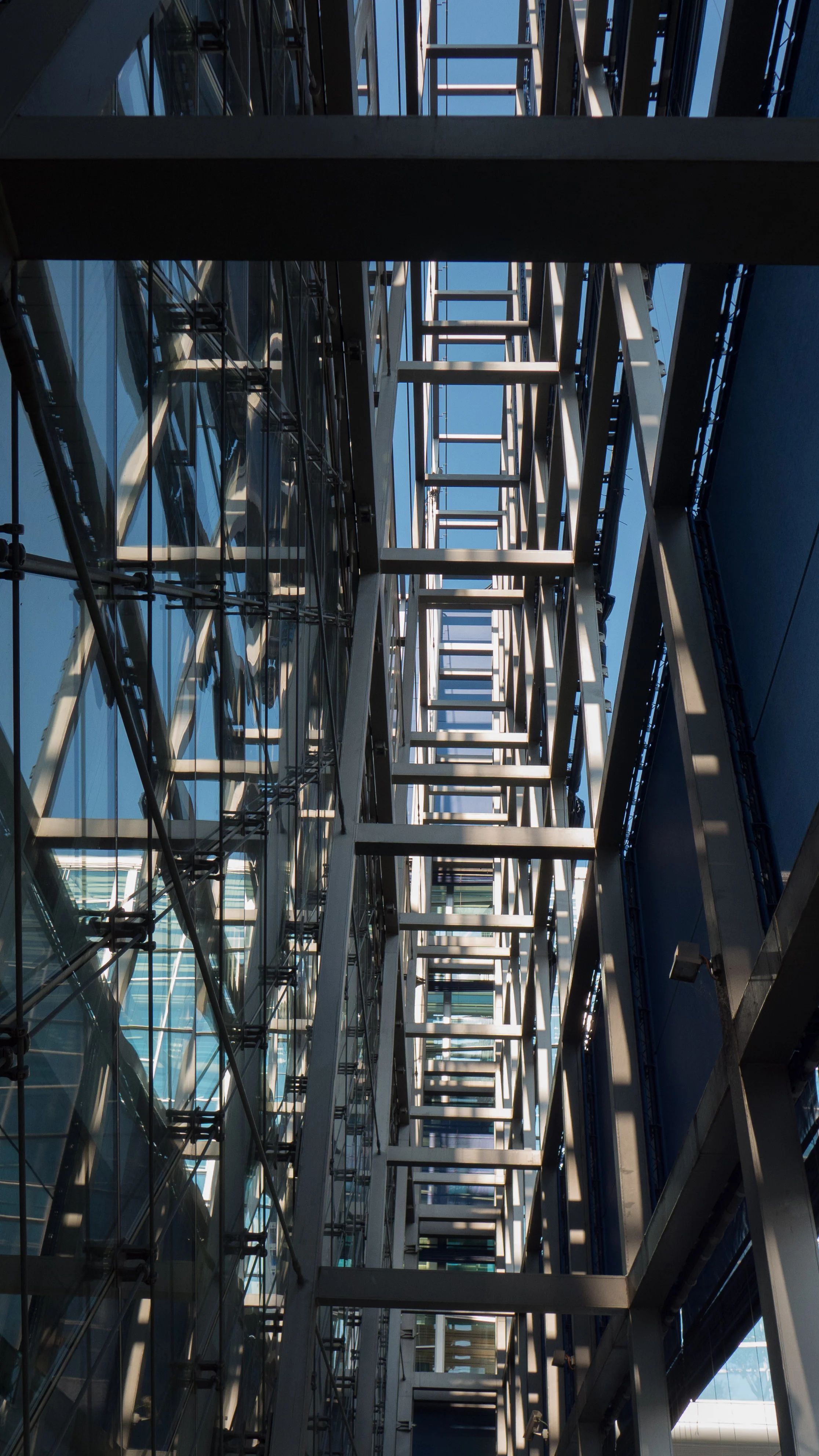
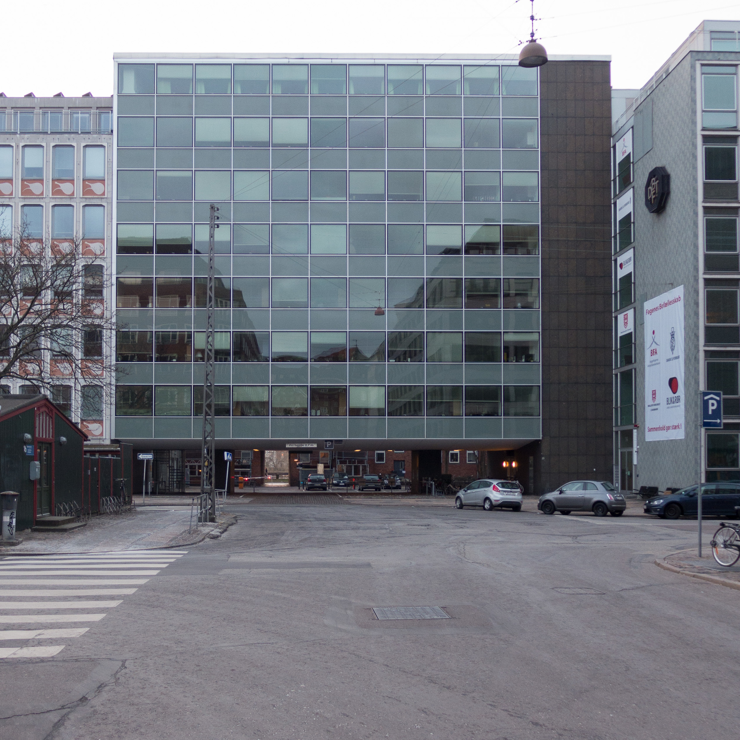
For larger buildings such as the SAS Hotel in Copenhagen, Jacobsen was clearly aware that with the industrialisation of building construction, where you use a large number of components that were made in a factory and assembled on site, including all the windows, then to get the proportions of a single unit wrong would mean that that potentially ugly or disproportionate elements would be multiplied along the length of the facade or throughout the building to compound a poor design: it was essential that each part had to be not only well made but also well proportioned.

In fact, for the SAS Hotel in Copenhagen, not only was the design of the elevation based on geometric proportions but the basic window width of 60 centimetres, or multiples of that dimension, was used by Jacobsen for standard furniture and fittings for the rooms, including bedside tables and bed headboards so that furniture and fittings could be used in different positions and different combinations but still relate to the basic proportions of the space.  

Jacobsen trained at a time when both classicism and functionalism were dominant in Danish architecture and surviving drawings show that he studied classical buildings on trips to Italy …that included visits to Paestum. 

Nor is Jacobsen alone in using not just proportion but specifically the golden rectangle or golden proportion at this time.

In Norway the academic Frederick Macody Lund (1863-1943) was involved in a long-running dispute about the restoration of Nidaros Cathedral in Trondheim where he contended that the design of the medieval building had been based on the Golden Section and argued that geometry should be the principle control for any new work. The controversy this created was published in 1915.

In 1920, just before Jacobsen began his training at the Academy, Ivar Bentsen (1876-1943) produced designs for a new Philharmonic Building in Copenhagen where the fenestration was based on the Golden Section so the upper windows were square 5 by 5, the windows below that 8 by 5, then below that level windows13 by 5 and the lower row of openings was 21 high by 5 wide … in fact a ground floor and mezzanine. The dimensions of the windows are a progression based on golden proportions but presumably that was not immediately obvious even to someone interested in geometry.

That is part of the problem with using geometry: it is a useful tool as a starting point but if applied slavishly can produce a design that at best is mechanical and at worst is seen as something esoteric or downright obsessional when the geometry is pointed out to most people … even to many architects.

That is not to suggest it has no value. For thousands of years, artists and architects and designers have realised that certain shapes and certain lines are seen as more attractive or even as more beautiful than others and actually most people can appreciate that difference. As soon as you say that something looks a bit thin or something looks rather squat then you are making a judgement about the proportions.

Steen Eiler Rasmussen discussed this in his general work on architecture, Om at opleve arkitektur, published in 1957 and published in English as Experiencing Architecture in 1959.

In a chapter on Scale and Proportion, he talks about mathematical relationships and compares music and architecture … talking about composition and harmony.

“The truth” he explained, “is that all comparison of architectural proportions with musical consonance can only be regarded as metaphor … that scale and proportion play a very important role in architecture is unquestionable. But there are no visual proportions which have the same spontaneous effect on us as those which we ordinarily call harmonies and disharmonies in music.” 2

In that book Rasmussen also gives a very clear explanation of how the Golden Section is constructed and discusses how it was used by Le Corbusier in the 1920s as part of his system of subdividing or creating a series of related parts described as “Le Modular.” 

A return to simple facades with no or with much less decorative detail and a general return to symmetry and the rejection of designs that copied or adapted decorative details from earlier periods but applied them to distinctly new building types was a reaction against Romanticism. Young architects questioned why it was appropriate to use features taken from mediaeval architecture for a railway station. In 1954 the architect Kay Fisker explained bluntly that “… through a deliberate work with proportions and metrics, it was possible to reintroduce the concept of order after the individualistic chaos of the Nyrop era” … Nyrop being the architect most famously of the City Hall in Copenhagen that was completed in 1905.

Of course classical architecture, looking back to ancient Athens or Rome, for inspiration was equally used as a source of features from historic buildings whose original function had little to do with 20th-century buildings but, at least, stripped back to elements of construction then it is possible to argue that a system of vertical supports and horizontal beams - columns and lintels - the basic elements of classical buildings - created more appropriate and more practical spaces than arches and vaults and buttresses.

For Arne Jacobsen symmetry rather than asymmetry and clear honest construction used to create clean well proportioned spaces - rather than a building having a veneer of pattern that was more to do with nostalgia and romanticism than it was to to do with the real structure underneath - appealed to his own taste for clarity and for rational architecture that was essentially linear and graphic rather than sculptural and decorative.


Notes:

1 Quoted by Carsten Thau and Kjeld Vindum in their definitive work Arne Jacobsen (2002) page 16 

2 Steen Eiler Rassmussen, Experiencing Architecture (1959) page 105


all in the detail … office building for A Jespersen & Son


The office building for A Jespersen & Son was designed by Arne Jacobsen and completed in 1955.

Just a few streets from the SAS Hotel, this is an elegant and beautiful building but its apparent simplicity is deceptive because all the details of the facade, the proportions of the separate parts and even, what was then, the very advanced engineering underlying the construction were all very carefully considered. 

Through a precise and exacting process to refine the design, Jacobsen worked hard to get a building that looks so simple and so right by a process of reduction and simplification for not just the overall design but also for all the individual elements.

It is an important building because, at a remarkably early date, it exploited complex and novel engineering methods. With a cantilevered concrete frame, Jacobsen overcame exacting planning stipulations; made possible an open plan inside the building and allowed him to design an incredibly stripped down and elegant and sophisticated facades on the exterior.

This is not a brutal building but concrete construction at its most subtle and sophisticated.


The building is in an interesting part of the city that has a complex history. 

Nyropsgade, running north south, is between the main railway line to the east - the line that heads out of the main station to first Vesterport Station and then on to Nørreport - and, to the west there is Sankt Jørgens Sø - the southernmost of the lakes on the west side of the city.

This is a curious part of Copenhagen - close to the station and close to Tivoli and the busy area around the city hall - but most cyclists and most car traffic use the busy roads to the east and west or cut across the north or south end of Nyropsgade so many may not realise that Nyropsgade opens out at the centre to a long but well-proportioned square.

The Jepersen building is at the top or north-west corner of the square with the front facing you if you approach Nyropsgade along Dahlerupsgade.

Until the middle of the 19th century this area was outside the city defences and the lakes to the west were then larger with more irregular outlines. In the late 19th century, after the defensive walls and embankments of the old city were dismantled, the main railway station for the city was in this area, on the north side of Vesterbrogade - approximately in the position of what is now the present Vesterport suburban station - and there were railway sidings and what appear from the maps to have been water works between the station and the edge of the lake. 


A new main railway station, the present building, was built on a new site a block south of Vesterbrogade and was finished in 1911.

The route for rail tracks in and out of the station were altered. Whereas, the earlier station was a terminal with all lines heading out to the north over the lakes by what is now Gylensløvesgade, after 1911 the main line headed out south and curved below Vesterbro and a new rail line, connecting the present station to Østerport, previously a terminal for trains from the north, was completed in 1917 with the tracks set down in a deep cutting that followed the line of the main streets of Nørre Voldgade and Øster Voldgade.

With the construction of a new city hall, finished in 1905, the area to the north of the city hall square and Vesterbrogade became an important new commercial district but the area between the old station and the lakes developed relatively slowly.

A very large apartment block, Vestersøhus designed by Kay Fisker, was completed in 1939, with a long narrow courtyard behind it, but further building work in the area was delayed by the war and Nyropsgade with its office blocks dates mostly from the 1940s and later.


Nyropsgade from the south

That long courtyard behind the Fisker apartments actually dictated the form of the building that Jacobsen designed for Jespersen & Son. The new office building was designed to bridge its relatively narrow plot so that space and, more important, traffic could flow underneath to provide access to the courtyard and to provide a route from Nyropsgade, acroos the courtyard and to an archway opposite … an archway through the middle of the apartment building, that was and is still a relatively popular way to cut through under the apartments to the lakeside road.

The solution was to place a narrow block for the main staircase and services, just 4 metres wide, along the north side of the plot with just two main, widely-spaced piers on the spine axis of the arch that support a cantilevered concrete floor system that spans the rest of the plot that is nearly 24 metres wide, with no cross walls running front to back, other than the wall of the main staircase, and no vertical supports on the front or the back wall of the building.


For the facades above the archway Jacobsen used a curtainwall design that was primarily glass within a grid of thin metal framing.

The main entrance into the building is from the archway into the centre of the stair block. The only other feature to cut through the ground-floor arch, apart from the two piers, is a second staircase from the basement to the first floor that is set in a glass tube, a circular staircase with a diameter of 2 metres, with its structure reduced to an absolute minimum.

At the first floor, each of those two piers is divided into a front and back column of concrete with a spine corridor running between them. 

With toilets and the lift in the narrow service block of the main staircase, the rest of each floor, on either side of this central corridor, is open plan. There are no structural cross walls or piers on either facade … the fronts are reduced to that elegant grid of large plain, undivided windows with panels below in green/grey with the same reflective qualities as the window glass. 

On the top floor there was a canteen across the street frontage and, on the courtyard side, the outer wall was set back into the building to form a long open terrace.

The cantilevered floor beams are tapered on the underside so they are much thinner on the outer wall line than they are over the central piers but even so they are not expressed and therefore are not visible on the facades … the division between floors is marked simply by a bevelled metal frame between the window below and the panel of the floor above that has the same dimensions and the same profile as the frame between the windows. There is no lintel or marked horizontal to indicate any sort of structure or support over the arch itself. The panels of the curtain wall drop just below the ceiling of the arch for the practical reason that this creates a drip course … otherwise rain in heavy storms would run down the front and then cut back under onto the ceiling of the archway.

However, although there is no lintel or beam over the archway, you can see the slope of the ceiling as it follows the taper of the cantilevered beams and the ceiling slopes down by 500 mm between the outside edges and the lowest part at the centre. Again this is a clever and subtle visual trick as the ceiling, in shadow, just gives an emphasis below the facade that might otherwise look thin and weak.

Light and shadow through the archway are also used effectively - with the light of courtyard beyond the arch and then a patch of light of the passageway through to the lake-side road - that add an element of drama to the design.

Looking across the courtyard and under the Fisker apartments to the lake beyond

From under the Fisker apartments looking back across the courtyard to the Jespersen building


Window glass and the panels below the windows were replaced in a major restoration about 2013.

The opaque panels below the windows are now a consistent and regular colour but photographs from before the restoration show changes of colour between the different panels that was, presumably, just degradation over time rather than being part of the initial design.

Although the panels below the windows reflect light in much the same way as the glass of the windows, the darker tone of the panels gives a horizontal banding to the front.


Dull dark grey/green polished stone was used to clad the narrow service block on the street frontage and this was taken through the ground floor within the arch but concrete blocks of the same size were used on the courtyard side. 

Overall, the simplest glazing arrangement possible, with single pane and no subdivision, means that the proportions are crucial.

The only modulation to the design is the use of a thicker metal frame to the parapet and the south edge of the windows on what would be the line of the party wall between the Jespersen building and the office building to the south. Again, because this thicker frame is set back, it achieves its effect by creating a slight shadow … almost like the line of shadow from the cut of the inner edge of a mount for a framed print.


This graphic quality to the design can be seen in the rational use of proportions that are a strong if understated part of the design of the facade. Stone facing tiles on the staircase block are slightly less than a double square set vertically with three panels to each floor and eight across the width of the staircase bay.

These panels on the staircase towards the courtyard are in cheaper concrete but are the same size and the stair windows, lighting intermediate landings, are exactly the same height as the panels.

The panels below the windows on the front and back facades have the same double square proportions so the whole design is fitted within a carefully proportioned grid.


From the Fisker apartments, looking across the courtyard to the back of the Jespersen building and through the archway to Nyropsgade beyond.
Note the roof terrace and the arrangement of the windows of the staircase fit precisely within the grid of the concrete blocks.


note:

for an analysis of how Jacobsen used proportions and geometry see:
all in the detail ... geometry and proportion in buildings by Arne Jacobsen


all in the detail … Bispebjerg Bakke


Plan from Arkitekturbilleder, Det Kongelige Danske Kunstakademis Skoler for Arkitektur, Design og Konservering


It would be difficult to find two more different buildings in Copenhagen than the Jepersen office block by Arne Jacobsen and the apartment buildings at Bispebjerg Bakke from the partnership of the Danish artist Bjørn Nørgaard with the architectural practice Boldsen & Holm but what they have in common is that both designs depend absolutely on their focus on every detail of the design … not simply plan and elevations but the profile of window frames, the careful choice of the right finish and exactly the right colour for materials on the facades, the details of unique, custom-made staircases and so on.

Although the apartment buildings were completed in 2007, the initial idea for Bispebjerg Bakke went back many years before that to a conversation between Nørgaard and the chairman of the Association of Craftsmen so, from the start, an important aspect of the scheme was to have a strong link between an artistic concept and its execution with a very high level of craftsmanship.

Nørgaard made an initial model in clay so the design was organic rather than a building, like the Jespersen block, that was primarily about, what was for its date, very advanced engineering. Bispebjerg Bakke is about fluid lines and the potential for architecture to take sculptural form while the Jespersen building is about bringing to reality the beauty of a mathematically precise design. How you view the two buildings; how you experience the two buildings and how you move around and through the two buildings could hardly be more different and yet both depend on understanding completely the building methods that they exploited and both, with huge confidence, play games with forms and with styles that can only be achieved with the support of a client, willing to go with designs that were far from conventional by the standards of contemporary buildings.

Curiously, what the buildings also have in common is that the starting point for both designs was determined by their site. This might not be as obvious for the Jacobsen building, which appears to be suitable for any urban site, but the plan had to take as an unusual starting point, set by the planners, a stipulation that contact with the ground had to be reduced to the minimum as the space had to flow through from the street to the courtyard behind.

Bispebjerg Bakke could not be more different. It is absolutely and completely grounded on its landscape and follows a complex sloping site. To the west is the public road, Bispebjerg Bakke, that runs down the hill with the grounds of a large hospital opposite, and to the east of the narrow plot is a suburban railway line in a relatively deep cutting. The land drops down from the narrow north end but the road curves away to the west and the railway line curves sharply away to the east so the plot widens out as it slopes down to the south and east.

The landscape includes mature trees but it also means that the changing light as the sun moves round and views across the site and through the buildings are crucial as all the apartments have been given a dual aspect but few can benefit from direct sun from the south.

There are 135 apartments in the complex with a main building that has a sinuous line following the road, well over 400 metres long, and with a smaller second building, just under 90 metres long, to the east where the plot begins to widen out as the railway curves away. The arrangement of the apartments is in some ways quite conventional in that there are separate doorways giving access to a main staircase with just two apartments at each level, a single apartment to each side of the staircase, and the apartments run through from front to back of the block … to provide that dual aspect.

Each “block” or section is self contained with footpaths or roads between, linking the public street and path with an internal service road, with two entrance doors in each section but the roof is continuous down the length of the long building running across each pathway or road that cuts through the building. Each break is the full height from the pavement to the underside of the roof which adds considerably to the drama as the sections vary in height from three to eight storeys, the tallest section is at the north or uphill end, and the upper apartments in each section have mezzanines so have windows rising up through two tall or even two very tall floors.

The main staircases, two in each section, rise around an oval stair well and the apartments have curved walls and curved balconies so again the design appears to be organic although there is actually a strong and logical conceit in the use of materials on the different sides of the buildings that gives an interesting rationality to the design. In traditional apartment buildings from the early and mid 20th century in Copenhagen, in districts like Nørrebro, the blocks were built with what was then more expensive and more fashionable red brick on the street side and yellow brick towards the courtyard. In the city, an apartment building might be part of a longer row, forming just part of a city block, or might be around a complete block so often the junction between red and yellow brick is not visible or not particularly obvious. At Bispebjerg Bakke it is made into a distinct feature. Red and yellow brick meet at a vertical join half way through each archway and the join is emphasised with bricks projecting at a slight angle and interlocking to look almost like overstitching used on blankets or leather work.


There is a further game with the colour of brick used on each side of the buildings: vertical runs of window and balconies have brick columns or piers between them so, on the red-brick facades, the piers are in yellow brick and tiles, used for the sills and for the parapets of the balconies, are pale yellow but on the sides using yellow brick for the main walls, those piers are in red brick and the tiles - for the sills and balconies and for the surrounds or frames of the main entrance doorways - are red … a deep ox blood red.

Initially, on first seeing them, the doorways and balconies appear to be sculptural - rather free and organic - more Barcelona and more Gaudi than anything normally seen in Copenhagen - but then the effect depends on the very Danish precision and skill of the bricklayers and other craftsmen. Details like rain hoppers, the precision of the construction of the copper roof, the regularity of joints in the roof and the precisely shaped and coursed brickwork are all very carefully executed.

Windows are framed in jacoba wood and given a sinuous profile and inside the rails of staircases are bowed out. 


It seems odd to describe the roof as flat or even as mono pitch when in reality it swoops and twists across the building but it is certainly not pitched in the conventional sense because it does not have a ridge with inner and outer slopes. In terms of challenges, the main roof must be the most impressive part of the construction as the placing of joins in the copper sheeting must have required very careful design because there are surprisingly shallow and unobtrusive baffles and lipping to direct rain water, which can be torrential in Copenhagen, to run down the slopes to hoppers and down-pipes rather than simply cascading over the edge.


The curved lines of the balconies are interesting. Balconies are on the party wall and there is a central dividing pier on the line of the partition between one flat and its neighbour. The front line of each balcony curves back to the main wall line, forming a bowed, almost semi-circular front to each pair of balconies and the windows curve in from the front line of the wall to the partition to create what is, in effect, triangular balconies but with curved rather than straight lines to the front and window. Note window frames are curved but double glazing units are flat simply for practical reasons, primarily economic.  

On their web site Boldsen & Holm describe Bispebjerg Bakke as a building “where art, architecture, workmanship and technology melt into each other, in an equal and even interaction. The organic shape originates from the character of the area …”