all in the detail


There have been several posts on this site about the stone cobbles or setts used for roads and pavements in the city. This is obviously far from being a cheap option but it is hard wearing and it is practical … unless you are wearing stiletto heels or you are trying to control a suitcase on wheels … and almost impossible if you are doing both. 

The first photograph is of the old meat market just to the west of the central station. There are no longer carts with metal hoops on their wheels clattering and bumping over these lanes and they no longer get covered with blood and gore - or at least not often - but the cobbles form a fantastic foil for the buildings.

Cobbles in the city range in colour through greys and dull purples and form an appropriate base for the buildings and create a texture that concrete paving or tarmac really cannot match.

The cobbles are laid with blocks of stone and together they form pathways that are used to direct the walker and cobbles can also be used on more prominent features to form embankments or gullies for drainage - as in front of the warehouses on Holmen. Cobbles are laid with considerable skill - part of the cost - for changes of level or to direct away water as in the example shown here which is at Højbro - the bridge over the canal from Christiansborg - where the curve of stone steps and the slope of the cobbles are necessary where the levels change dropping down from the bridge and round to the lower level of the quay at Ved Stranden.

At the top, two photographs show the corner of a street in Christianshavn … not an old surface - because until the 1990s this was the site of industrial buildings of a large engineering works - but cobbles have been used to respect the importance of this historic quarter of the city.

A trench was dug across part of the road fairly recently but with the cobbles back there is now no trace of the work so not just stylish but also practical … as long as you don’t insist on wearing those stiletto heels.


Hal C Arsenaløen - Christianshavn sports hall


from Værftbroen - looking along the canal towards the sports hall

On the opposite bank of the canal to Kids' City in Copenhagen - the school designed by COBE - is a local sports hall called Hal C that was designed by the architects Christensen & Co and completed 2013.

There is a large sports hall open to the roof at the east end that is lit by large tall windows on both sides - to the canal and towards the playing field to the north - arranged in pairs. All these opening have large plain shutters that open outwards and these and the deep red timber cladding are inspired by the 18th-century mast sheds nearby.

The west end of the sports hall is on two floors with an entrance lobby at the corner, glazed on two sides, and offices and changing rooms on the ground floor and a small hall or meeting room on the first floor.

In keeping with the beautifully simple exterior the interior has large area of plain panels much pierced and a very simple straight staircase with a plain solid side panel but the railings of the landings are rather more complicated open grill.

The building makes really good use of natural lighting inside. The sports hall has areas of top lighting. On both sides of the sports hall are wide wood step where spectators can sit and on the canal side there are steps along the length of the building where people sit and a series of landings down to the canal.


Christensen & Co

a new bridge across the canal from Kids' City

the windows and shutters of the main sports hall from the other side of the canal

entrance at the south-west corner

large windows to the sports hall on the side towards the canal with pairs of shutters

windows and shutters of the main sports hall from the playing field to the east

testing alternatives

At an early stage in a building project, a trial section of wall can be constructed on the site to get a clear sense of the colour of the main material in the actual location and it is also a chance to judge the effect of different colours or different textures of mortar which can have much more of an impact than many people would expect … dark mortar tends to act rather like the black leading in a stained glass window by making the colours of the main material, stone or brick, darker and will certainly emphasise any pattern in the bonding.

The appearance and the character of a facade will be modified by the light as it changes through the day and materials will certainly look very different from their appearance in the studio or even as seen on an another building. And colours and textures look different if they are in shadow, on a side away from the sun, or face towards the sun and are brightly lit and architectural details can look very different in bright light reflected up off water… bright light can make even strongly-projecting features look thin or flat or bleached out.

ATP Pakhus by Lundgaard and Tranberg on the Langelinie Quay in Copenhagen has just been completed but trial sections of wall were built at the construction site on the quay. Clearly two very different colours of brick were considered. Perhaps the deep orange brick was chosen rather than the very dark brown because a heavier tone, for such a large building, could have looked oppressive. It is interesting to compare the brickwork on the finished building with the appearance of the historic brick warehouses along the inner harbour and in Christianshavn.

ATP Pakhus, Langaliniekaj (2016)

Nordatlantens Brygge, Strandgade (1767)

texture and tone and growing old gracefully


warehouses in Christianshavn in Copenhagen - there is a mixture of materials and colours in the building materials but a uniform colour of paint for woodwork helps link the buildings together and the use of stone paving and simple areas of gravel provide a neutral landscape

Generally, until the 19th century, the visual character of towns and cities was determined by the use of relatively local materials unless a building was particularly important and then the cost of importing materials over some distance might be justified.

But today materials can be transported easily and relatively cheaply so one obvious problem now is that new buildings in many cities have lost any specific sense of place.

When choosing materials, rather than understanding the local topography and specific geology, the architect has to consider cost and factors like the sustainability of materials or their insulation properties so, with many new buildings - particularly commercial buildings - there is a feeling that economics or engineering have determined what the building looks like as much as specific aesthetic considerations.

And with some buildings, the design appears to be more influenced by ego … either that of the architect or the client … or at least there appears to be a clear determination to be different or novel rather than having any strong empathy for the location and for neighbouring buildings.

And often there appears to be little consideration for the texture and the tone of materials or for how materials will wear and weather over time.

on the main warehouse the bricks, the stone used for the plinth and the setts used for the road surface all have a mauve or purple/grey tone. The black and white photograph shows that the darkest tones are actually the doors which helps suggest depth to the arcade and, rather surprising, the trees and the water of the harbour basin. Although the clay tiles of the left-hand warehouse looks very different in colour the black and white photograph suggests that actually the depth of colour of the roof is appropriate for the wall of the building below.

early modern ... Vesterport, Vesterbrogade, Copenhagen

Vesterport - a large copper-clad office building on Vesterbrogade and close to the central railway station in Copenhagen - was designed by Ole Falkentorp and Povl Baumann and was completed in 1931.

It fills a complete city block with the building running back from Vesterbrogade to Gammel Kongevej with a side elevation towards Meldahlsgade that is over 110 metres (365 ft) - and there are three service courtyards.

This was the first steel-framed building in Copenhagen with reinforced concrete floors and is the first truly modern building in the city but if anyone notices it today then it is probably for the striking colour of the cladding which, with patina, has turned a sharp but pale acid tone of green. When new, before the copper changed colour, the building was known as the penny.

At street level there were shops so, again in a modern way, this was very much a commercial building and it was in what was then an important commercial area of the city.

The principle tenant was an English insurance company but the open-floor construction meant that it could be subdivided with non-structural partition walls depending on the requirements of any tenants.

But it is not just the method of construction but it is the scale of the block with its flat roof line and the grid-like division of the facades with continuous lines of windows above panels of cladding that is distinctly modern.


Signs for the road names as part of the canopy survive as an example of good typography from the period and brass doors at the entrances with heavy brass handles have been retained.

The building has a significant place in design history for another reason because Den Permanente, an influential design gallery and furniture shop, opened here in 1931 with display space over two floors. It was at the south-west corner of the building with large windows to Vesterbrogade and to Trommeshalen but closed in the 1980s.

note:

The photograph of the ironwork of the building at an early stage of the construction is from the city archive - Historie & Kunst, Københavns Kommune, Stormgade 20


all in the detail … Bispebjerg Bakke


Plan from Arkitekturbilleder, Det Kongelige Danske Kunstakademis Skoler for Arkitektur, Design og Konservering


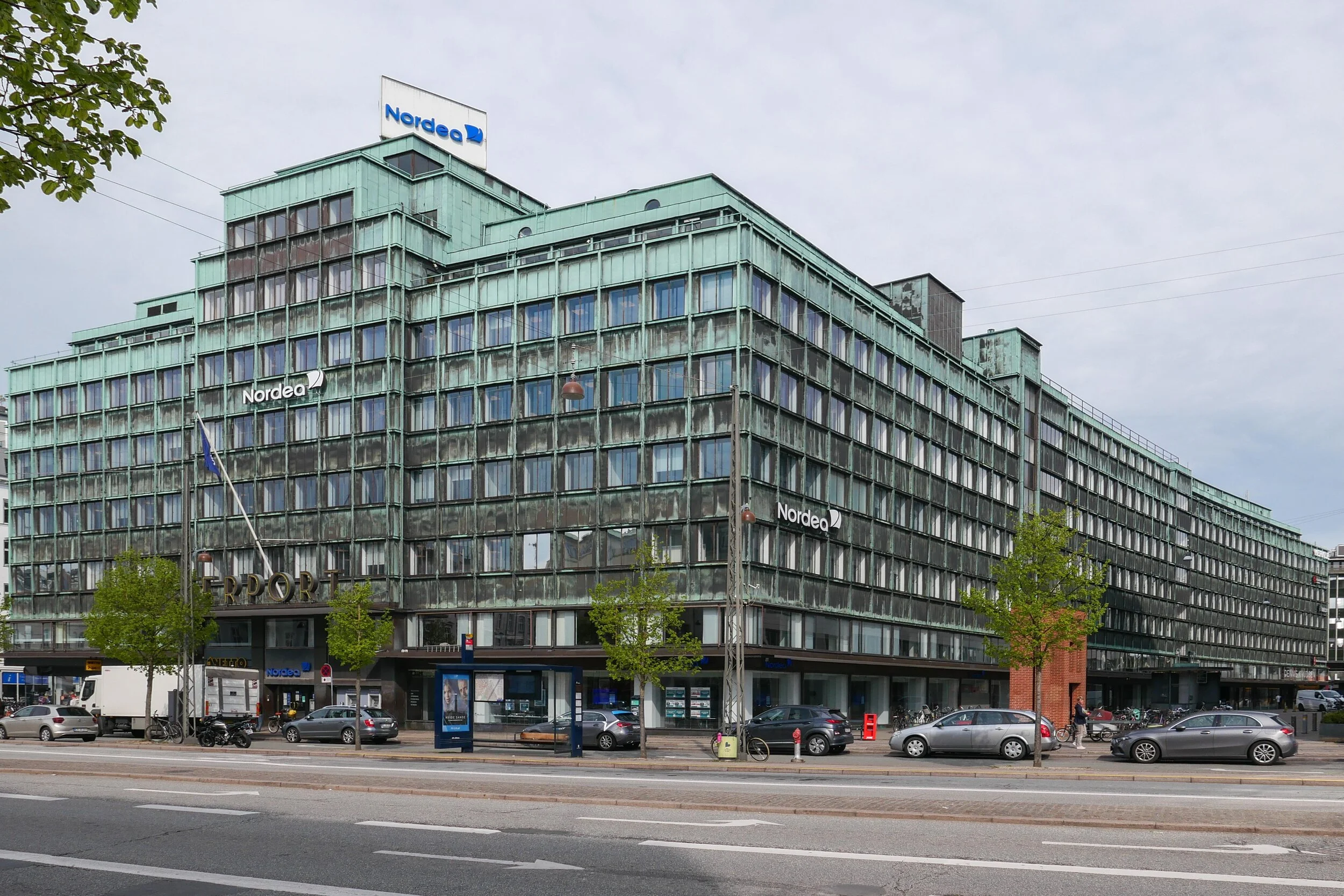
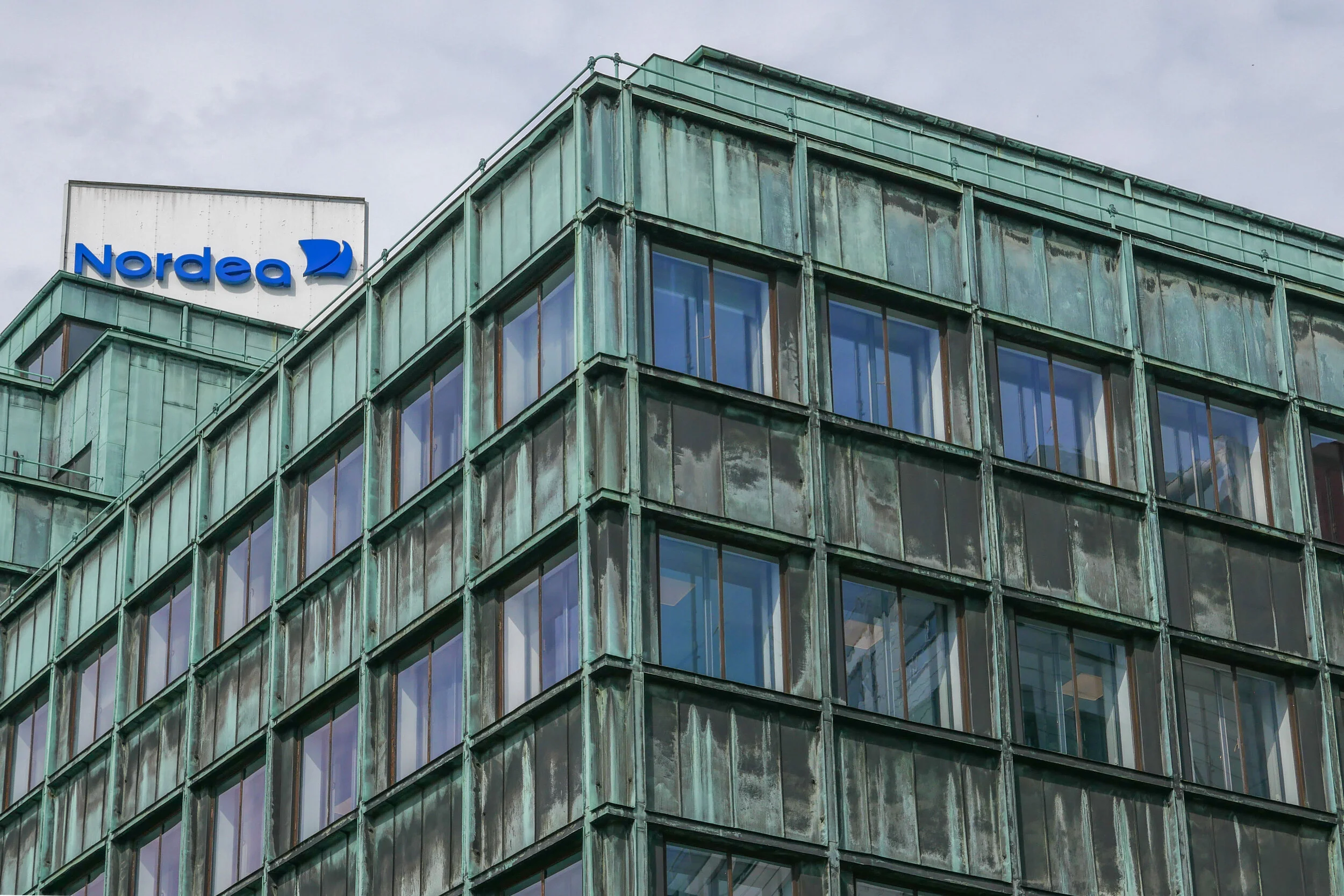
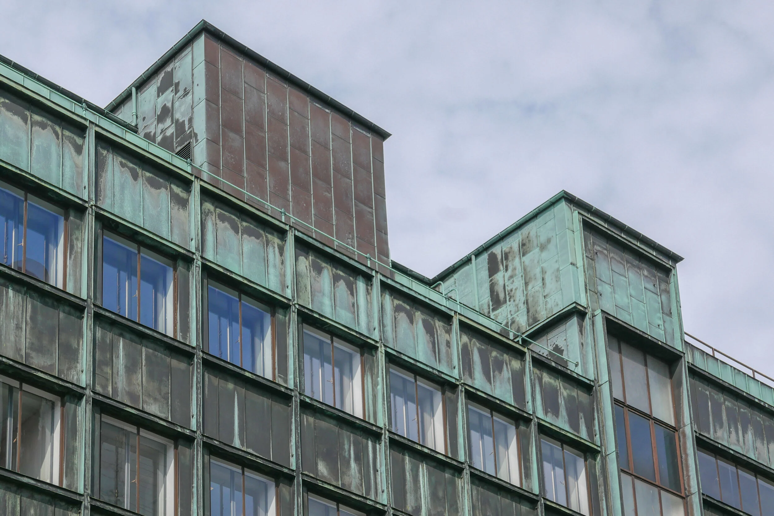
It would be difficult to find two more different buildings in Copenhagen than the Jepersen office block by Arne Jacobsen and the apartment buildings at Bispebjerg Bakke from the partnership of the Danish artist Bjørn Nørgaard with the architectural practice Boldsen & Holm but what they have in common is that both designs depend absolutely on their focus on every detail of the design … not simply plan and elevations but the profile of window frames, the careful choice of the right finish and exactly the right colour for materials on the facades, the details of unique, custom-made staircases and so on.

Although the apartment buildings were completed in 2007, the initial idea for Bispebjerg Bakke went back many years before that to a conversation between Nørgaard and the chairman of the Association of Craftsmen so, from the start, an important aspect of the scheme was to have a strong link between an artistic concept and its execution with a very high level of craftsmanship.

Nørgaard made an initial model in clay so the design was organic rather than a building, like the Jespersen block, that was primarily about, what was for its date, very advanced engineering. Bispebjerg Bakke is about fluid lines and the potential for architecture to take sculptural form while the Jespersen building is about bringing to reality the beauty of a mathematically precise design. How you view the two buildings; how you experience the two buildings and how you move around and through the two buildings could hardly be more different and yet both depend on understanding completely the building methods that they exploited and both, with huge confidence, play games with forms and with styles that can only be achieved with the support of a client, willing to go with designs that were far from conventional by the standards of contemporary buildings.

Curiously, what the buildings also have in common is that the starting point for both designs was determined by their site. This might not be as obvious for the Jacobsen building, which appears to be suitable for any urban site, but the plan had to take as an unusual starting point, set by the planners, a stipulation that contact with the ground had to be reduced to the minimum as the space had to flow through from the street to the courtyard behind.

Bispebjerg Bakke could not be more different. It is absolutely and completely grounded on its landscape and follows a complex sloping site. To the west is the public road, Bispebjerg Bakke, that runs down the hill with the grounds of a large hospital opposite, and to the east of the narrow plot is a suburban railway line in a relatively deep cutting. The land drops down from the narrow north end but the road curves away to the west and the railway line curves sharply away to the east so the plot widens out as it slopes down to the south and east.

The landscape includes mature trees but it also means that the changing light as the sun moves round and views across the site and through the buildings are crucial as all the apartments have been given a dual aspect but few can benefit from direct sun from the south.

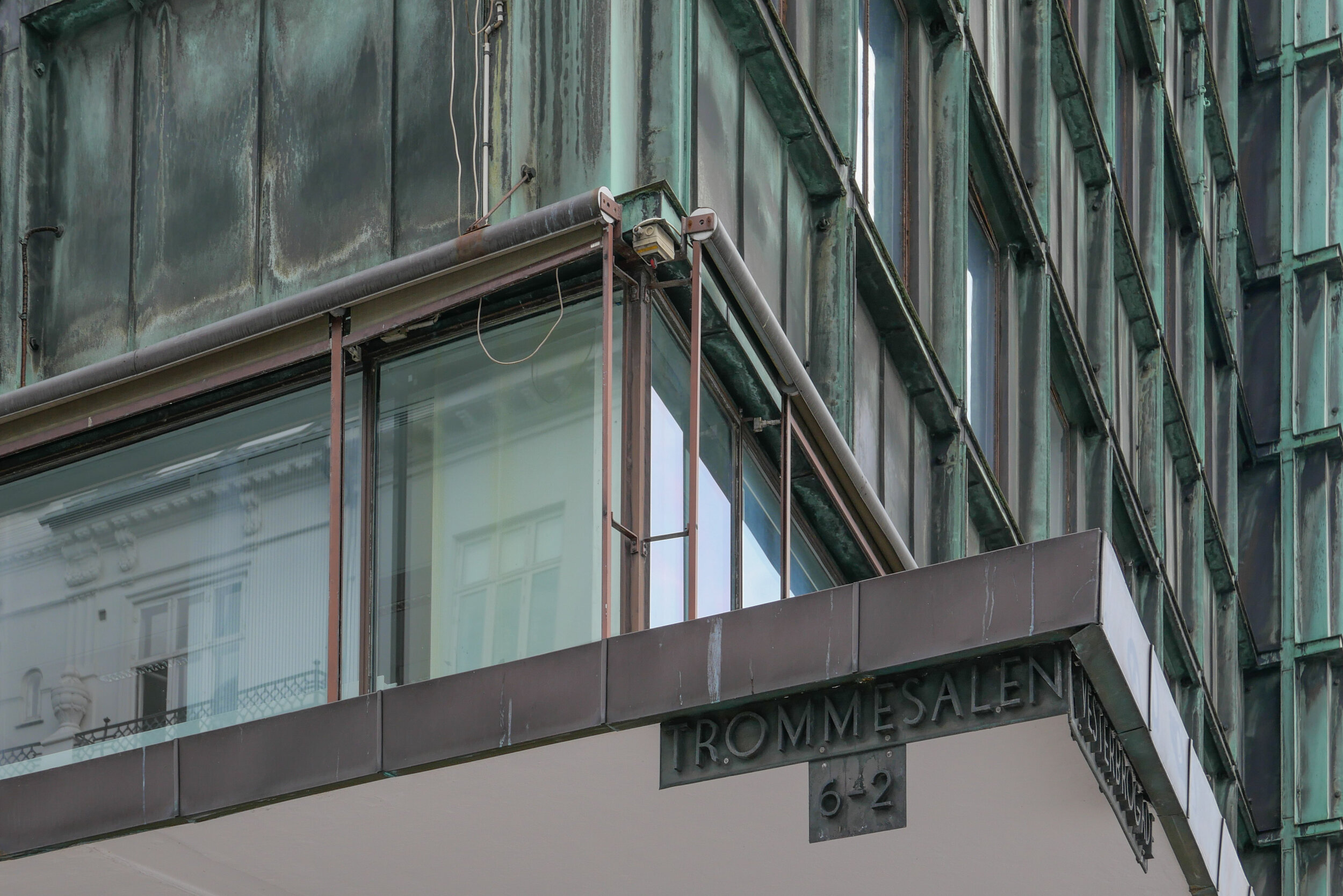
There are 135 apartments in the complex with a main building that has a sinuous line following the road, well over 400 metres long, and with a smaller second building, just under 90 metres long, to the east where the plot begins to widen out as the railway curves away. The arrangement of the apartments is in some ways quite conventional in that there are separate doorways giving access to a main staircase with just two apartments at each level, a single apartment to each side of the staircase, and the apartments run through from front to back of the block … to provide that dual aspect.

Each “block” or section is self contained with footpaths or roads between, linking the public street and path with an internal service road, with two entrance doors in each section but the roof is continuous down the length of the long building running across each pathway or road that cuts through the building. Each break is the full height from the pavement to the underside of the roof which adds considerably to the drama as the sections vary in height from three to eight storeys, the tallest section is at the north or uphill end, and the upper apartments in each section have mezzanines so have windows rising up through two tall or even two very tall floors.

The main staircases, two in each section, rise around an oval stair well and the apartments have curved walls and curved balconies so again the design appears to be organic although there is actually a strong and logical conceit in the use of materials on the different sides of the buildings that gives an interesting rationality to the design. In traditional apartment buildings from the early and mid 20th century in Copenhagen, in districts like Nørrebro, the blocks were built with what was then more expensive and more fashionable red brick on the street side and yellow brick towards the courtyard. In the city, an apartment building might be part of a longer row, forming just part of a city block, or might be around a complete block so often the junction between red and yellow brick is not visible or not particularly obvious. At Bispebjerg Bakke it is made into a distinct feature. Red and yellow brick meet at a vertical join half way through each archway and the join is emphasised with bricks projecting at a slight angle and interlocking to look almost like overstitching used on blankets or leather work.


There is a further game with the colour of brick used on each side of the buildings: vertical runs of window and balconies have brick columns or piers between them so, on the red-brick facades, the piers are in yellow brick and tiles, used for the sills and for the parapets of the balconies, are pale yellow but on the sides using yellow brick for the main walls, those piers are in red brick and the tiles - for the sills and balconies and for the surrounds or frames of the main entrance doorways - are red … a deep ox blood red.

Initially, on first seeing them, the doorways and balconies appear to be sculptural - rather free and organic - more Barcelona and more Gaudi than anything normally seen in Copenhagen - but then the effect depends on the very Danish precision and skill of the bricklayers and other craftsmen. Details like rain hoppers, the precision of the construction of the copper roof, the regularity of joints in the roof and the precisely shaped and coursed brickwork are all very carefully executed.

Windows are framed in jacoba wood and given a sinuous profile and inside the rails of staircases are bowed out. 


It seems odd to describe the roof as flat or even as mono pitch when in reality it swoops and twists across the building but it is certainly not pitched in the conventional sense because it does not have a ridge with inner and outer slopes. In terms of challenges, the main roof must be the most impressive part of the construction as the placing of joins in the copper sheeting must have required very careful design because there are surprisingly shallow and unobtrusive baffles and lipping to direct rain water, which can be torrential in Copenhagen, to run down the slopes to hoppers and down-pipes rather than simply cascading over the edge.


The curved lines of the balconies are interesting. Balconies are on the party wall and there is a central dividing pier on the line of the partition between one flat and its neighbour. The front line of each balcony curves back to the main wall line, forming a bowed, almost semi-circular front to each pair of balconies and the windows curve in from the front line of the wall to the partition to create what is, in effect, triangular balconies but with curved rather than straight lines to the front and window. Note window frames are curved but double glazing units are flat simply for practical reasons, primarily economic.  

On their web site Boldsen & Holm describe Bispebjerg Bakke as a building “where art, architecture, workmanship and technology melt into each other, in an equal and even interaction. The organic shape originates from the character of the area …”