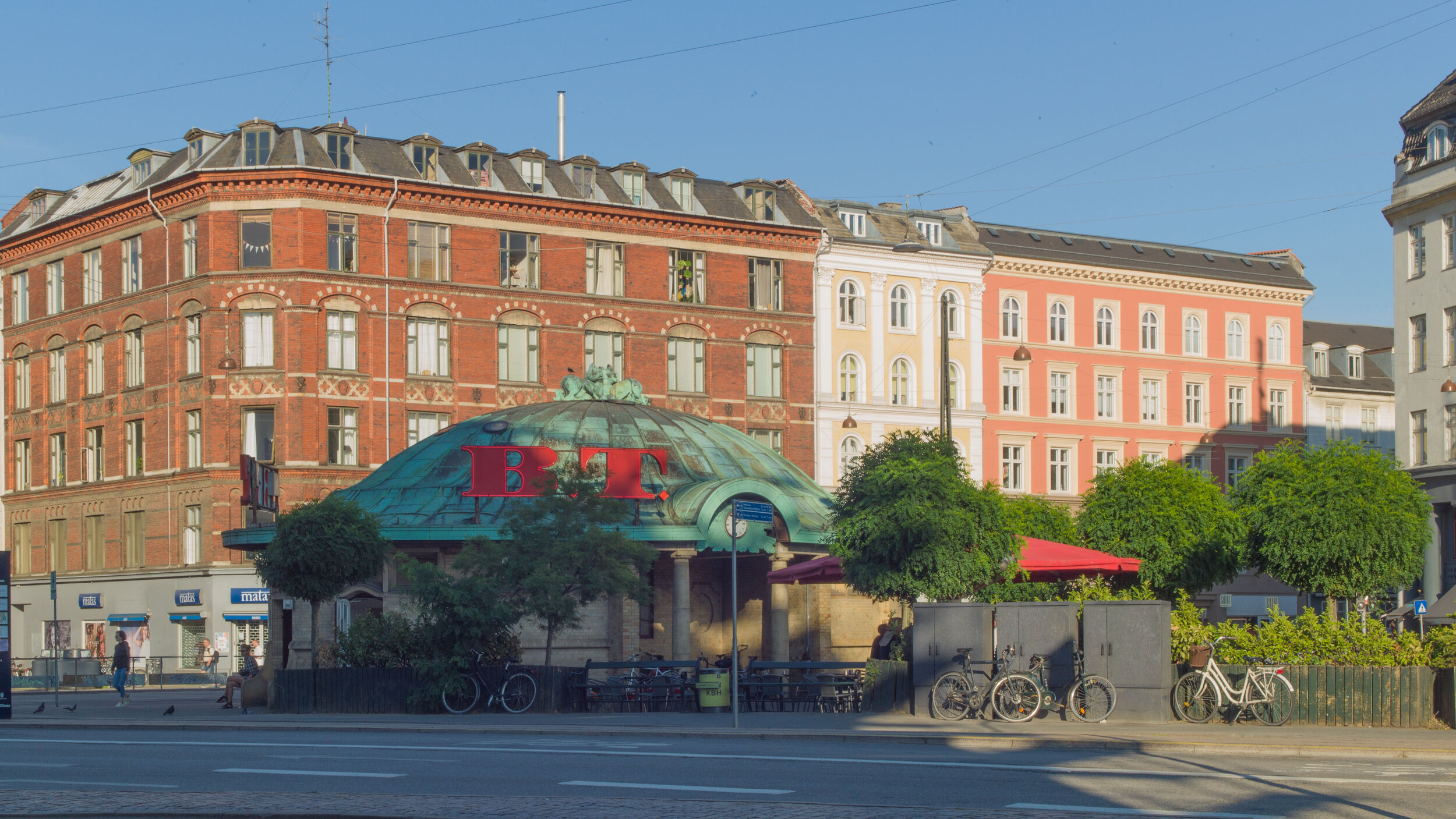
Bien at Trianglen


This is one of the more extraordinary buildings in Copenhagen. 

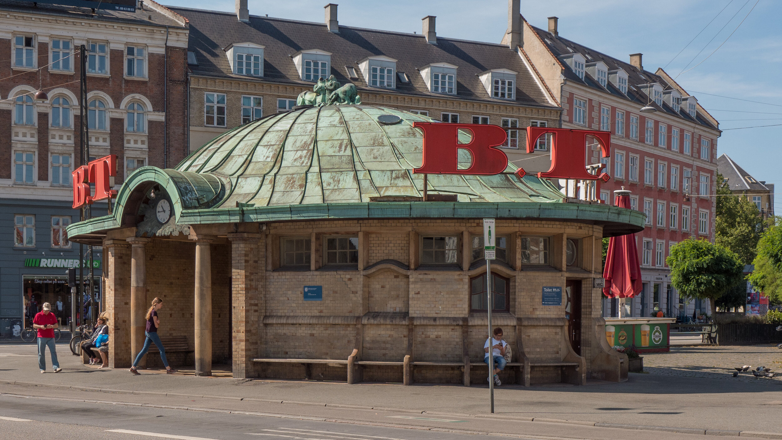
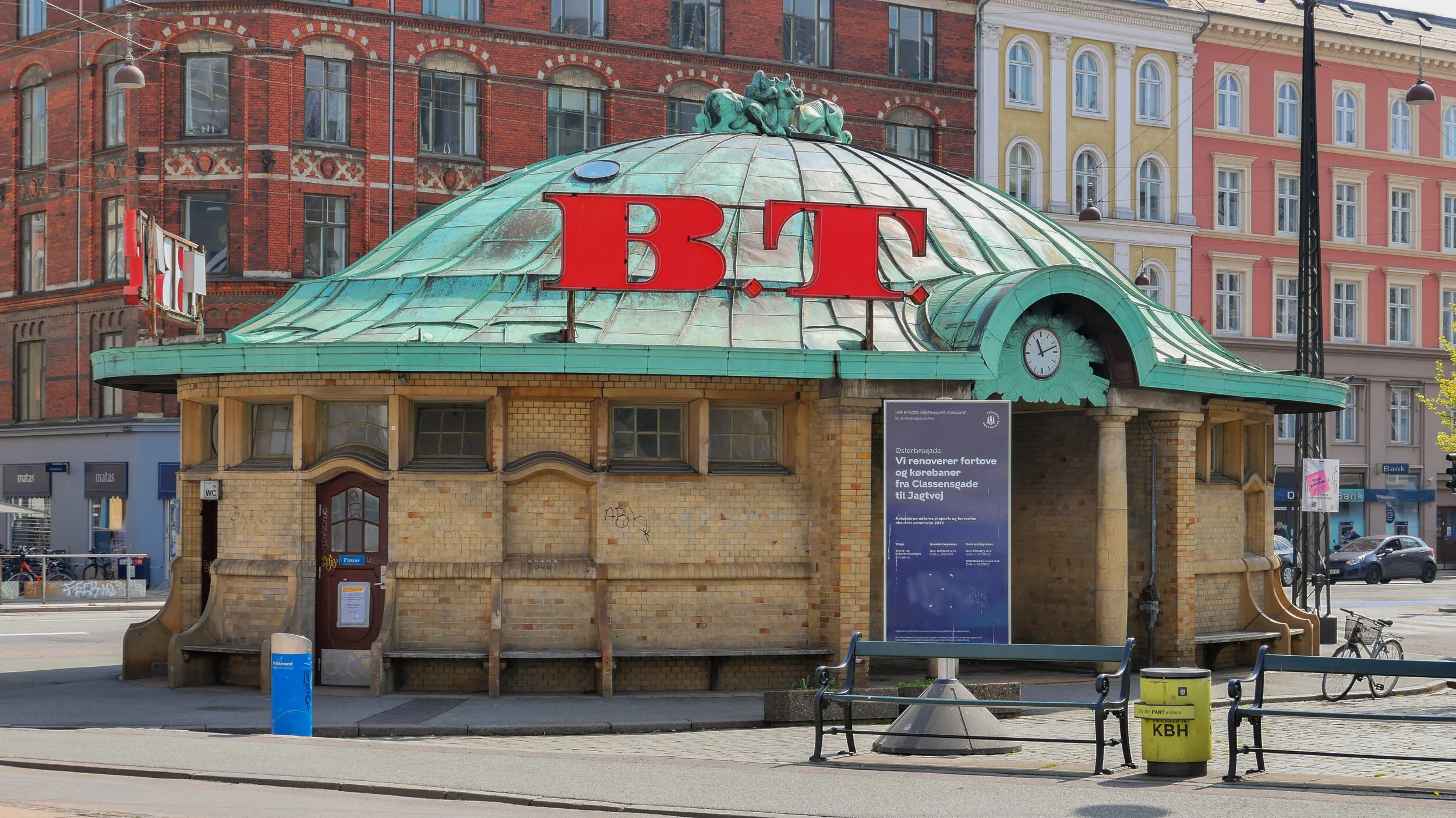
It is at the east end of Trianglen in Østerbro, on the traffic island that was a tram car stop and it was a kiosk; a room for a traffic controller and public toilets and there were benches not only in the recessed spaces on the east and west sides but also around the outside where people could sit if they had to wait for trams at this busy interchange.

The architect was PV Jensen-Klint and it was commissioned in 1904 by the Østerbro Grundejerforening or Landowners Association to replace a wooden hut on the same site. A number of designs were presented before a final design was approved and the building was completed in 1907.

It has a sort of exuberance and delight in playing with variations of shape and form that is associated with Art Nouveau architecture but here the columns on each side with strong entasis - the bowing out in the middle - and the almost Baroque elements with curved shaped heads to windows and doors picked up in the line of glazing bars makes it more robust and strongly architectural than buildings you would find from the same period in Paris or Brussels.

The oval shape of the building and its copper roof meant that it was soon given the nickname of the Super Terrin or Terrinen - it looked like a large soup dish with a lid with the heraldic animals on the top like a knob or handle although they are actually flues for the stoves. The building is also known as Bien or The Bee from the name of the kiosk here at one stage.


all in the detail


There have been several posts on this site about the stone cobbles or setts used for roads and pavements in the city. This is obviously far from being a cheap option but it is hard wearing and it is practical … unless you are wearing stiletto heels or you are trying to control a suitcase on wheels … and almost impossible if you are doing both. 

The first photograph is of the old meat market just to the west of the central station. There are no longer carts with metal hoops on their wheels clattering and bumping over these lanes and they no longer get covered with blood and gore - or at least not often - but the cobbles form a fantastic foil for the buildings.

Cobbles in the city range in colour through greys and dull purples and form an appropriate base for the buildings and create a texture that concrete paving or tarmac really cannot match.

The cobbles are laid with blocks of stone and together they form pathways that are used to direct the walker and cobbles can also be used on more prominent features to form embankments or gullies for drainage - as in front of the warehouses on Holmen. Cobbles are laid with considerable skill - part of the cost - for changes of level or to direct away water as in the example shown here which is at Højbro - the bridge over the canal from Christiansborg - where the curve of stone steps and the slope of the cobbles are necessary where the levels change dropping down from the bridge and round to the lower level of the quay at Ved Stranden.

At the top, two photographs show the corner of a street in Christianshavn … not an old surface - because until the 1990s this was the site of industrial buildings of a large engineering works - but cobbles have been used to respect the importance of this historic quarter of the city.

A trench was dug across part of the road fairly recently but with the cobbles back there is now no trace of the work so not just stylish but also practical … as long as you don’t insist on wearing those stiletto heels.


Hal C Arsenaløen - Christianshavn sports hall


from Værftbroen - looking along the canal towards the sports hall

On the opposite bank of the canal to Kids' City in Copenhagen - the school designed by COBE - is a local sports hall called Hal C that was designed by the architects Christensen & Co and completed 2013.

There is a large sports hall open to the roof at the east end that is lit by large tall windows on both sides - to the canal and towards the playing field to the north - arranged in pairs. All these opening have large plain shutters that open outwards and these and the deep red timber cladding are inspired by the 18th-century mast sheds nearby.

The west end of the sports hall is on two floors with an entrance lobby at the corner, glazed on two sides, and offices and changing rooms on the ground floor and a small hall or meeting room on the first floor.

In keeping with the beautifully simple exterior the interior has large area of plain panels much pierced and a very simple straight staircase with a plain solid side panel but the railings of the landings are rather more complicated open grill.

The building makes really good use of natural lighting inside. The sports hall has areas of top lighting. On both sides of the sports hall are wide wood step where spectators can sit and on the canal side there are steps along the length of the building where people sit and a series of landings down to the canal.


Christensen & Co

a new bridge across the canal from Kids' City

the windows and shutters of the main sports hall from the other side of the canal

entrance at the south-west corner

large windows to the sports hall on the side towards the canal with pairs of shutters

windows and shutters of the main sports hall from the playing field to the east

testing alternatives

At an early stage in a building project, a trial section of wall can be constructed on the site to get a clear sense of the colour of the main material in the actual location and it is also a chance to judge the effect of different colours or different textures of mortar which can have much more of an impact than many people would expect … dark mortar tends to act rather like the black leading in a stained glass window by making the colours of the main material, stone or brick, darker and will certainly emphasise any pattern in the bonding.

The appearance and the character of a facade will be modified by the light as it changes through the day and materials will certainly look very different from their appearance in the studio or even as seen on an another building. And colours and textures look different if they are in shadow, on a side away from the sun, or face towards the sun and are brightly lit and architectural details can look very different in bright light reflected up off water… bright light can make even strongly-projecting features look thin or flat or bleached out.

ATP Pakhus by Lundgaard and Tranberg on the Langelinie Quay in Copenhagen has just been completed but trial sections of wall were built at the construction site on the quay. Clearly two very different colours of brick were considered. Perhaps the deep orange brick was chosen rather than the very dark brown because a heavier tone, for such a large building, could have looked oppressive. It is interesting to compare the brickwork on the finished building with the appearance of the historic brick warehouses along the inner harbour and in Christianshavn.

ATP Pakhus, Langaliniekaj (2016)

Nordatlantens Brygge, Strandgade (1767)

texture and tone and growing old gracefully


warehouses in Christianshavn in Copenhagen - there is a mixture of materials and colours in the building materials but a uniform colour of paint for woodwork helps link the buildings together and the use of stone paving and simple areas of gravel provide a neutral landscape

Generally, until the 19th century, the visual character of towns and cities was determined by the use of relatively local materials unless a building was particularly important and then the cost of importing materials over some distance might be justified.

But today materials can be transported easily and relatively cheaply so one obvious problem now is that new buildings in many cities have lost any specific sense of place.

When choosing materials, rather than understanding the local topography and specific geology, the architect has to consider cost and factors like the sustainability of materials or their insulation properties so, with many new buildings - particularly commercial buildings - there is a feeling that economics or engineering have determined what the building looks like as much as specific aesthetic considerations.

And with some buildings, the design appears to be more influenced by ego … either that of the architect or the client … or at least there appears to be a clear determination to be different or novel rather than having any strong empathy for the location and for neighbouring buildings.

And often there appears to be little consideration for the texture and the tone of materials or for how materials will wear and weather over time.

on the main warehouse the bricks, the stone used for the plinth and the setts used for the road surface all have a mauve or purple/grey tone. The black and white photograph shows that the darkest tones are actually the doors which helps suggest depth to the arcade and, rather surprising, the trees and the water of the harbour basin. Although the clay tiles of the left-hand warehouse looks very different in colour the black and white photograph suggests that actually the depth of colour of the roof is appropriate for the wall of the building below.

copper and Copenhagen buildings


Copper and the copper alloys of bronze and brass are amazing metals with a long history of use in Denmark for a wide range of uses including making domestic vessels; for coins; for making weapons, particularly ornate weapons for ceremonial use or to display status, and copper and bronze, because they are relatively easy to work, have been used in jewellery and in the decorative arts, particularly for cast sculpture. From the late medieval period onwards copper and bronze have also been used on a much larger scale in architecture, for covering and protecting the roofs of important buildings and, again, because the metals are durable but relatively easy to work and because they can be used as thin sheets that can be shaped and joined together, copper is particularly good for covering domes and spires where the metal layer can be supported by a strong formwork or framework.

read more

early modern ... Vesterport, Vesterbrogade, Copenhagen

Vesterport - a large copper-clad office building on Vesterbrogade and close to the central railway station in Copenhagen - was designed by Ole Falkentorp and Povl Baumann and was completed in 1931.

It fills a complete city block with the building running back from Vesterbrogade to Gammel Kongevej with a side elevation towards Meldahlsgade that is over 110 metres (365 ft) - and there are three service courtyards.

This was the first steel-framed building in Copenhagen with reinforced concrete floors and is the first truly modern building in the city but if anyone notices it today then it is probably for the striking colour of the cladding which, with patina, has turned a sharp but pale acid tone of green. When new, before the copper changed colour, the building was known as the penny.

At street level there were shops so, again in a modern way, this was very much a commercial building and it was in what was then an important commercial area of the city.

The principle tenant was an English insurance company but the open-floor construction meant that it could be subdivided with non-structural partition walls depending on the requirements of any tenants.

But it is not just the method of construction but it is the scale of the block with its flat roof line and the grid-like division of the facades with continuous lines of windows above panels of cladding that is distinctly modern.


Signs for the road names as part of the canopy survive as an example of good typography from the period and brass doors at the entrances with heavy brass handles have been retained.

The building has a significant place in design history for another reason because Den Permanente, an influential design gallery and furniture shop, opened here in 1931 with display space over two floors. It was at the south-west corner of the building with large windows to Vesterbrogade and to Trommeshalen but closed in the 1980s.

note:

The photograph of the ironwork of the building at an early stage of the construction is from the city archive - Historie & Kunst, Københavns Kommune, Stormgade 20


copper after Vesterport

government buildings between Christiansborg and the harbour in Copenhagen by Thomas Havning 1962-1967


In terms of style, Vesterport can hardly be said to have set a fashion as few buildings copied the use of copper cladding although through the 1930s and well into the 1950s many did have brass window and door frames and brass architectural fittings including handrails for staircases.

Superficially the government buildings in Copenhagen at Slotholmgade and Christians Brygge designed by Sven Eske Kristensen and Thomas Havning and built in the 1960s are reminiscent of Veserport. The blocks have the strong colour tone dominated by green and of course with the continuous lines of windows and very regular lines of panels divided by ribs forming a regular grid but only the roofs and certain fittings are copper or brass … the panels below the windows and vertical divisions between the panels are in a dark green polished stone or slate.

However, more recently, the offices and tower at Pakhusvej near Amerika Plads by Arkitema has facades in copper. It was completed in 2004 and although now darkening in colour there is no sign yet of a surface patina of verdigris which shows how slow the transition can be even though this building, opposite the terminal for ferries from Oslo, is subject to winds off the sea.


the main tower and a detail of the copper cladding at Amerika Plads by Arkitema 2004


Most recently the Axel Towers in the centre of Copenhagen, close to Tivoli, by Lundgaard and Tranberg and nearing completion have been faced in tombac- a copper zinc alloy -and again it will be interesting to watch as this prominent, building - close to the City Hall and very close to the SAS Hotel by Jacobsen and two blocks from Vesterport, changes the visual dynamics of the area as its colour changes.


Axel Towers, Copenhagen by Lundgaard and Tranberg ... work nearing complettion