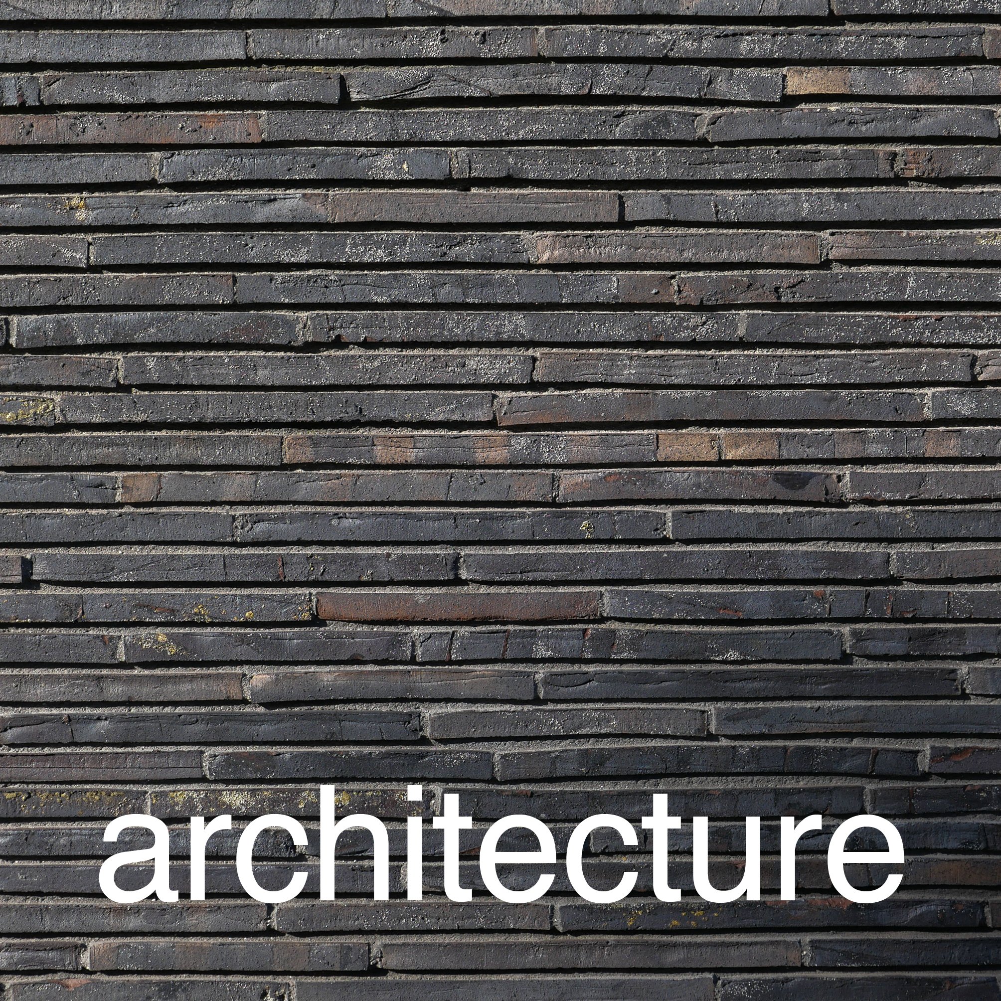
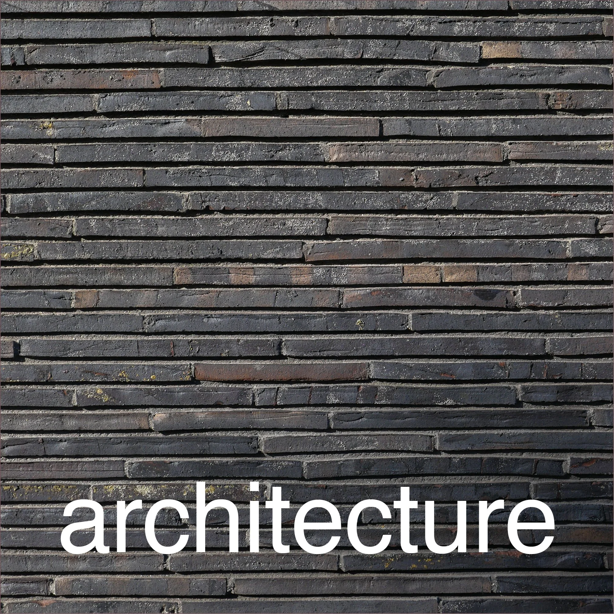
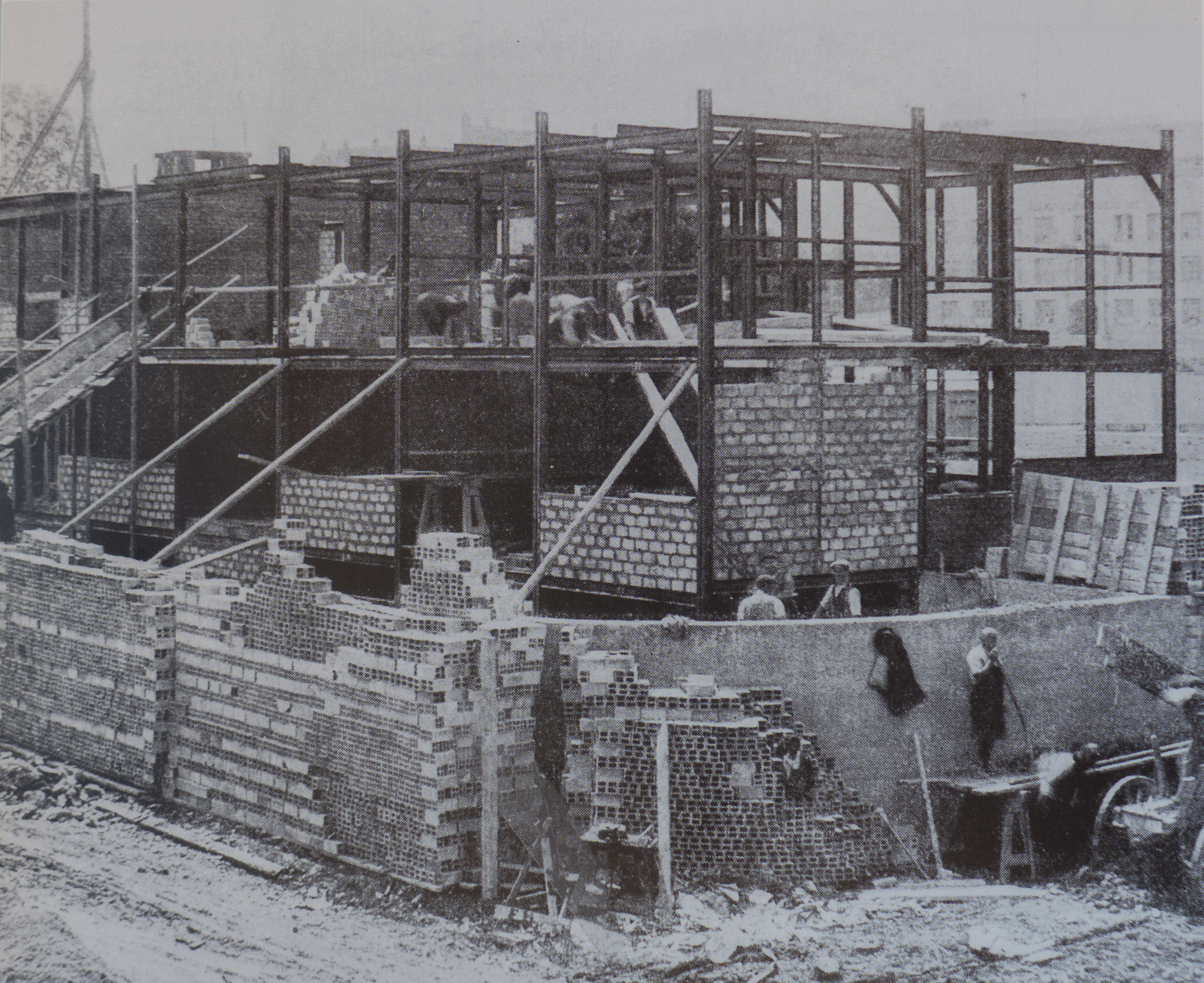
brick cladding


Out near the beach on the east side of Amager there are large new apartment buildings that are going up and at an incredible speed because of the method of construction being used with large panels of preformed concrete lifted into place by huge cranes before then being fixed or linked together. 

Then, on the outer face, goes insulation and a veneer of brick in large sheets made in a factory …. and that is where I begin to have reservations.

There is nothing wrong with the building method - and the advantage is that very speed of building - but then my inner puritan kicks in. I notice the long straight joins between the panels and think that this really has little to do with real brickwork … basically because brickwork isn’t, curiously, just about bricks but also about the mortar and the courses and the patterns - created by how the bricks are laid - and how different colours of brick and how different colours of mortar effect the appearance.

Then there is the thing about honesty … that’s not honesty as in money and value but honesty in design so about using building materials in an appropriate way that reflects and uses the intrinsic qualities of those material. Here I can see that brick facing is used for these modern apartment buildings because people like it - it’s somehow more reassuring and warmer and more comforting than concrete or glass - and because it can be a good attractive colour and, at least, brick does provide an element of texture that can be missing from many cladding materials. 

Which is sort of part of the irony here … it is a factory made product - manufactured - but it appropriates the qualities of something made by hand. On Grundtvigs Kirke every brick was laid one at a time by hand … is that one of the reasons that makes it such an amazing building?

Obviously the apartment building is a very very different type of building so is that voice of my inner puritan wrong and misplaced? Is it perfectly OK to use current technology to achieve some of the benefits for none of the skill or effort?

But Copenhagen has a long and well-established tradition using brick in its buildings and it’s not simply a practical solution simply because these new apartments are very tall blocks so traditional brickwork would not be appropriate …. just look at the huge power stations in the city from the 1930s or some of the very large brick apartment buildings from the 1920s and 30s and you can see good traditional brickwork on very large buildings.

I guess in the end it comes down to thinking that the finished buildings look a bit mechanical because it’s all rather too flat and rather too regular. Presumably the developer would argue that the cost benefits outweigh any quibbles about trying to keep alive traditional building methods and they would probably tell you about 19th-century apartment buildings with thin walls a single brick thick where cold and condensation and noise were and are a serious problem. 

So do cost and comfort always trump aesthetics and rapidly-disappearing craft skills? 

select any image to open the photographs in a slide-show gallery ….

it really is interesting to look at how the concrete and insulation and brick panels are sandwiched together


is design all in the concept ....


For any design - a design for a building, a chair or a teapot - the starting point has to be the idea, the concept. It is that first attempt to imagine the what and then think about the how. 

If you are cynical or pedantic or just being realistic - in this tough world - you could argue that a commercial design actually starts with the commission and the contract but for me what is fascinating about looking at a great design is to try and understand that initial concept and to see how it was realised.

My apartment is about 200 metres from Cirkelbroen - The Circle Bridge - that was designed by Olafur Eliasson and completed in 2015. So whenever I walk into the city I either see the bridge at the end of the canal or I actually cross over the bridge to get to Islands Brygge or get to the west part of the city centre. 

When it first opened I thought it was stunning … and to be honest also rather useful as it made it possible for the first time to walk from Christianshavn on south along the harbour … but mainly I thought that it was stunning.  

Unique as well. Elegant and curiously delicate, almost ephemeral, when seen in sunlight but particularly if it is misty or the light is failing at the end of the day - but at night somehow stronger and much more dramatic. 


Sometimes a clever idea for a design looks exciting the first time you see it and then you begin to think well so what and then it becomes just part of your streetscape, maybe even a bit mundane or worse, because when the novelty wears off, you stop even seeing it. 

That is certainly not the case with the bridge and, living so close, I have the opportunity and sometimes find time to watch and see how people react to the design … so, for a start, it is obvious when people are seeing the bridge for the first time.

It is fascinating but not surprising that the city - because of the prominent location - wanted and commissioned something much more than a basic bridge that could be raised or swung open to let boats sail out from the canal into the harbour. 

And I guess it’s not that surprising that Nordea-fonden were sufficiently taken with the design to finance the work as a gift to the city but, at some point, someone, some how thought about commissioning Olafur Eliasson - the Danish Icelandic artist - to come up with the concept for the form and design the bridge. That is interesting.

His studio is in Berlin and his work challenges you but in a way that is subtle rather than hectoring or shocking. You seem to get drawn in and it is at that point, once you are involved, that you start to question your assumptions or question what everyone, including you, just accept without thinking.

For The River Runs Through It at Louisiana in 2015 the galleries were filled with rocks and gravel - scree from Iceland - with a stream running down the centre through the rooms. In the first space the rocks simply covered the floor but as people walked further in most seemed to slow down, look carefully at different rocks, touch the water, and slowly you could see people realising that in climbing up slowly through the series of galleries, they had just ducked to get under a doorway that they knew to be 4 metres or more high and then you began to see just how monumental the installation was and how radical and how it challenged your perception of what an art gallery could or should be and then question what we take for granted as being inside and what should or should not be outside.

Cirkelbroen if you let it slow you down on your walk - or on your bike - it makes you look in a different way at the harbour and it really doesn’t work like you expect a bridge to work.

The basic concept is that rather than a single arch over the canal, there are a series of five interlinked but offset circles set horizontally to form the deck. This is, in part, the way people are slowed down … so for cyclists it should be more than racing up the ramp, sprinting across the top and racing down the other side … although some do that … and in part it is so that people walking can stand to one side, on one of the great outward-curving bows, to look at the harbour or to look along the canal and watch the boat traffic there. 

Each of the circles has a tall mast at its centre and there are wires down from the top of the masts to the deck, held taut, like standing rigging on a sailing ship so, as you approach along the quay, you have the impression or perhaps, - even less tangible - an echo or a sort of ghost of the large masted boats and sailing barges that in the past docked along the harbour as they unloaded and loaded. Large sailing ships still come into the harbour so you can sometimes see what the harbour must have looked like when this really was a working commercial port. But because the masts on the bridge are off set then this never becomes a pastiche … never an attempt to look like a boat docked here … simply an evocative impression. 

The railings of the bridge are inside the wires and are set to slope inwards to respect the angle of the rigging so again, with the timber hand rail, there is an echo of the railings of a ship but, because of that angle inwards, more dramatic.

And when the bridge opens there really is a sort of magic. Bridges should clink and clunk and chains should pull. Most bridges that open do that. Cirkelbroen glides and, because of the circles and the masts, it seems to pivot and spin. That’s the brilliant part of the concept.

.... or all in the engineering ....

the bridge open for a boat to move out from the canal and into the harbour beyond


To be mundane, I suppose Cirkelbroen is simply a bridge over a canal, where there had been no bridge before, but it means that, for the first time, people on bicycles or walking can get along the waterfront of the harbour between Knippelsbro - the historic bridge at the centre of the harbour that links the historic centre and Christianshavn - and Langebro - the main traffic bridge between the city centre and Amager. All that was needed was a simple steel bridge that could either be raised or swung open to let boats from the canal sail out into the harbour.

Of course the bridge designed by Olafur Elliasson is so much more than it … but even so …  in the end … it all has to work and it has to be robust and it has to be relatively quick to move and and easy to operate. So that it is the engineering part of the design that allowed the concept to be realised.

Rambøll - the engineering company - were responsible for the construction of the bridge, and there are a number of interviews on line and a video on YouTube that shows the parts of the bridge deck arriving by barge and being lifted into place by a giant crane on another barge. There you can not only get a real sense of the size and weight of the parts but also get some sense, as it is lowered in to place, how it works. 

the bridge closing and, on the right, almost closed as cyclists wait to cross


You can see that although the bridge appears to pivot around the largest mast at the centre of the bridge, when it is opened, there is, in fact, a substantial substructure below the water that swings back and that carries the outer two circles at the Knippelsbro end of the deck in and away to create an opening for taller boats to pass.

The quay here is just 1.6 metres or so above the water and although a bridge deck at the level of the quay would have been simpler, and less intrusive visually, it would have given no head room for vessels to pass under the bridge without it being raised or swung open. By taking the deck up - just 1.1 metres above the quay - most tour boats and smaller pleasure boats and canoes can pass under the bridge with the deck in place. 

But the consequence is that there have to be long ramps up to the deck and because the ramps extend well beyond the quays on either side of the canal then there are also steps up onto the deck from the quay of the canal.

The length and the gradient of the ramp has to be a compromise: short but steep and the ramps would have been difficult for cyclists - particularly if they are riding family bikes, the famous Christiania bike, which can be heavily loaded or they are riding bikes with fixed gears - but too shallow a slope would make the ramp too long. In fact, the ramps seem just slightly too short and steep because cyclists seem to be pushing hard to get the top but then on reaching the deck it is not easy and certainly not an intuitive change to quickly reduce the effort on the pedals so bikes tend to come across the bridge just slightly too fast and, curiously, the curves on the route across either mean people cut the corners slightly - making their route less predictable for other users - or some faster cyclists even do that thing of leaning into the curves as they snake across and actually gain momentum … or at least appear to.

The other problem, of course, is that with tourists they are distracted - looking at the bridge or absorbed by watching what is happening on the harbour or they are looking at the back of a camera or holding up a phone for a selfie rather than watching out for the bikes coming through - so it is also a good place to pick up a smattering of Danish and foreign swear words. 

That’s not to suggest that the concept or the final design is wrong … just that, with any concept, the most difficult part is anticipating how human beings will behave.

Ramboll


concrete and steel in the 1930s

L1180329.jpg

The Deutscher Werkbund - the German Association of Craftsmen - held an exhibition in Stuttgart in 1927 that included houses and apartment buildings - the Weissenhof Estate - designed by German architects but also by architects from Belgium, France and the Netherlands. New construction techniques for domestic buildings were shown … here an open steel frame infilled with concrete blocks for an apartment building designed by Mies van der Rohe


Arne Jacobsen at the SAS building during construction with Copenhagen City Hall in the background

Until the 20th century, the main materials for building construction in Europe were natural … so stone as a strong but usually expensive walling; timber for wall framing, roofs and architectural fittings including windows and doors. Natural materials were not of course always used in their found state but were modified or transformed by builders so sand for glass; plaster for covering internal and external surfaces; clay fired for bricks and roof tiles and, of course, lime for mortar and for cement. Perhaps the biggest change to the structural form and then, as a direct consequence, to the appearance of buildings in modern Denmark came with the more and more frequent use of concrete and steel … not just for industrial buildings but for housing and apartment buildings and for new large building types and particularly where high or wide and open enclosed spaces were wanted that were unencumbered by walls or internal supports.

The use of concrete and steel are now so common for building that we rarely stop to consider that both can be used in many different ways. Someone might say “… oh it’s a glass and steel block …” but that’s about as useful in helping to conjure up an impression or mental image of a building as saying that a meal was meat.

In the 1920s and 1930s steel was not always used for a complete frame of a building but could be used as simply a reinforcement for lintels and supports for wide openings but with traditional building materials for the wall itself and similarly concrete could be used for piers and frames to support large open floor spaces or it could be used poured into shuttering for panels for walls that could support considerable weight or concrete could be used cast in moulds for building blocks, used with mortar like stone or brick, or used for ornate features that could be reproduced easily and much more cheaply than when previously such features of a building were carved in stone. Above all, in terms of how the appearance of everyday buildings changed, reinforced concrete can be used with minimal support or can be cantilevered out from the facade for thin canopies or for balconies.

Arne Jacobsen’s own house in Ordrup should be seen as an important building at a pivotal stage in house design. Completed in 1929 it appears to be a modern and ground-breaking house with plain smooth white walls in the International Style that was then becoming fashionable but in fact, at that point, Copenhagen regulations did not allow concrete to be used in house building so the walls are actually built in brick and were then rendered and even the apartments at Bellavista completed in 1934 - perhaps the most iconic representation of the modern style of the 1930s in Denmark - are again brick rendered with plaster. 

Jacobsen did use concrete in the Mattsson riding building just north of the apartments - also completed in 1934 - to roof over a wide high space and concrete became more and more important in his work in housing but more frequently for the industrial and commercial buildings he designed.

There is an amazing photograph taken of Jacobsen with others at an upper floor of the SAS Hotel in Copenhagen looking out over the city before the tower was clad in glass. The impression of the building now, for most people, is of a light and thinly elegant block but the outside cladding and the internal fittings cover the underlying structure and this photograph and photographs of the tower under construction show clearly a massive and robust concrete structure. 

With potential problems with transport and access to the site, the concrete parts were not formed in a factory and brought to the city centre - a later and the more usual method - but the floors and cross walls were cast on site.

One obvious benefit from this substantial sub structure and the substantial internal supports is that there are no corners to the building … or rather the corners are formed by the windows and panels of the adjoining fronts being abutted to form a thin and almost invisible corner.