MINDMAP #66 ... a site-specific installation by Gitte Svendsen


An installation of works by Gitte Svendsen with heavily-tufted material and fringes in strong colours that are combined with panels of plexiglass, wood, metal and print.

GITTE SVENDSEN

MINDMAP #66
DANSKE KUNSTHÅNDVÆRKERE & DESIGNERE
(Association of
Danish Craftsmen & Designers)

Officinet, Bredgade 66, 1260 Copenhagen K

28 October 2023 - 11 November 2023

Into the Woods - an exhibition of work by Lene Thomasen

Into the Woods is an installation by the Danish textilformgiver (textile designer) Lene Thomasen at Officinet - the gallery of Danske Kunsthåndværkere & Designere - the Danish Association of Artisans and Designers.

Created over the last year and created specifically for this exhibition, the works were inspired by trees, leaves, moss and, perhaps above all, the layering of light and form and colour found in the natural setting of woodland.

Lene Thomasen is a textile designer who trained at Kolding and now works primarily with screen printing. Works shown here are printed on silk, linen, or cotton and on very fine wool and she uses sheer fabrics and textiles that are layered and draped to create depth and a sense of space with weaving, sewing and gathering, where different materials are combined, for an intriguing and strong sense of volume.

In some works Lene Thomasen applies resist techniques - ways to block the dye reaching the fabric and often used to create texture - for instance by using a temporary coat of wax that is removed after the fabric has colour applied with a squeegee.

Patterns are overlaid or shifted or slightly offset and different intensity of dye are used, again to create a sense of depth, so, for example, to create an interpretation of the dappled light through layers of leaves and branches in the canopy in the woods.

Generally, there can be a temptation to see textile printing as simply a form of graphic design, so flat, but here, with the textiles displayed on wood frames, Lene Thomasen shows that textiles can have a strong presence in three dimensions as the works have to be explored from all angles as you walk around the gallery space.

Into the Woods continues at Officinet until 5 June 2022
Officinet, Danske Kunsthåndværkere & Designere, Bredgade 66, 1260 København K 

Lene Thomasen


knotting strips of fabric through an open canvas base is a technique found not only in this part of Scandinavia but also in the UK and was a traditional and rural way of making rugs … known in some areas as rag rugs because salvaged or worn fabrics - rags - are torn into strips to make a heavy rug often used in front of the fire or hearth of a farm house or cottage
here, some of the strips are velvet so the nap - the short, soft fibres on one side - add to the depth and richness of the effect


Lene Thomasen uses rope or cord in some of these works … not only as part of the way of hanging the textile but they become another layer of the design like vines or aerial roots in the wood

many of the works here are about how patterns overlay …. a large repeat can be off-set, or turned through 90 degrees, or overlaid in a different colour or in a different density of dye, to create an impression of depth, or the same pattern is printed on a fine, almost transparent, fabric that is draped or hung in front

note:
As for many of the artists and designers working towards a major exhibitions at Officinet, Lene Thomasen was able to spend several months at Statens Værksteder for Kunst in Copenhagen.

It is an amazing resource, in an old warehouse - Pakhus at Gammel Dok in the centre of the historic city - where designers and artists, with a scholarship or attachment, can use extensive facilities there that they may not have access to in their own studio or maybe not with the space to work at scale. The workshops also provide an environment for the intense focus and the long hours required for a complicated or demanding project.

The online site for the workshops has pen portraits of artists and projects that include photographs of their work in progress and that gives, at least, an impression of the level of technical skill and the mastery of materials that is at the core of the work of formgivers and crucial to the development or evolution of their work.

Lene Thomasen at Statens Værksteder for Kunst
Statens Værksteder for Kunst

claydiesselfies


This is an exhibition to mark twenty years of CLAYDIES …... the working partnership of the potters Tine Broksø and Karen Kjældgård-Larsen.

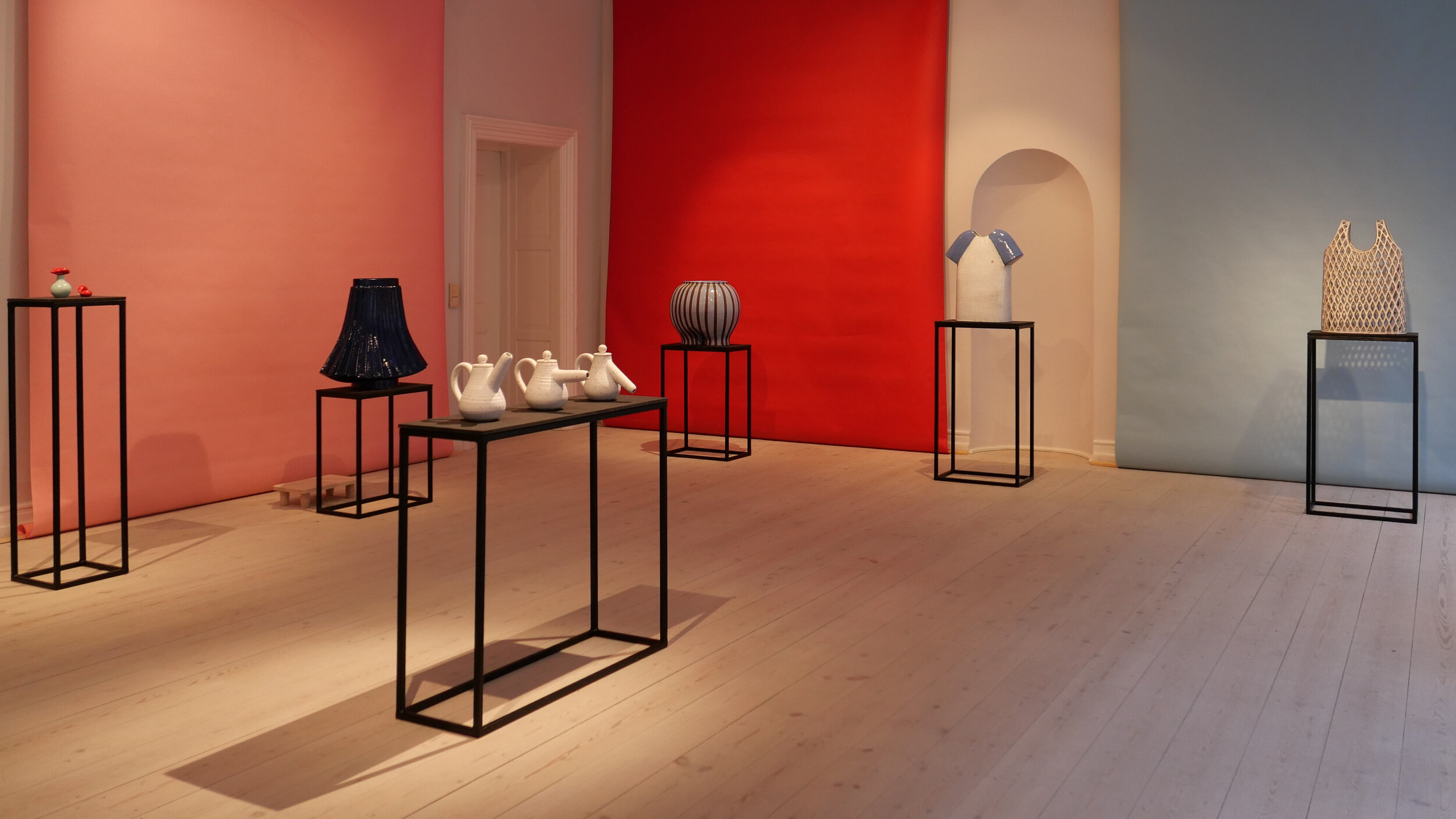
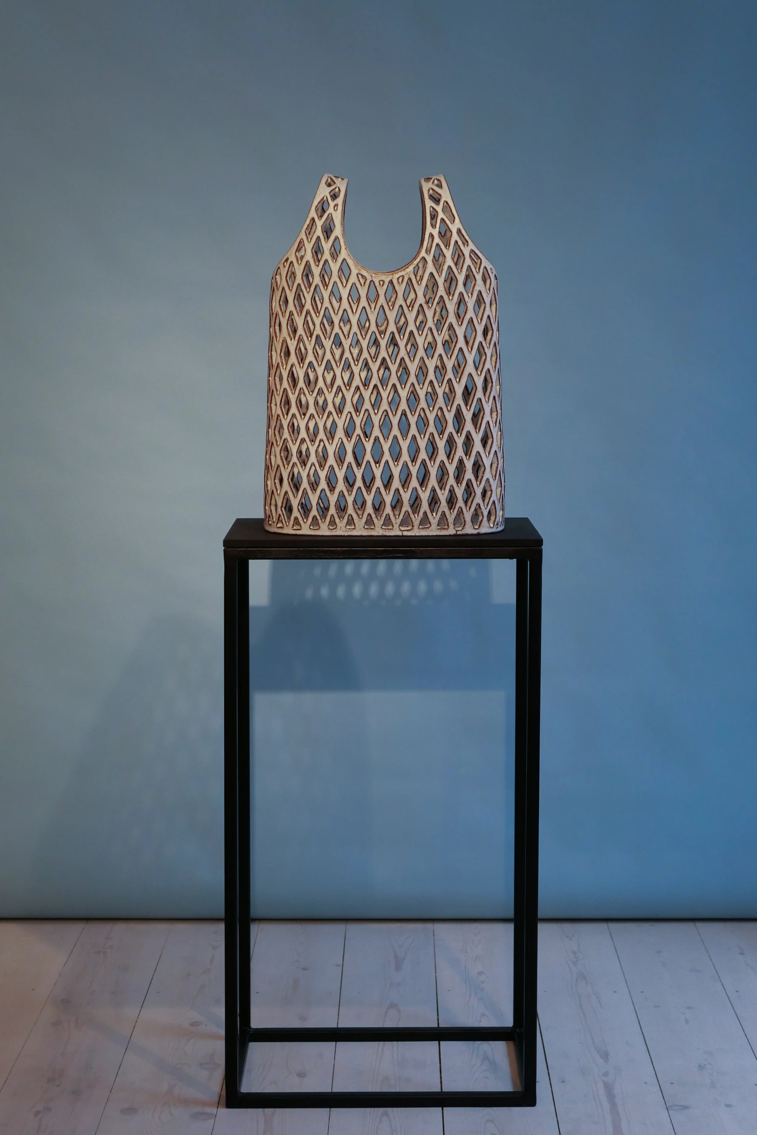
It's a brilliant show with all the humour and the self parody you would expect from CLAYDIES …. where else would you be encouraged to have your photograph taken behind a ceramic string vest or apparently 'wearing' a swishing pleated skirt or with your head stuck through a large ceramic collar?

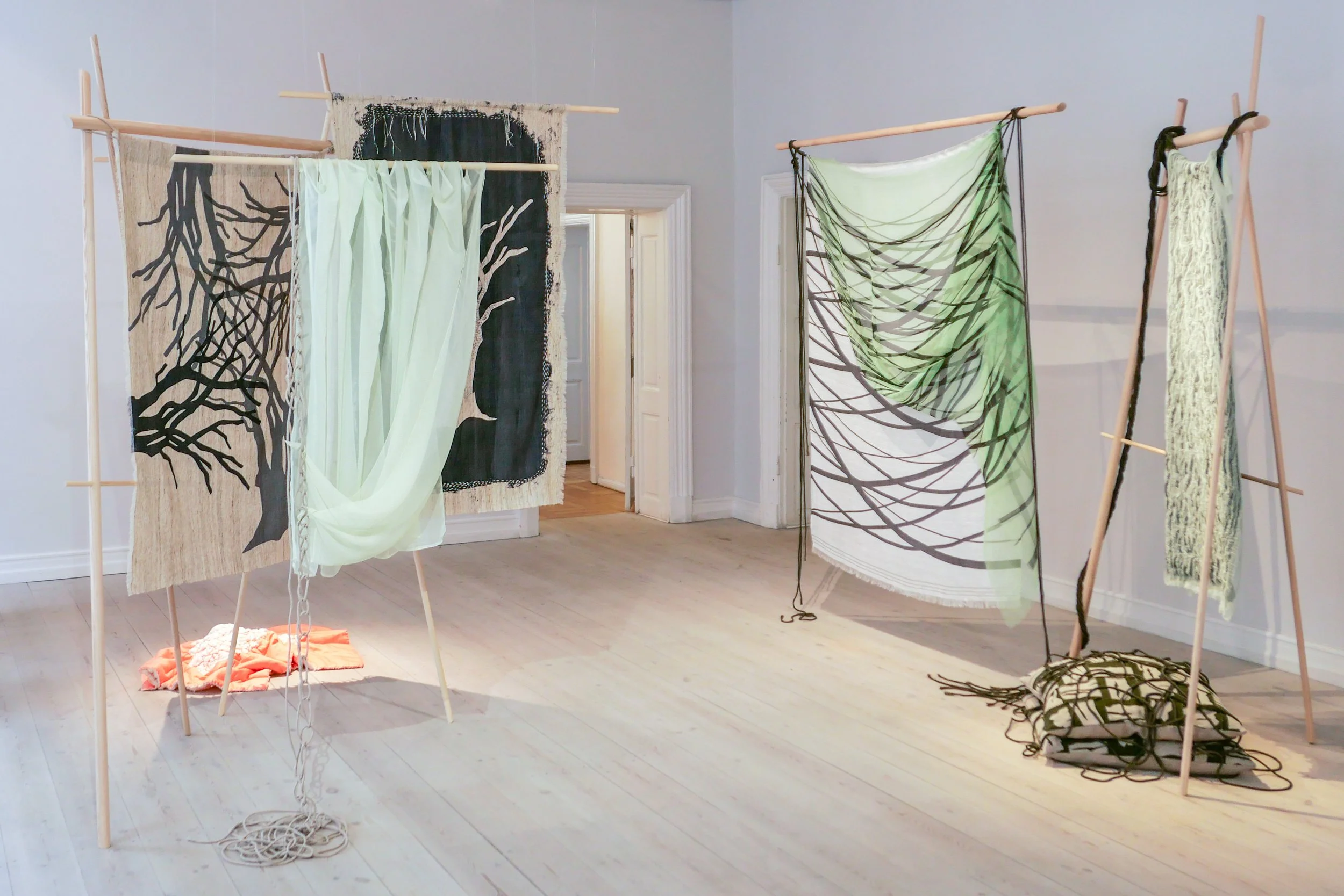
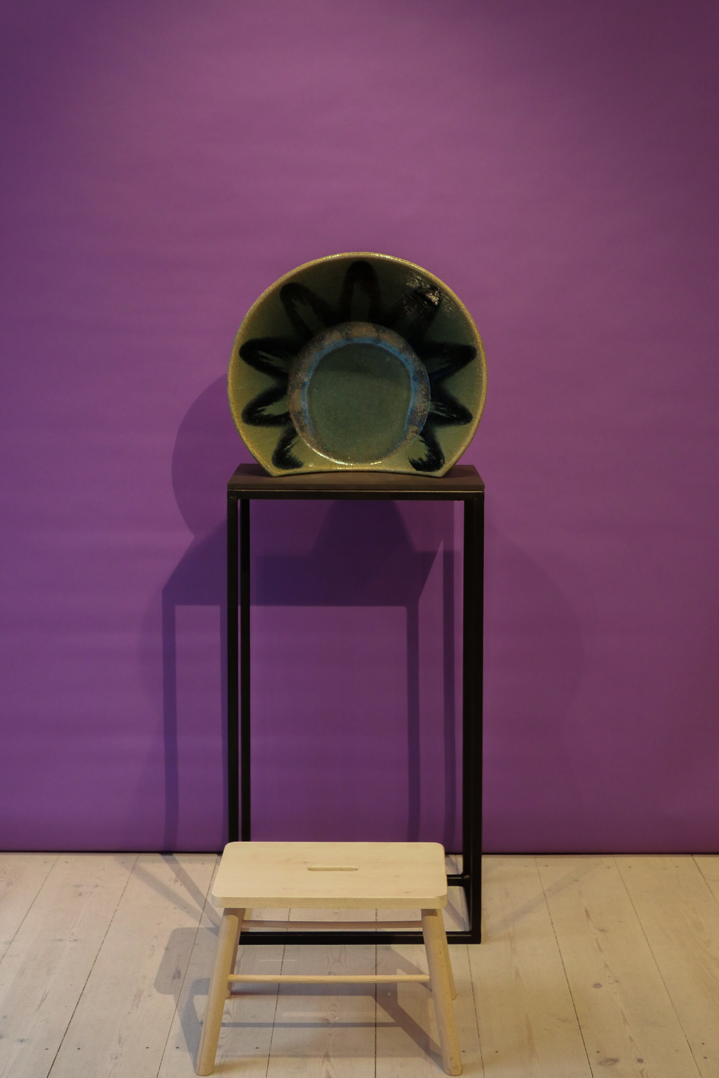
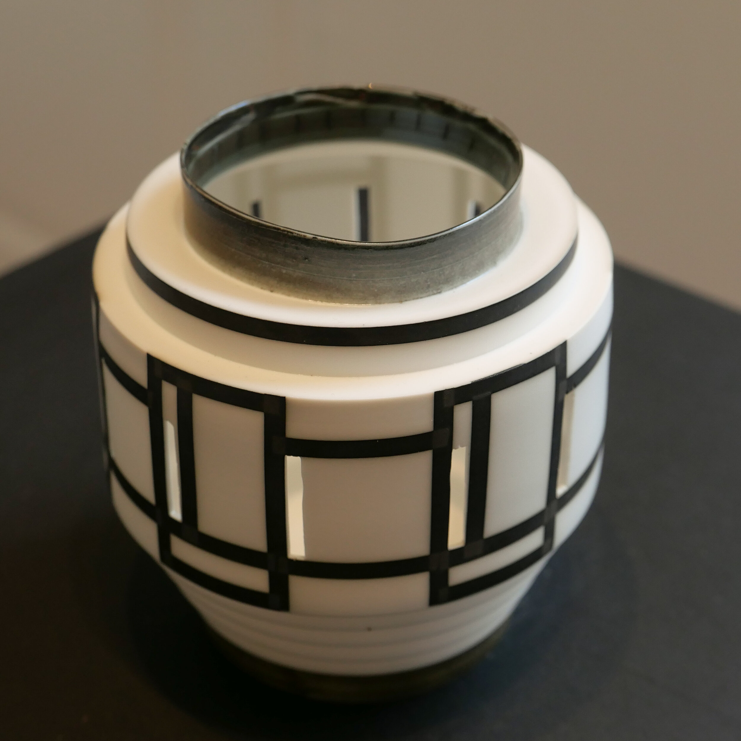
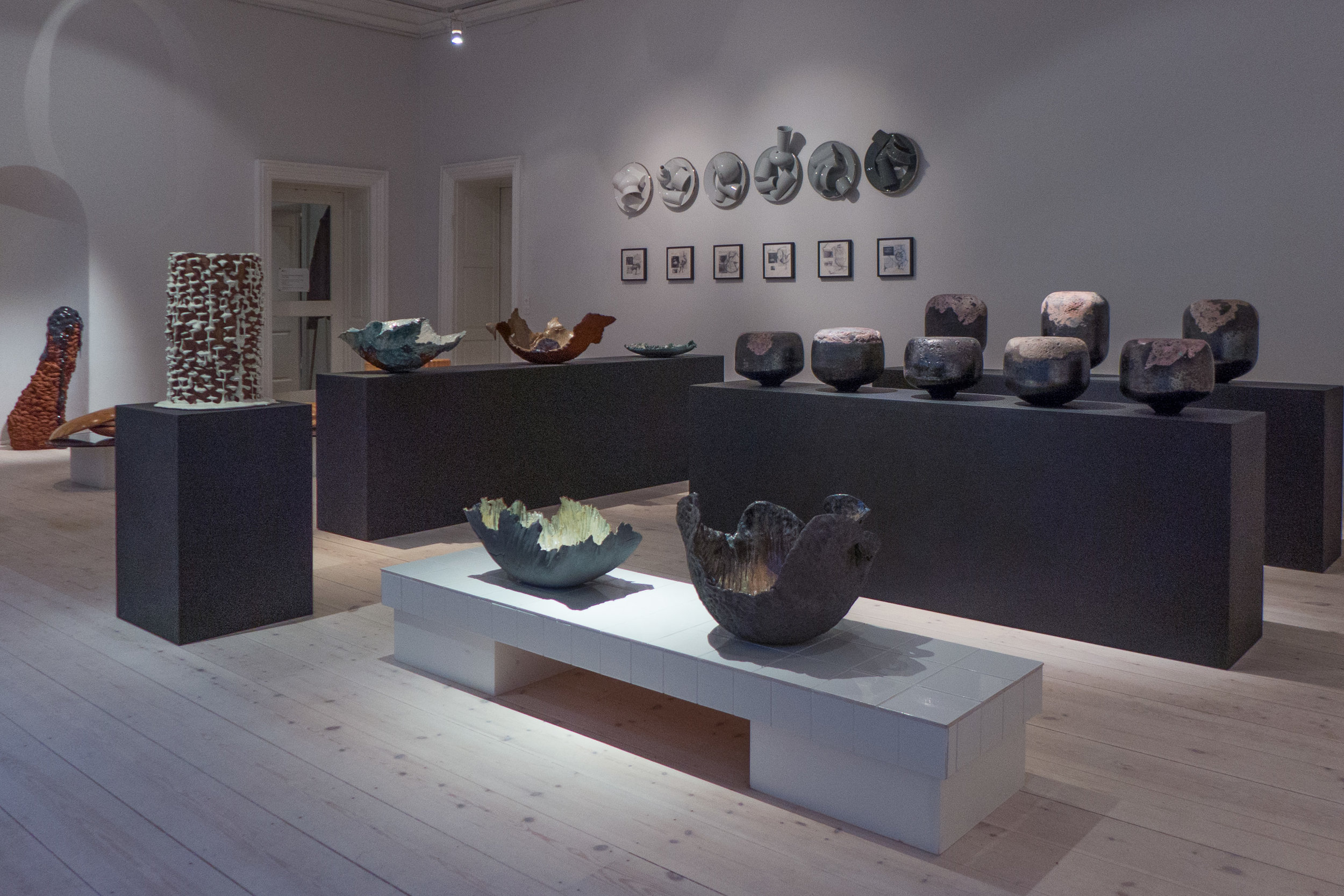
Behind the fun, of course, is their very real understanding of ceramic techniques and their very real skill. For a start, some of these pots are huge and must have been a headache to fire and there is the use of a wide range of glazes that are exploited for different strong colours and different effects. You can’t get away with taking a gentle dig at your craft unless you have mastered it.

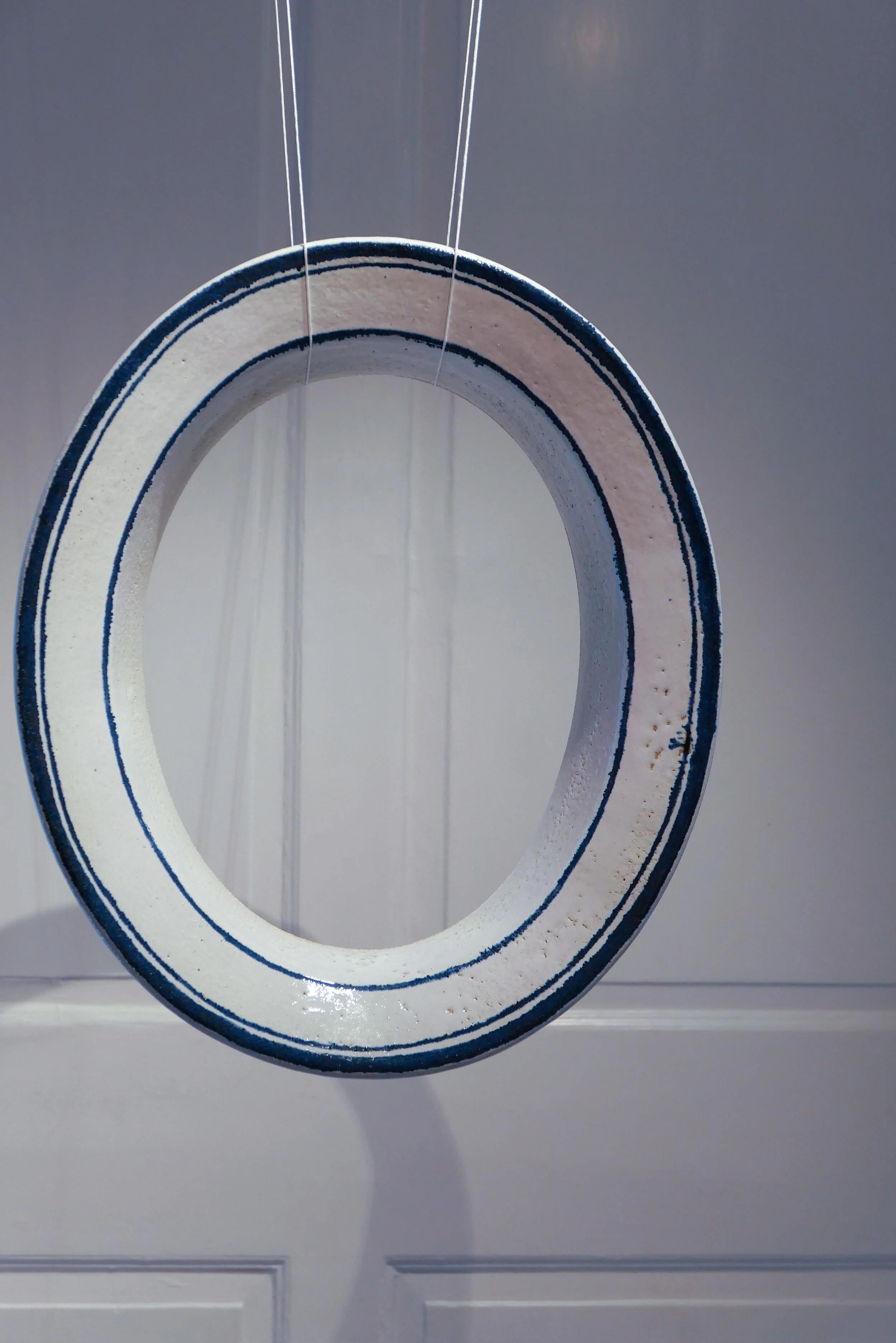
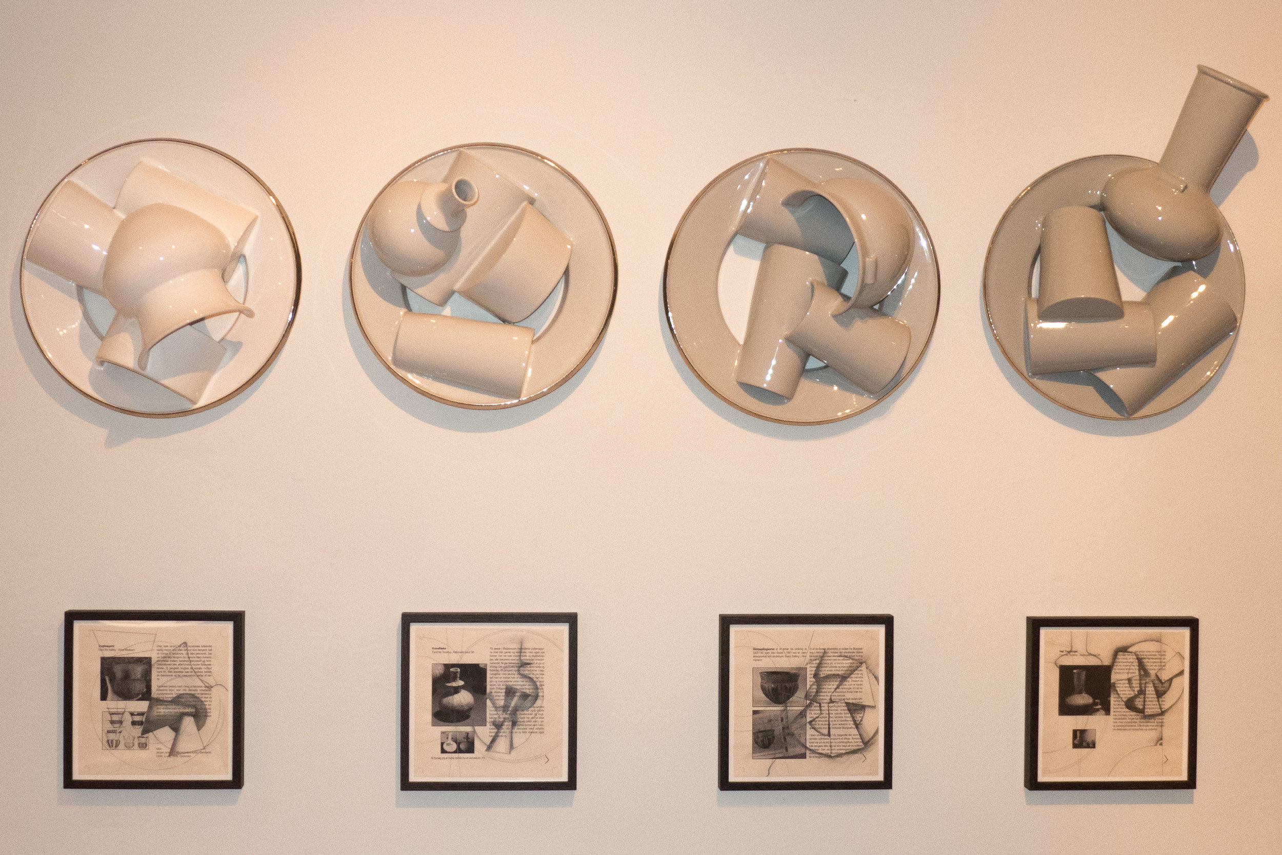
The two large ceramic collars are hung at the right height for sticking your face through for a portrait. One has grey/blue glaze reminiscent of tin-glazed earthenware - white ceramics with thin painted lines and simple decoration in blue that were presumably the early precursors of Copenhagen Royal pottery - and the other, with a lattice of basket work, in the style of what was called cream ware or in England Queen's Ware in the 18th century. Remember, Karen Kjældgård-Larsen has designed for Royal Copenhagen where she took a fresh look at their traditional blue and white patterns and then came up with a giant and fragmented version of the decoration to bring the china to the attention of new and younger buyers.

There are elements here in the exhibition of the cartoon … so about making something exaggerated or slightly absurd to make us look in a new way at aspects of ceramics that are too often just taken for granted. Of course it's obvious that the spout of a teapot points upwards but how and when and why did the form of a teapot become so firmly established? Are certain forms of tableware like they are just because that's a sort of ultimate and definitive shape or size or is it simply because that's what we, the customer, have come to expect and anything else, anything unconventional, would be difficult to sell?

I was going to make a joke about brewing tea and brewer’s droop but then I’ve been told by several Danish friends that Danes think puns are a particularly odd and not very clever form of British humour. So, maybe it’s enough to say here, that some of the pieces are poking gentle fun at some of these lazy conventions.

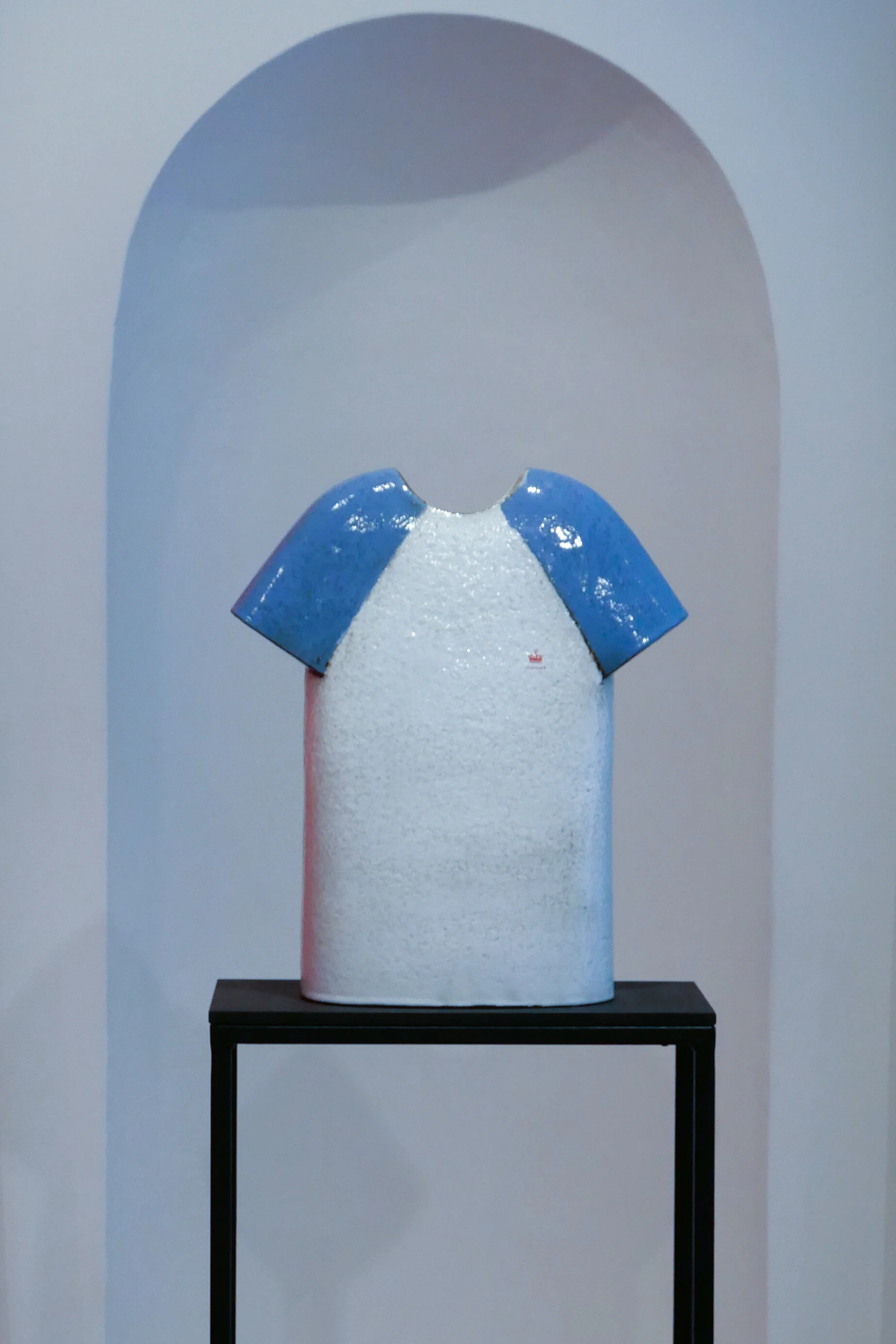
There is also an interesting attempt to break down the border between mass culture and 'high culture' where an object in a museum is to be revered in part because it is in a museum. One of the pieces is a ceramic T shirt with blue sleeves that has the obligatory logo on the breast but here the CLAYDIES ceramic mark. You can’t get much more mass culture than a T shirt with a logo.

And also, of course, above all, this is a brilliant but gentle dig at the obsession with selfies. It’s a bit like that old fairground or end-of-the-pier seaside attraction where your photo was taken by a street photographer but with your face stuck through a hole in a picture of a very very large lady wearing a striped bathing costume standing next to a scrawny little husband so your face replaces hers. Here there is a patterned knitted jumper but made in clay to stand behind or a pottery bobble hat.

Having said all that, the exhibition here is slightly restrained for CLAYDIES. In 2013, for their show called This is Not a Joke, they produced ceramic eyeballs to be left in bowls of soup and whoopee cushions; an unpleasantly realistic piece with the title SHIT; joke teeth; a delicate and refined tea cup but when tipped up to the mouth it had what looked like a pigs snout painted on the bottom and a scarf called BOOBS. Follow the link to see why all this is difficult to describe.

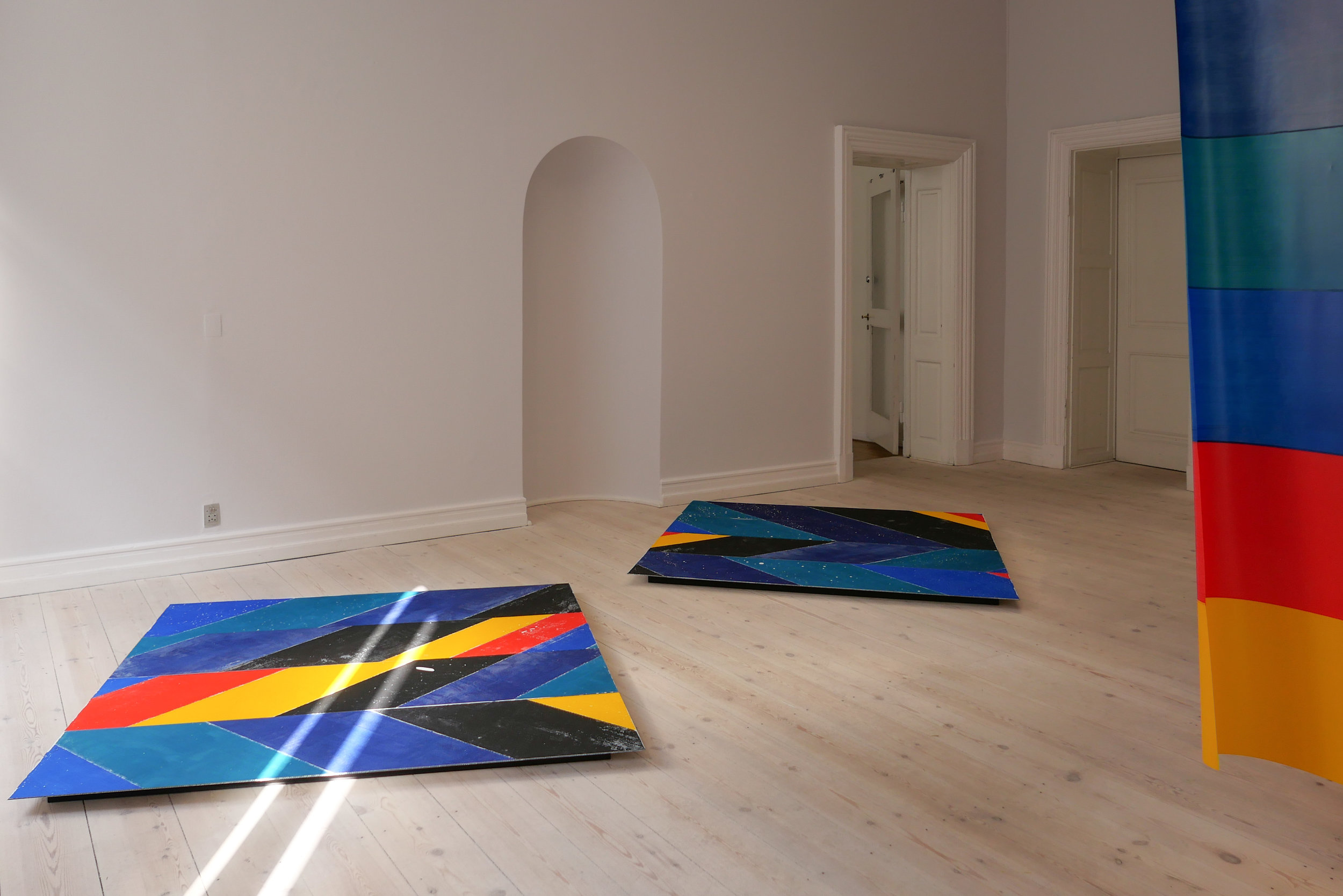
With these big bold ceramics set against big bold strong colours, this exhibition is where pot art meets pop art.

claydiesselfies continues at Officinet until 28 March 2020
Danske Kunsthåndværkere & Designere

Claydies

PORCELAIN PLUS - Göransson + Manz + Nordli

This is the last opportunity to see Porcelain Plus at Officinet - the gallery of Danske Kunsthåndværkere og Designere in Bredgade in Copenhagen - as the exhibition closes tomorrow 29 February 2020.

Porcelain Plus has been curated by Bettina Køppe of the gallery Køppe Contemporary Objects in Nexø on Bornholm.

Here are shown works by three major Scandinavian ceramic artists with all three working in porcelain and all three artists use slip pouring or casting.

All three show how their works have evolved as they explore specific ideas or a number of themes but also, through the development of their skills and their specific techniques, they explore the qualities of their chosen material to discover what is possible and what is not possible as they exploit what is essential about the qualities of porcelain.

But here, with the current works of the three artists, their pieces could hardly be more different.

exhibition review

Porcelain Plus at Officinet -
the gallery of Danske Kunsthåndværkere og Designere
in Bredgade in Copenhagen -
opened on 7 February 2020 and continues until 29 February.

Officinet, Danske Kunsthåndvækere & Designere
Køppe Contemporary Objects

Mia Göransson
Still Life, 2017

Bodil Manz
Dessau ll, 2019

Irene Nordli
Opløst Venus, 2020


An Adopted Sense of Time and Space

An exhibition of works by the furniture and spatial designer Clinton Stewart that “is an exploration, and observation of the way that we embrace and create associations images and objects that we interact with.”

Clinton Stewart

the exhibition continues at OFFICINET, the gallery of
Danske Kunsthåndvækere og Designere /
The Association of Crafts and Design
Bredgade 66 until 18 May 2019

Extract - an installation by Ingrid Kæseler


Officinet - poster for Extract

This is a large scale installation by the artist Ingrid Kæsler that looks at how we see colour and how we perceive space and also explores the boundaries of the traditional techniques of how textiles can be coloured and how designs are printed or transferred.

At the centre are four large banners - they are described as membranes - that are hung one behind the other and you are encouraged to walk through the narrow space between them to see how the colours and sense of space and distance changes as you look along or through the work.

These banners all the same size but are made up from separate horizontal strips of polyester with 12 strips to each - of different widths and painted in strong acrylic colours. There are six colours, reminiscent of the colours of the rainbow but deliberately different and they are repeated in exactly the same sequence - so a run of six and then the same sequence of six to make up a complete banner. This creates what is almost a modulation or wave across the work as the banners ripple across the surface with the slight vertical folds of being hung free of the wall but also a gentle rising and falling of the bands of colour from front to back from banner to banner.

Each finished banner was laid out over a large squares of aluminium sheet that was turned through 45 degrees to form in effect a lozenge or diamond and the colour was transferred from the textile to the aluminium to create what are, in effect, translucent windows through which you can see through the work and see light from the gallery windows and the colours of the sequence of banners with a surprising sense of aerial perspective - surprising in that the colours are so strong but the distance between them is tightly confined. It is when you look through, from one to the next, that you see that the word membrane is appropriate.

One starting point or inspiration for the work was thinking about how light is refracted by a crystal.

The aluminium squares are actually made from four separate long narrow panels set side by side to form the square and with the colour transferred these have been set out on the floor on either side but not in the original sequence. Where the edge of the aluminium has left slight traces on the textile and where small areas of paint have not transferred each has a trace or an echo of the other so you can reconstruct where each aluminium sheet was placed when the colour was transferred.

The banners are 3 metres wide and three metres high and the aluminium panels are 1.5 metres by 1.5 metres so there is also a precise relationship between dimensions and scale and how we read space and proportions and about we do or do not make these connections.

Extract continues until 21 April 2019
at Officinet,
Danske Kunsthåndværkere & Designere,
Bredgade 66, Copenhagen

Ingrid Kæseler


Bornholms Stemme / Voice of Bornholm

glass by Morten Klitgaard


Bornholms Stemme / Voice of Bornholm - an exhibition on now at Officinet - the gallery of Danske Kunsthåndværkere & Designere in Bredgade in Copenhagen - has been curated and arranged by Bettina Køppe of the gallery Køppe Contemporary objects in Nexø on the island of Bornholm.

Bornholm is the large Danish Island in the Baltic that is about 35 kilometres off the south coast of Sweden. It's about 30 kilometres wide and possibly 40 kilometres from north to south and is renowned for it's landscape and for it's archaeology … with its position it controlled traffic through this part of the Baltic with major medieval fortresses. It's important not just for tourism but for artists and crafts makers who live here and the Royal Danish Academy of Fine Arts schools of glass and ceramics are based on Bornholm. 

The exhibition has works from four major ceramicists - Michael Geertsen, Nynne Rosenkrantz Christiansen, Christina Schou Christensen, and Jeanette List Amstrup - pieces by the glass maker Morten Klitgaard - works in wood by Tyge Axel Holm and jewellery by Kaori Juzu and Per Suntum.

the exhibition continues at Officinet until 26 January 2019
there are profiles of the artists and the works on Køppe gallery site Voice of Bornholm
Køppe Contemporary Objects

detail of Barrel Ceramic by Chistina Schou Christensen - top right
Stoneage Decon ceramics and works on paper by Michael Geertsen - bottom left
ceramic by Nynne Ronsenkrantz Christiansen - bottom right


Oak Tree - an exhibition of work by Tina Astrup


 Tina Astrup graduated as a textile designer from the Danish Design School but also completed a post-graduate degree in furniture and spatial design.

Inspired by the timber and the colours seen in a local saw mill, where oak was stacked and seasoned, the work shown here is a project that has evolved over four years. She takes large disks of timber - sections of tree trunk - or substantial wedges of oak and baulks of wood and enhances both the pattern of the natural grain that mark the growth of the tree but her process seems also to echo mechanical cuts and saw marks that show how a tree is felled and the trunk cut into planks.

She uses vinegar poured over the timber that has been wound tightly with wire … a process that brings out tannins in the timber and creates slashes of dark colour in a way that echoes the effect when textiles are tie dyed.


This changes the character of the oak to make it darker both in terms of colour and in the sense of being much more dramatic.

We tend to see oak now only after it has been worked - so finely cut and planed and smoothed and pale - and see oak as the ideal wood for wide, hard-wearing floor boards or for strong finely-made furniture.

Along with beech and ash, pale or almost white oak is still a hall-mark if not the hall-mark wood for the modern Scandinavian interior. Through the classic period of modern furniture design, the English even talked about ‘light oak furniture’ to distinguish the look they wanted from the ‘dark’ oak of 19th-century and earlier furniture that was regarded as old fashioned or unfashionable.

But oak trees, in the wood or the forest, can be twisted and gnarled - powerful and impressive - and even disturbing.

The cuts and marks on these pieces by Tina Astrup reconnects us with what is, after all, the force - the almost aggressive force - of chopping down a large tree and cutting it into planks and should take us a step back from the product to the natural material and to the way we work with timber to see new possibilities in how designers could work with and use oak in very different ways.


Kunsthåndværkere & Designere
Tina Astrup

the exhibition continues until 28 October 2018
at Officinet - the gallery of Danske Kunsthåndværkere & Designere - Bredgade 66, Copenhagen