Increasing details: an analysis of good design
/My posts through June were mostly about 3daysofdesign - a series of events that were held in Copenhagen at the end of May. Just to conclude those posts, I want to write a bit more here about one of the events … an exhibition at The Silo, called Re-Framing Danish Design, that was staged as a collaboration between Frame magazine and the new online design site DANISH™.
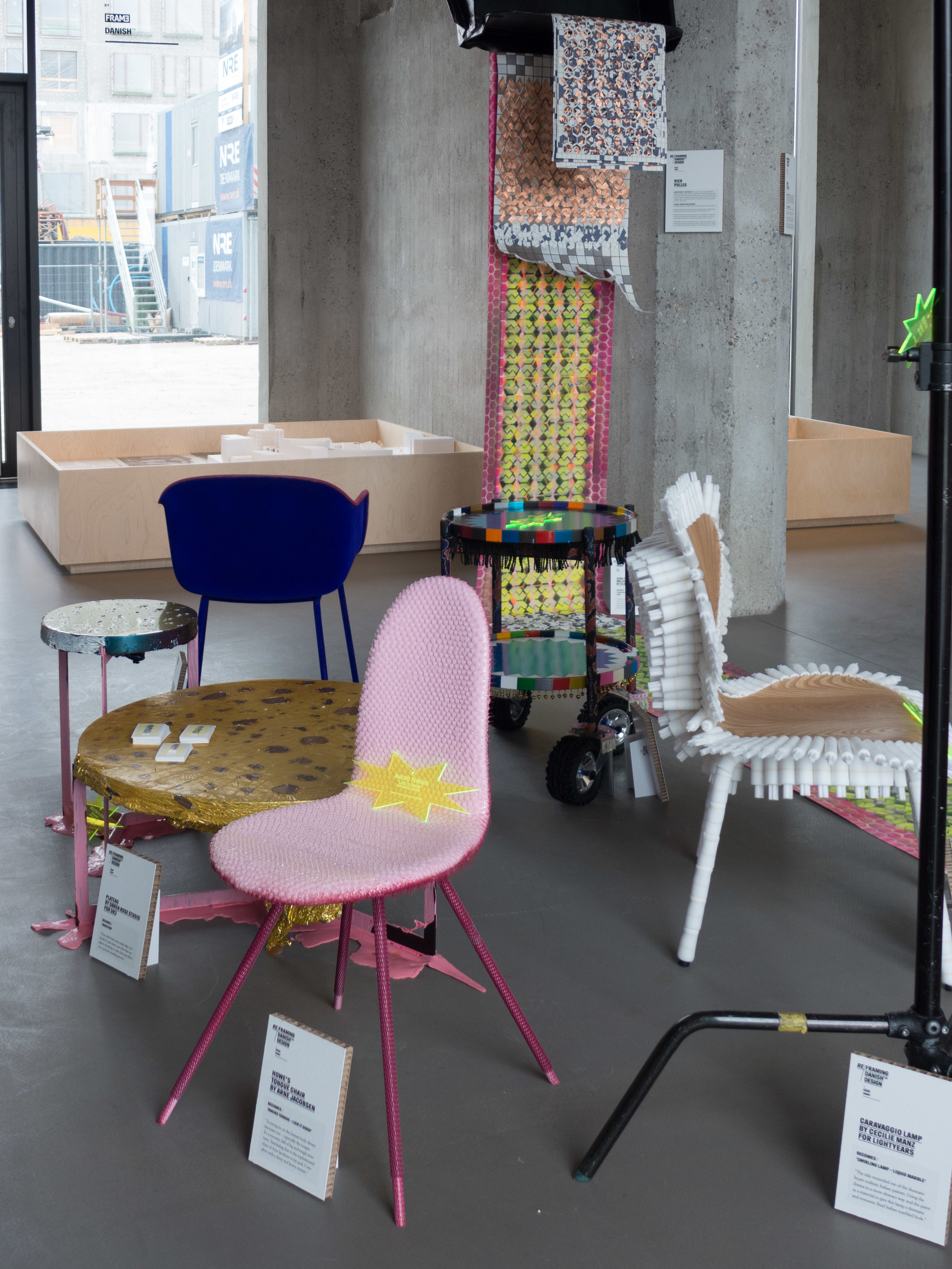
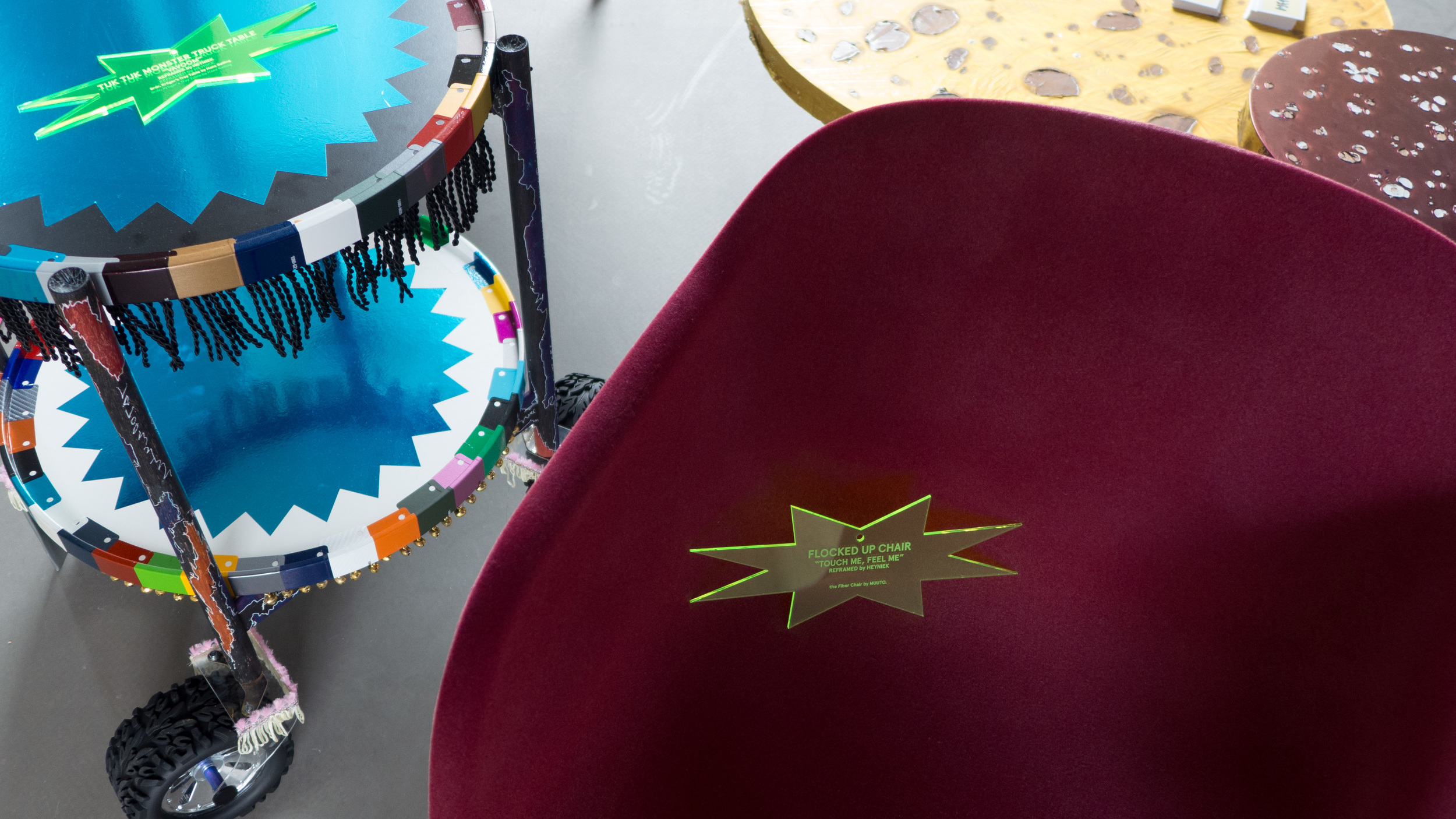
Two young designers, Niek Pulles from the Netherlands and Sebastian Herkner from Germany, were invited to assess or reinterpret 10 specific design pieces from Denmark that cover a wide range of styles and dates from the Safari Chair designed by Kaare Klint in 1933 to the Fiber Chair from Muuto that first went into production last year. What linked all the pieces - apart from being Danish - is that they are all still in production.
Both designers are already well established in their own studios and have a rapidly growing international reputaion - so they have clear, professional opinions about design - they have, presumably, views on how new design can and should move forward but also, as they come from neighbouring countries, they have an appropriate detachment from the Danish design tradition and from Danish design training.
The ten pieces were selected by the organisers of the exhibition and sent to their design studios.
Pulles decided to adapt the pieces by recovering them in challenging colours or interesting textures and his part of the exhibition attracted a lot of attention because these transformations seemed irreverent and possibly, for some, shocking and compounded a view that Danish design, compared to work from other countries, can appear to be too safe, too boring and lacking in humour. Pulles rectified that. The works he produced were lots of things but not boring.
Herkner, on the other hand, took a more subtle and analytical approach and for me that was actually more interesting. He worked with the pieces around in his studio and, as they became familiar, he identified specific qualities in each design and tried to appreciate what gave a sense of meaning to the designs. By sharing that process with us, through the exhibition, he also revealed something more general about how we analyse design and about how we decide which qualities and characteristics can make designs good or great or try to see which qualities explain why some designs retain their popularity.
Several of these Danish pieces are very well-known - particularly the Series 7 Chair by Arne Jacobsen - and most are widely acknowledged as good design - they have had a place in many Danish homes for many years and they are still purchased in large enough quantities to ensure their place in a current catalogue.
Clearly that in itself raises interesting questions. Do some pieces continue in production because they are acknowledged to be well designed? Is it simply because they have never been bettered? Is it because they acquire a sort of stamp of general approval or, possibly, is it just because they are familiar, they are a safe choice for the buyer?
Although it was not discussed in the exhibition, there is also an interesting insight here into a commercial aspect of design and manufacture: designers and manufacturers have to be able to distinguish which qualities in a design might generally be described as good by a professional designer but might not be appreciated widely enough to make the piece viable in commercial terms.
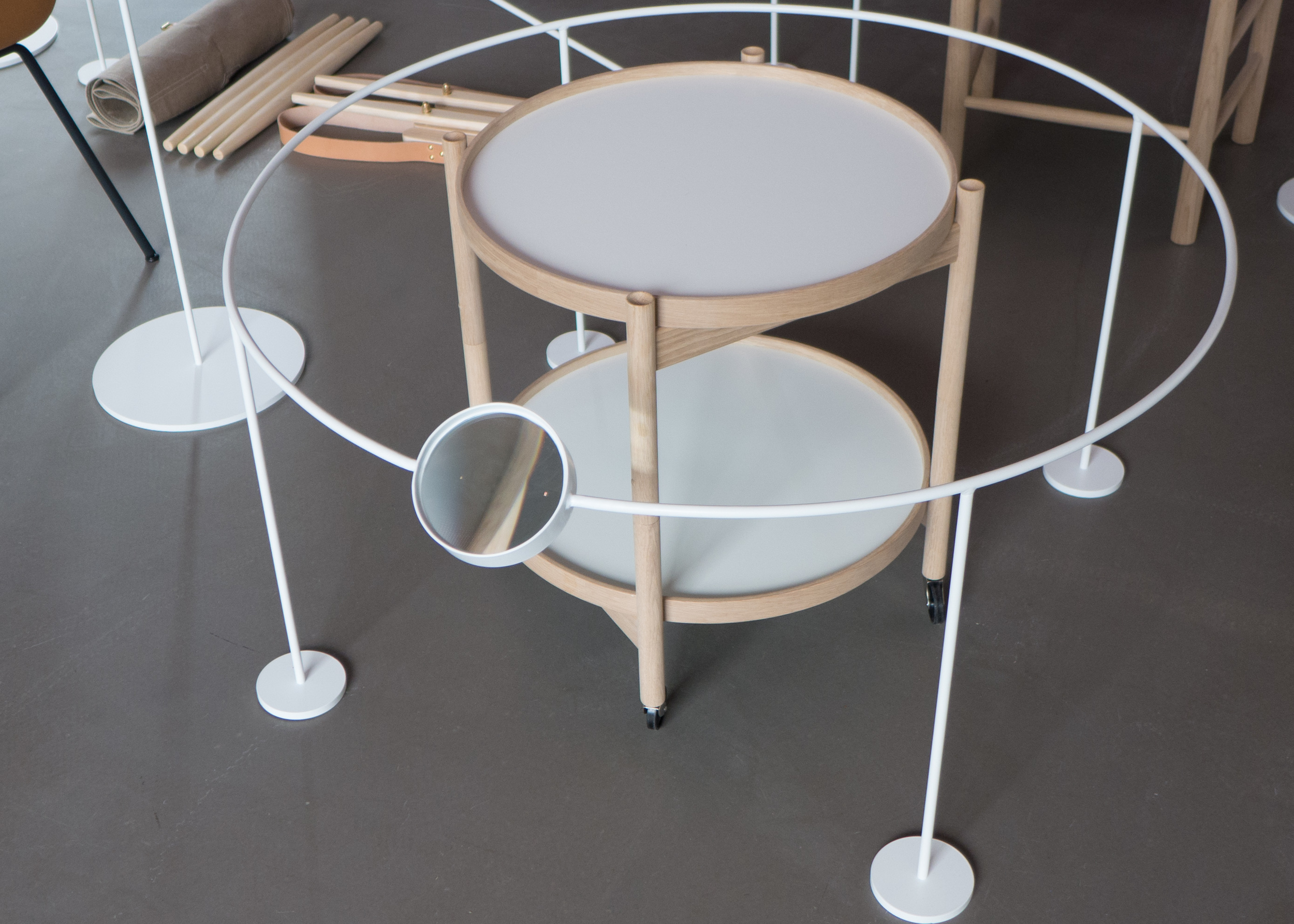
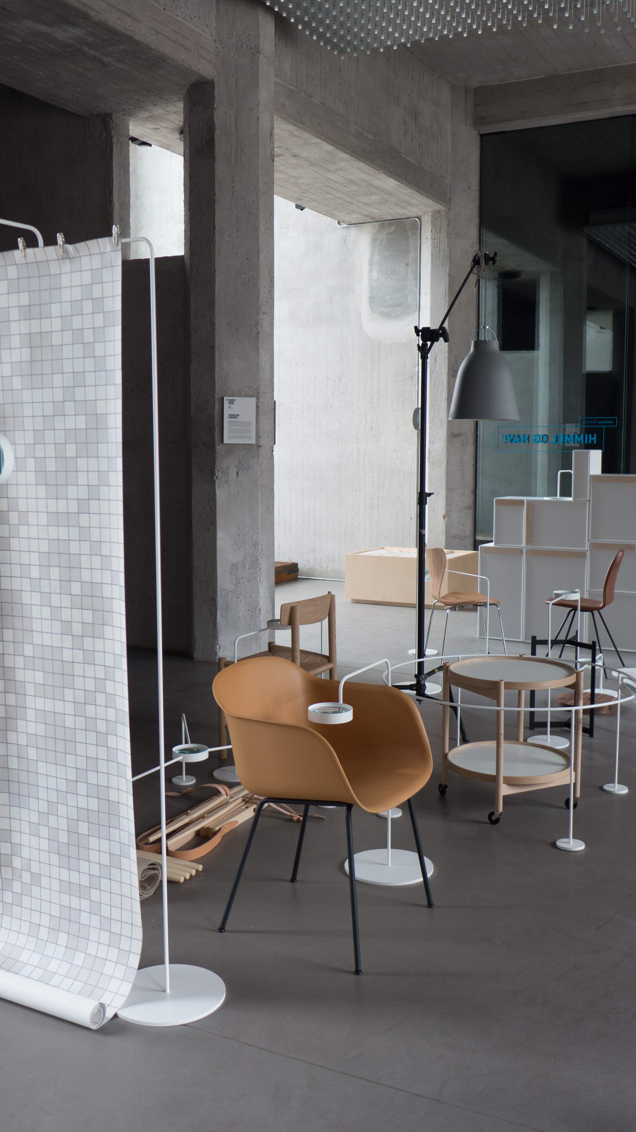
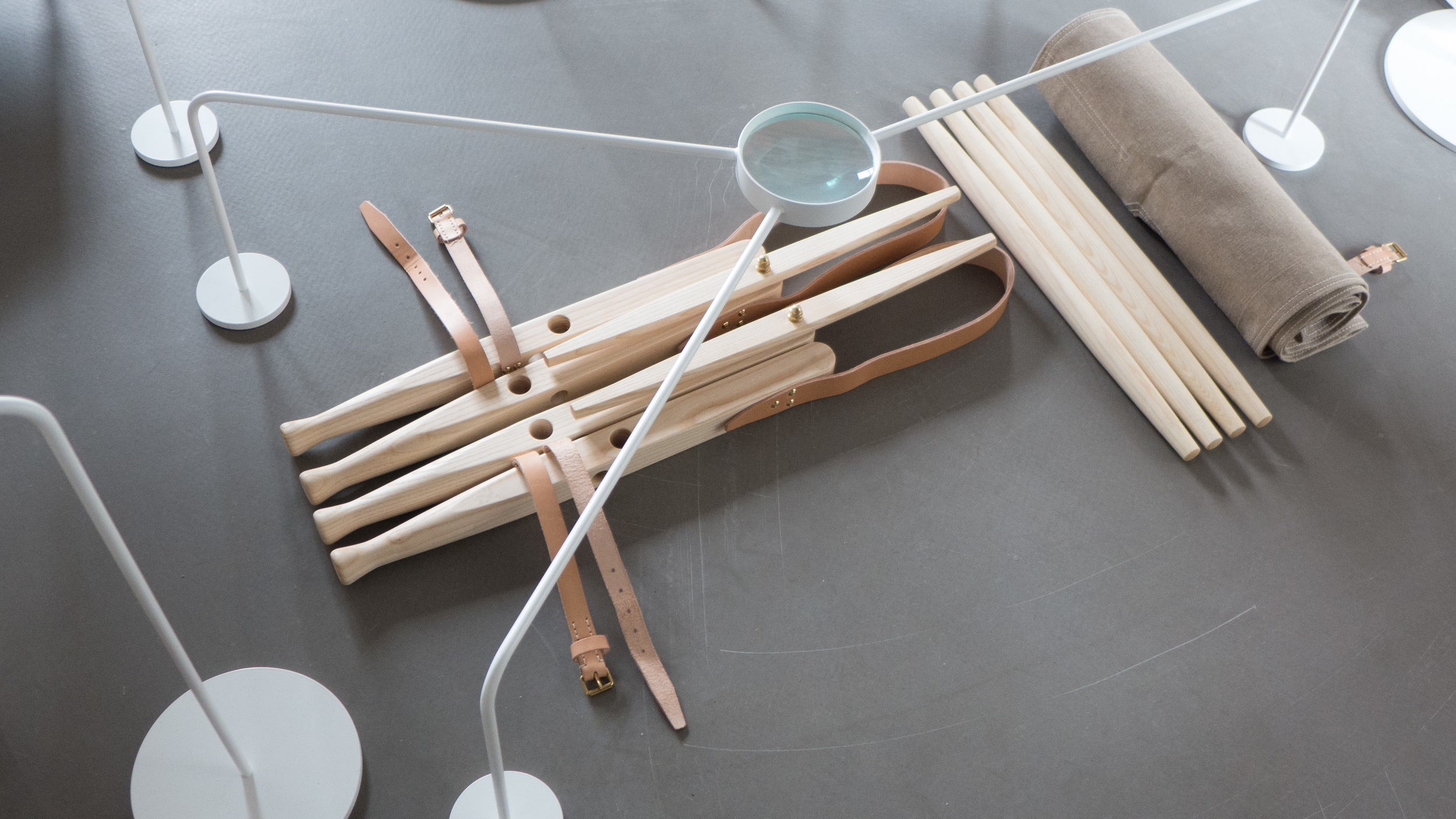
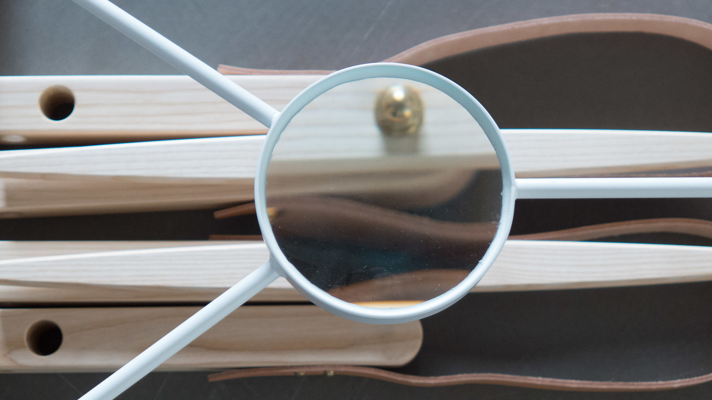
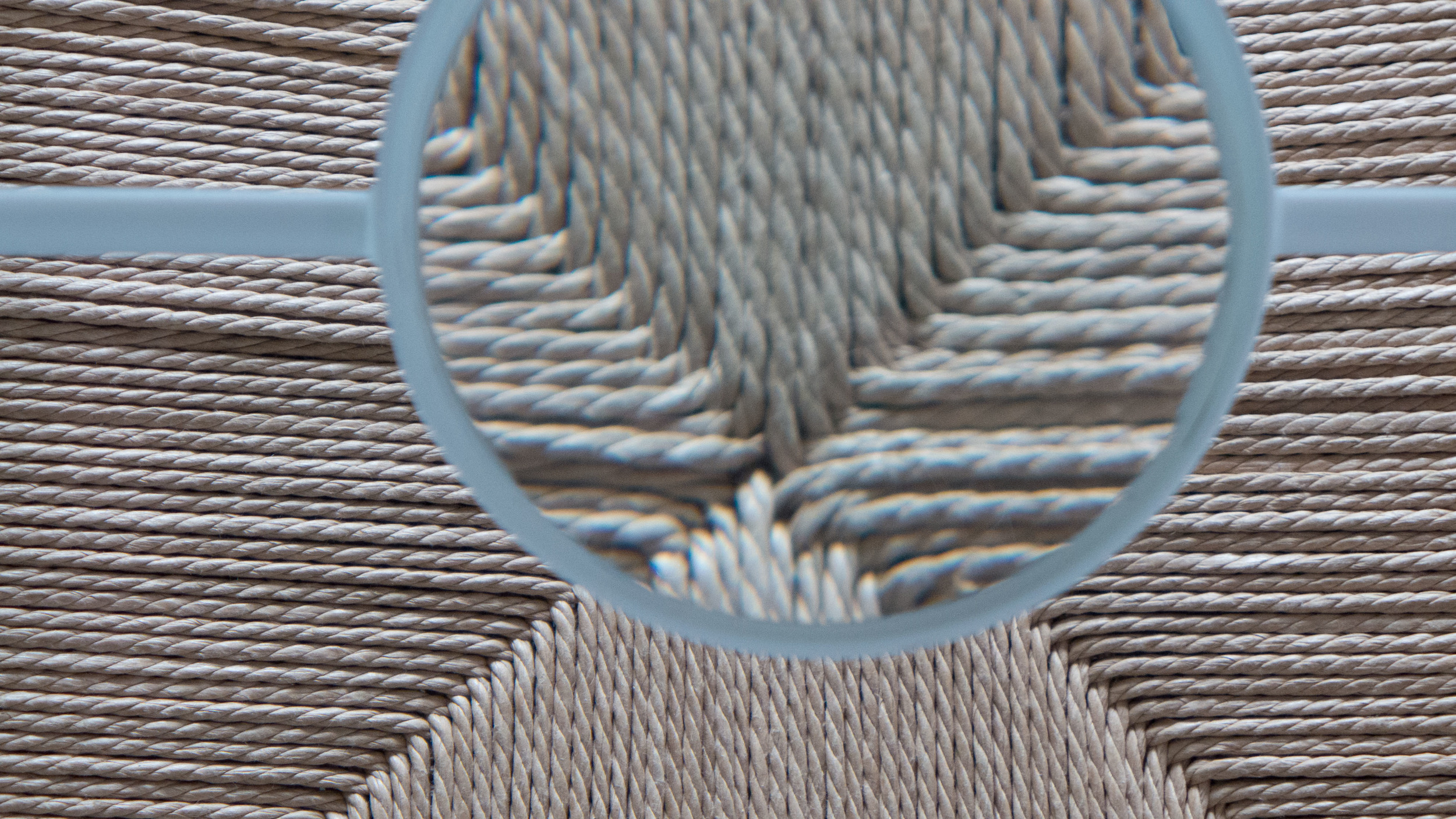
By placing a magnifying glass in a frame or stand with a fixed relationship to the pieces, Herkner made the viewer look at a point or area that he wanted to emphasise so each white frame holding the magnifying glass was different and each was specific to its piece and the position and the angle of the magnifying glass was fixed. A large magnifying glass could have been left free beside the object with the implication that the viewer had to look closely at the details of the materials and the construction techniques of the design but this was much more controlled than that.
In a wider context Herkner was, in effect, saying don’t take these designs for granted. Don’t just shrug and say I bought this because I like it or I bought this because my parents had one when I was little or I bought it because the design book said it was a classic. He was inviting visitors to the exhibition to really look and look carefully to see why both the design and the way each piece is manufactured is so good.
But this assessment was not just about looking at detail and appreciating quality.
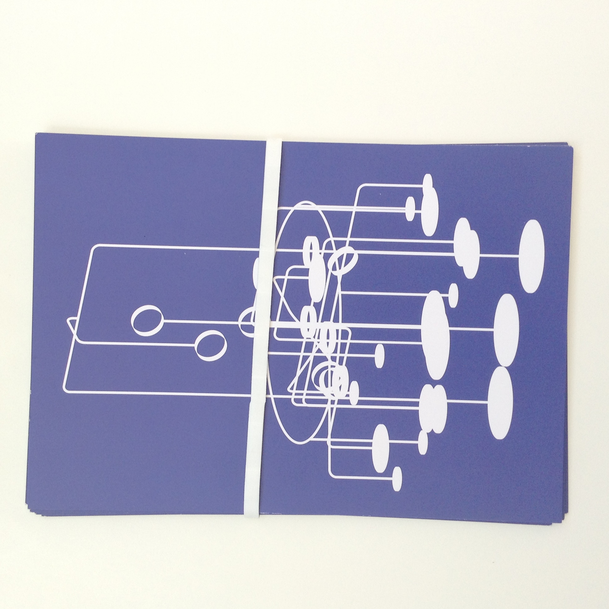
Herkner produced a set of A5 prompt cards. On one side is the framework and magnifying glass in white silhouette against a strong purple/blue and on the reverse there is a simple outline drawing of the piece and a brief summary of his reaction to the object and a single word that sums up this response and the cards were held together with a broad white rubber band. Simple but very very stylish.
There are eleven cards in the pack with the first one having a short introduction under the heading ‘Increasing details’. Then the ten specific cards are:
- simplicity The Caravaggio Lamp by Cecilie Manz
- craftsmanship J39 Chair by Børge Mogensen
- sustainability Fiber Chair from Muuto by Iksos Berlin
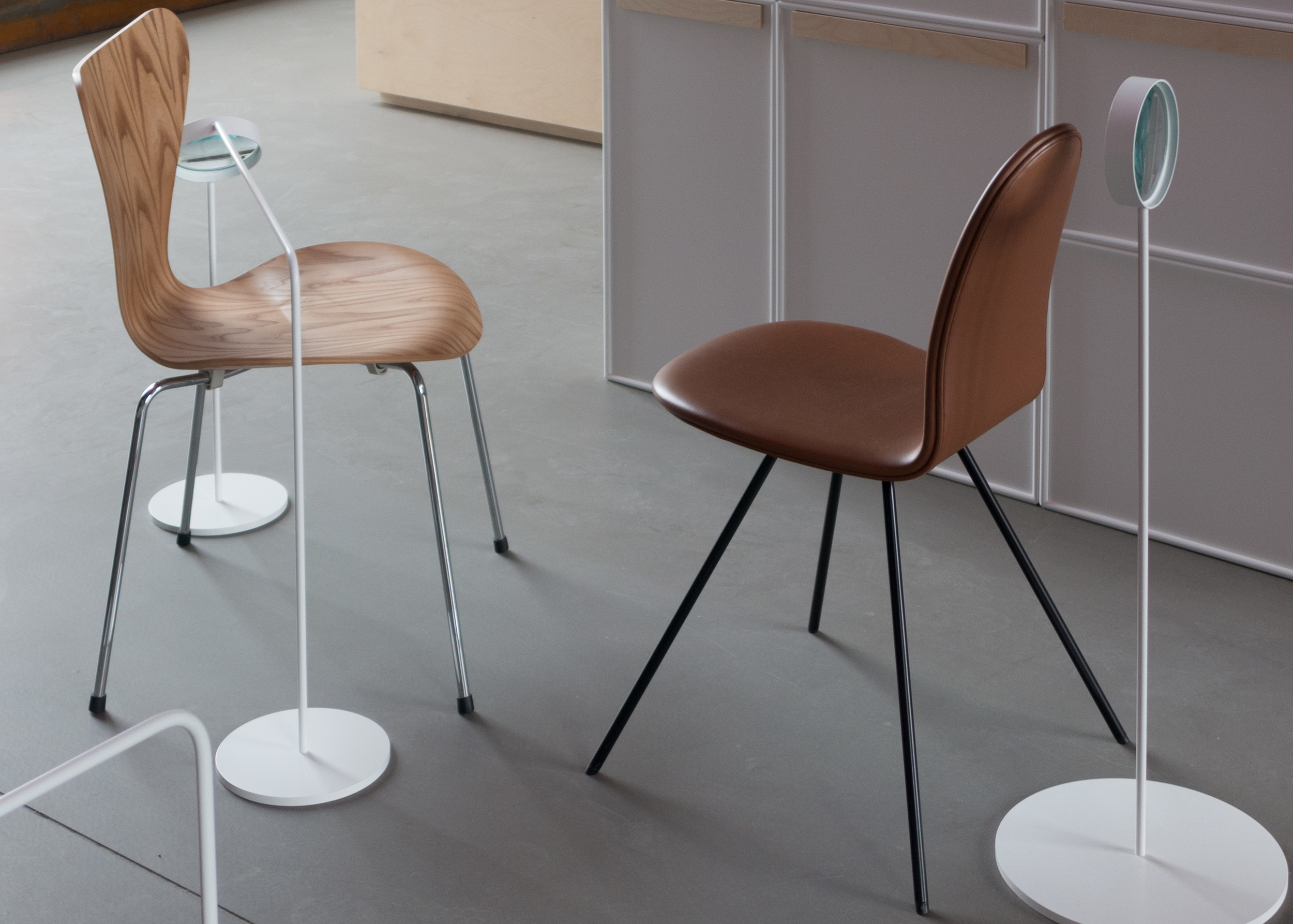
- functionality A Series 7 Chair from Fritz Hansen by Arne Jacobsen
- modularity The Montana System by Peter J Lassen
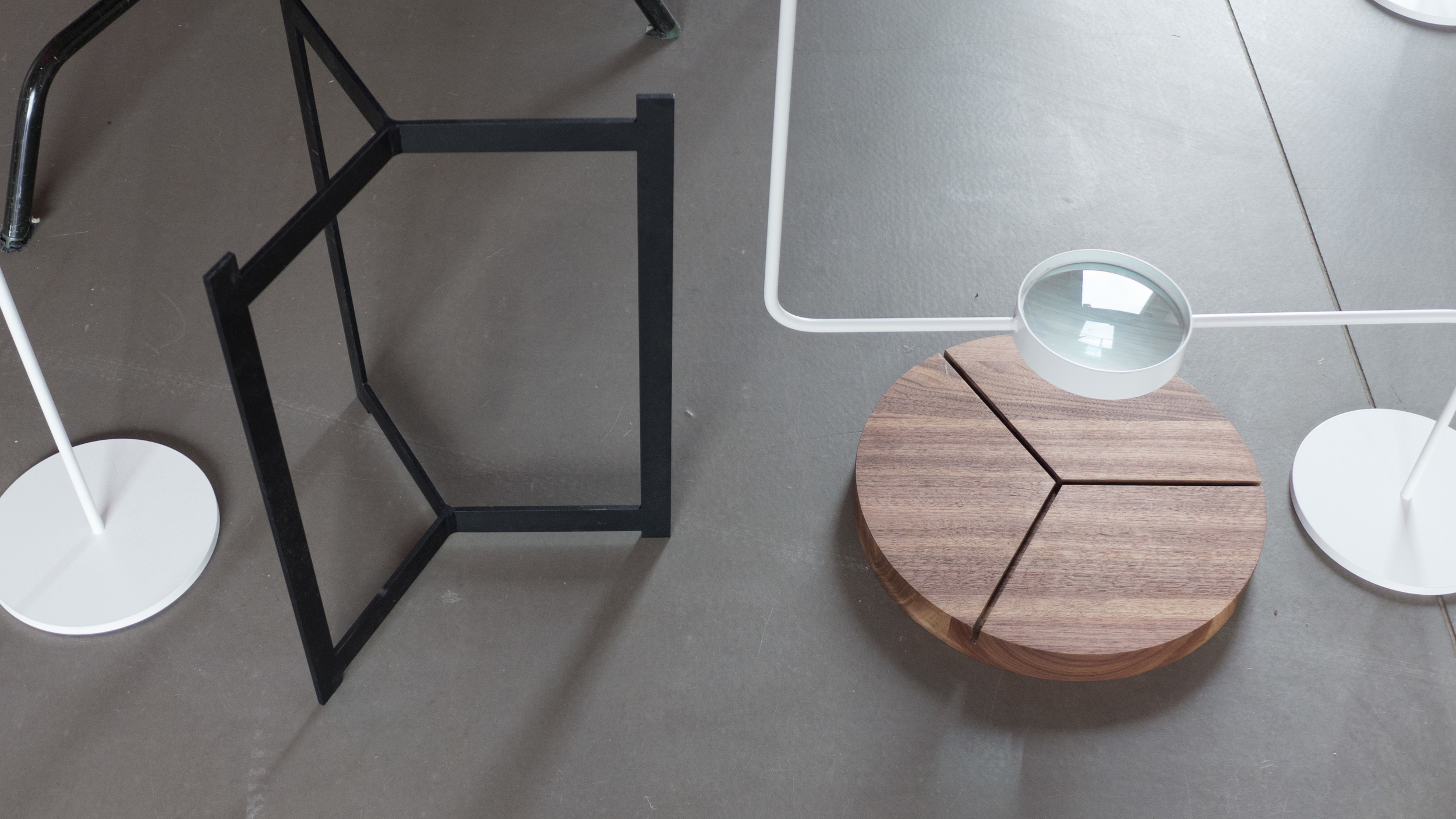
- self-explanatory Plateau Side Table by Søren Rose
- mobility Tray Table by Hans Bølling
- poetry Safari Chair from Carl Hansen by Kaare Klint
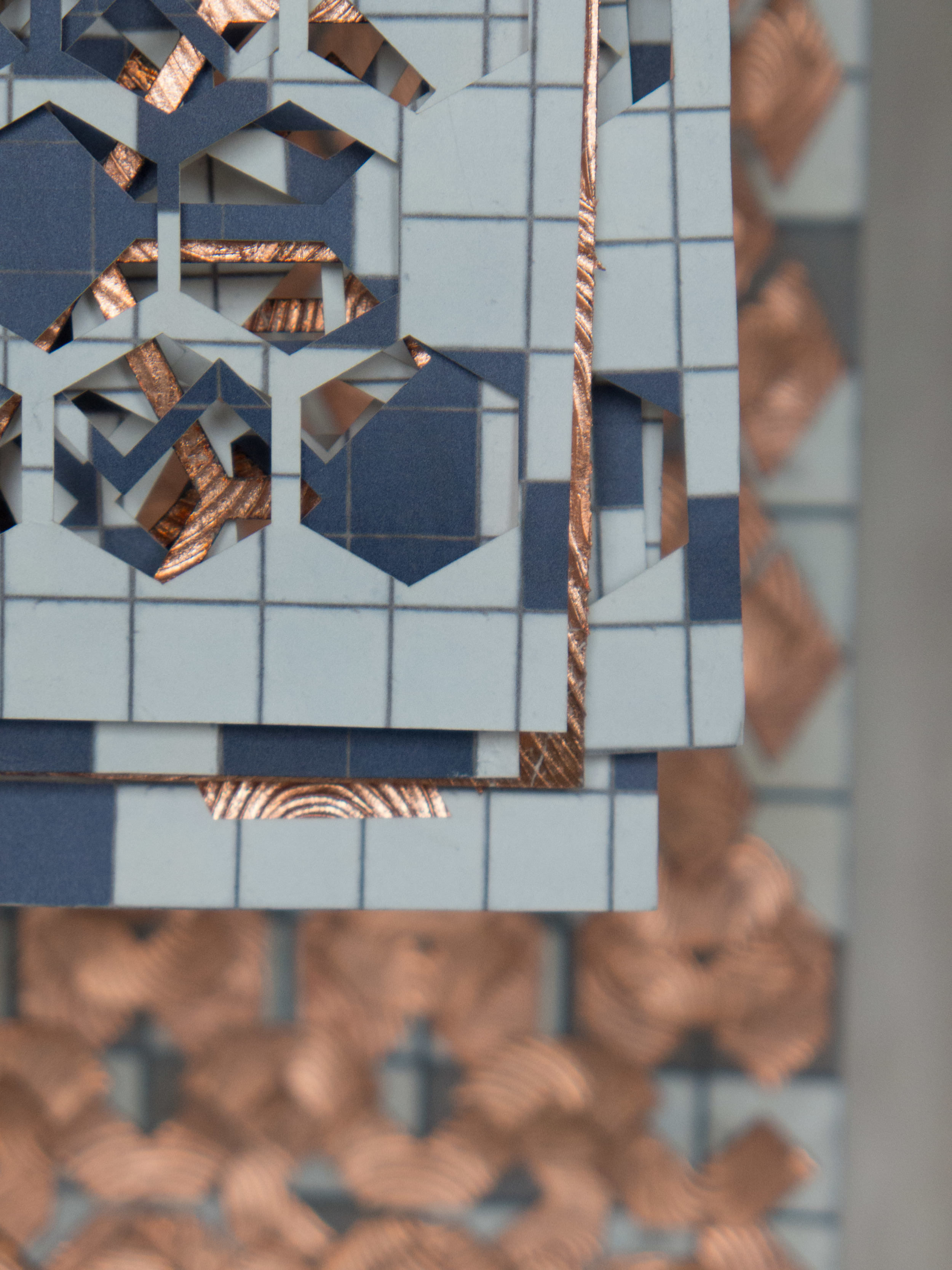
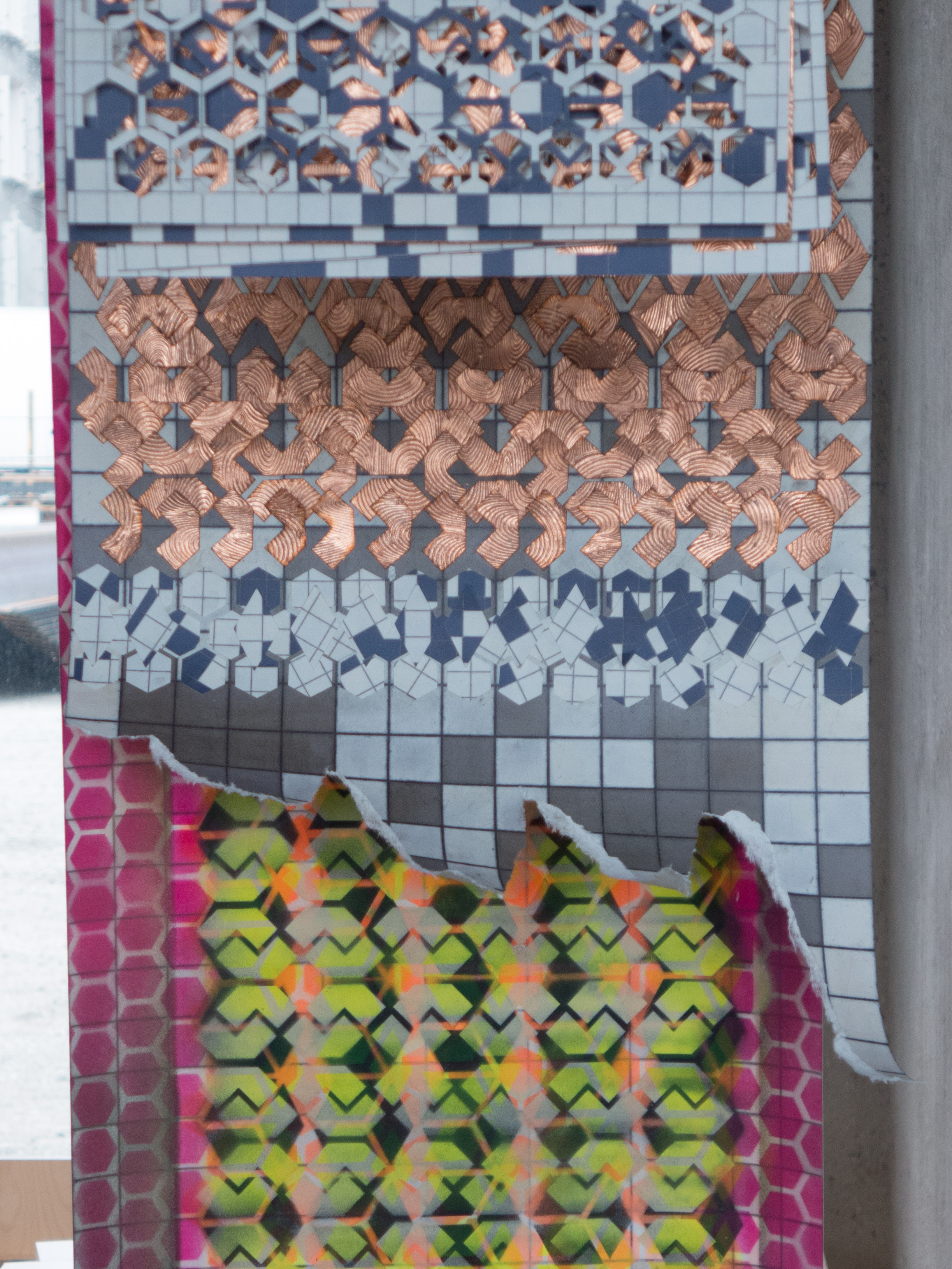
- transfer Nordic Antique Wallpaper by Heidi Zilmer
- irony Tongue Chair from Howe by Arne Jacobsen
Through the magnifying glass, the viewer was directed to a specific feature and in some cases that explained the characteristic or definition given to the piece but in some it focused on an aspect of the piece that was actually unrelated to the word or the text. To take the Safari Chair as one example, the chair was not assembled in the exhibition and the magnifying glass focused on the brass locking nut that holds the chair together when it is in use … so a crucial but normally overlooked technical feature of the design rather than something ‘poetic’ and for the chair by Borge Mogensen the magnifying glass was focused on the woven seat and that appears to comment on texture or the use of materials but, in fact, the card explains that several years ago Sebastian had visited a paper mill near Barcelona where paper cord for seating is made and this formed, for him, a personal connection with the work.
I confess that I was slightly confused when Herkner, in his introduction, emphasises that these ‘ten characteristics are interchangeable.’ Although I can appreciate that, for instance, the Safari Chair, if seen on a theatre or film set for Out of Africa is merely using a period piece in a poetic way but on an urban balcony in Copenhagen might be ironic but it could never be described as simple or six Muuto chairs around a dining table become modules and are functional but have nothing to do with mobility.
What is important is that Herkner is recommending careful observation and careful analysis of the object in reference to our normal criteria for assessing a design - its function, its aesthetics, its use of materials, the technical details and so on - but he also wants the viewer or user to analyse their own reaction and interact with the piece.
So what at first appears to be clinical … what could be more clinical than a magnifying glass? … rapidly becomes an analysis of our emotional reaction to the design and our connection with a piece. So this then becomes a very personal interpretation of the term reframing for both Herkner and for the visitor to the exhibition.
My only real criticism is that this might be seen as an academic exercise by a designer for designers. He excludes any form of judgement or opinion - which you might expect if design works are given art gallery status under a spotlight - and there is no context if these are to be seen as readily available product pieces that anyone can buy. I’m not complaining about that but it was interesting that no attempt was made to assess how these pieces are used either individually or together so where and how does the buyer fit in?
Someone could move into the Silo - in the space above the exhibition - when the new apartments are finished and purchase all these design pieces. It’s possible. So, how would they work together? Would they show the buyer had a clear appreciation of good design? Would it be tasteful or slightly odd to have a Safari Chair alongside a Montana shelf system? Well it all depends on the colours chosen and if the Safari Chair was used as a focus/discussion piece or if, maybe, it had been inherited from the family and was clearly well used and well loved. Or would putting these objects together, even theoretically, be seen as a cautious approach to design, buying only what is recognised or generally accepted as good design?
Sebastian Herkner raises some incredibly important questions and ideas about design in general but specifically about how we respond to good design and how important it is that we analyse and try to understand that reaction.
Next month, there will be another opportunity to see the exhibition at Northmodern at the Bella Center in Copenhagen from the 13th through to the 15th August.