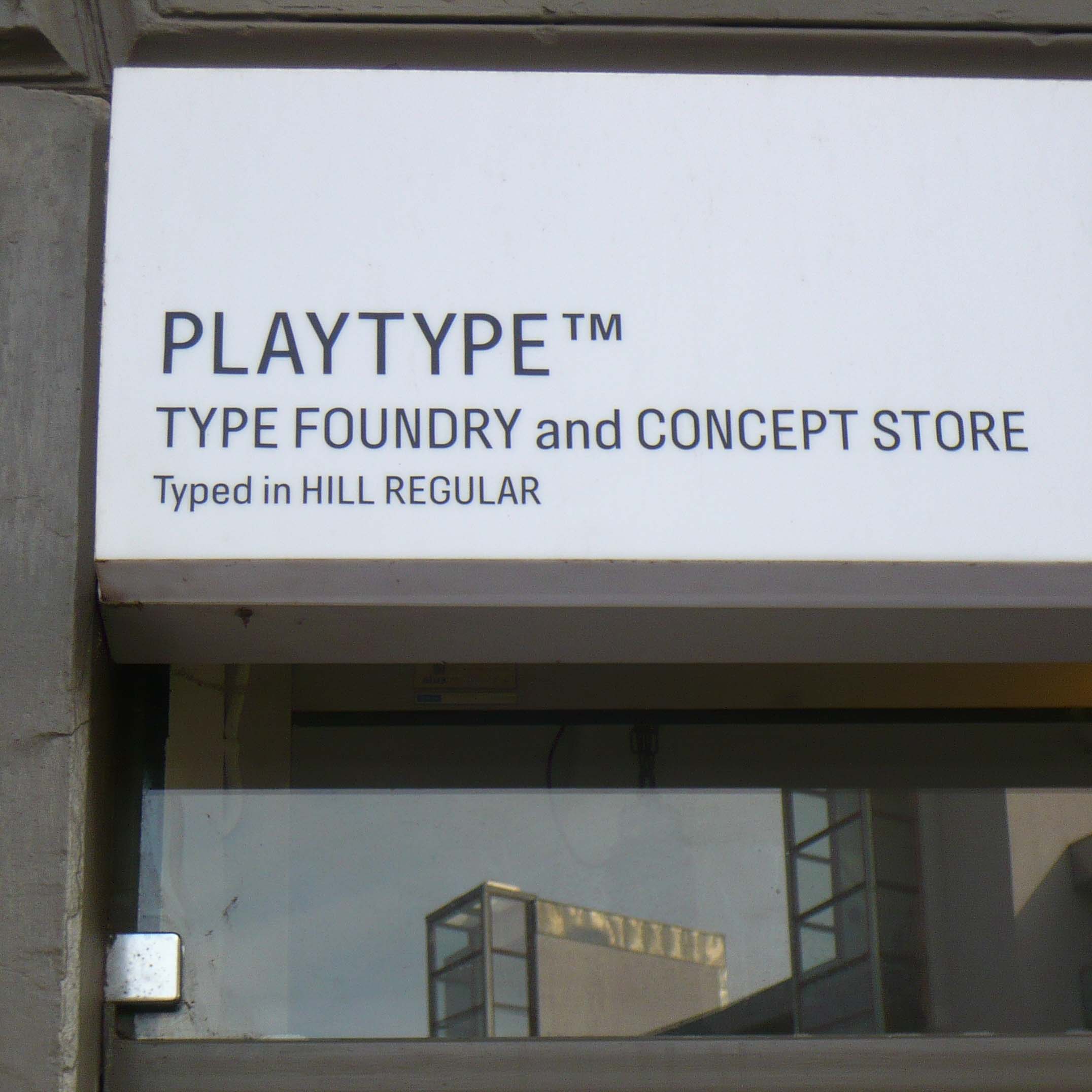
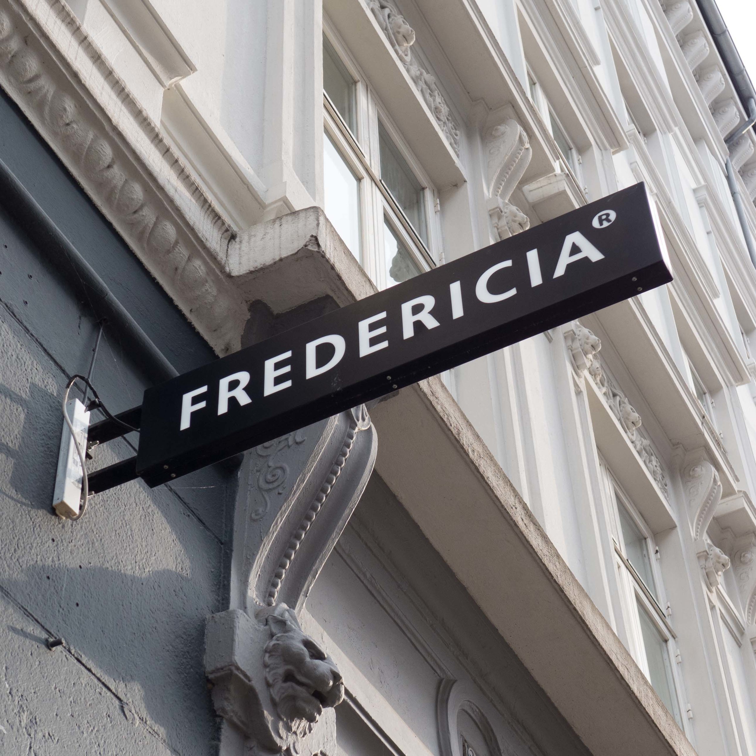
Playtype


A Danish brand and design agency, e-Types was founded in 2010. They established a type foundry and also have an on-line store and a small shop on the west side of the city in Værnedamsvej where they sell lettering and type on posters, mugs, T-shirts, sweatshirts and stationery along with magazines and books about type. Theirs is probably the only shop sign I have seen that gives you a reference to the typeface.

If you think that all sounds rather specialised and esoteric then think again because, in many ways, if you are interested in design and trying to understand more - trying to work out what makes one thing good design and another bad design - when you would actually be hard pressed to describe the difference - then typefaces and fonts are a good place to begin. For a start graphic design and type are universal so it is easy to find good and bad examples. Just compare a good quality newspaper or magazine with confused and muddled and badly printed advertising that is pushed into your mail box. Or look at a book that is a pleasure to read - not just text as words and meaning but pages that look good and where you can find your way quickly and easily aroud the page and compare that with one that looks chaotic and is actually difficult to read or do the same with shop signs or road signs to decide which ones are well designed. 

Again there is a bench outside Playtype and people sit here to drink coffee from one of the nearby coffee places and local people from the neighbouring furniture shops and book shops and so on stop and chat. The staff or the partners, over from the main office, may well be there. That’s how I got talking to Rasmus Ibfelt, one of the directors of the company … happy to talk even though I was disturbing his coffee break.

What Playtype shows above all is that at every level and in every way, good design is about communicating … not least the idea of using good design to help communicate complex ideas or important information.


Playtype, Værnedamsvej 6, 1620 Copenhagen V, Denmark

lettering out on the street in Copenhagen

Walking around Copenhagen you can appreciate how well, generally, fonts and typography are used for shop and office signs. Of course there are a few international companies who continue to think that one font and one size fits all and fits everywhere but Copenhagen is, more than most places, a city of small, independent and in many cases local companies and this is reflected in the variety of signs, and the variety of colours, sizes and styles of lettering chosen.

Some of the signs and lettering have survived from the 19th century or earlier and some companies choose to use more traditional serif fonts to indicate how long they have been established - even if they haven’t - but many use more modern san-serif fonts because the general perception is that without serifs a font is simpler and crisper and, therefore, has a stronger impact from a distance.


A surprising number of businesses have lettering applied directly to the building with free-standing letters - without a back board or mount - either painted or cut out from metal. This is not a cheap quick option, even if it sounds like that, because it actually requires a sign writer or sign maker with real skill to get the scale and spacing of the lettering right.

Similarly, some lettering is painted directly onto the glass of windows and doors. These examples of lettering applied to the facade or the window are almost opposite each other on Dag Hammarskjölds Allé.


Some organisations, particularly galleries and museums, and large companies, use long narrow banners hung either from short brackets on the building itself or hung from purpose-made poles on the pavement. The banners do not generally face out from the building but are set out at 90 degrees to face up and down the street so that they can be seen some distance away along the pavement.

These photographs show the entrance to the Davids Samling with discreet, traditional lettering over the entrance arch and note the very careful placing of the house number but also there is a vertical name banner between windows on the first floor and larger banners dropped down from a post on the pavement.


This unusual sign is in the archway leading into the Passage of Sankt Annæ off Bredgade and acts as a sign as well as a sort of map/guide and a commemorative panel marking the restoration and conservation of the courtyard and its buildings.


The  Bikuben Kollegiet on the Amager campus of the university uses lettering for decoration with a series of inspiring words on the concrete pillars of the building’s entrance.


Most of the signs and lettering in the city are remarkable for their restrained or appropriate size - very few could be accused of ‘shouting’ at customers.

However, curiously, this oversized roof sign actually seems appropriate for what is certainly the smallest hotel in Copenhagen.


The variety and the quality of signs for shops and businesses in the city is amazing. They vary from the stripped-down minimalism of the sign over the Playtype door - advertising their own typeface naturally - to the slightly macabre sign with the man on a penny farthing bike with his intestines exposed - maven means stomach in Danish.

I have said before that one of my favourite signs in Copenhagen is for the Bøger & Curiosa bookshop - but I guess that says more about my odd sense of humour than about my appreciation of good typography.

By far the most common form of sign, with or without lettering, is the sign that sticks out from the building on a bracket and is usually set between the ground and first-floor windows … like pub signs in England but rather more stylish.