Biennalen for Kunsthåndværk & Design / The Biennale for Craft & Design 2019


This evening, the prestigious Biennaleprisen from Danske Kunsthåndværkere & Designere - the Biennale Prize from the Danish Association of Craft and Design - was awarded to Katrine Borup, Pernille Mouritzen and Bess Kristoffersen for their work Revl og Krat / Wheat and Chaff … an installation that is a curated collection of natural objects - including soil, branches, bark moss and grass - with crafted objects, photographs and notes.

It is a collaborative project by artists who work in the woodland around Dyrehavehuset / Deer Park House - a historic timber-framed lodge that is close to Tystrup Lake - 70 kilometers south west of Copenhagen - and was part of the extensive estates of the historic house at Gunderslevholm.

In the catalogue, the artists acknowledge the influence on their work of the American academic, author and teacher Donna Haraway and cite her recent book Staying with the Trouble.

This is about connections and stories; about art, science and political activism and about trying to understand our environment and about showing respect for nature.

Dyrehavehuset, Rejnstrupvej 5, Fuglebjerg - has been restored and is now the studio of Bess Kristoffersen.

The web site for Deer Park House has a specific page to illustrate some of the workshop sessions and the works produced at the studio for Revl og Krat.  

bessktistoffersen.dk
pernillemouritzen.dk
katrineborup.dk
dyrehavehuset.dk


Naturen Vinder Biennaleprisen 2019

Prize Committee

Pernille Stockmarr, curator, Designmuseum Danmark
Peder Rasmussen, ceramicist
Christina Zetterlund, lecturer and curator Linnéuniversitet 

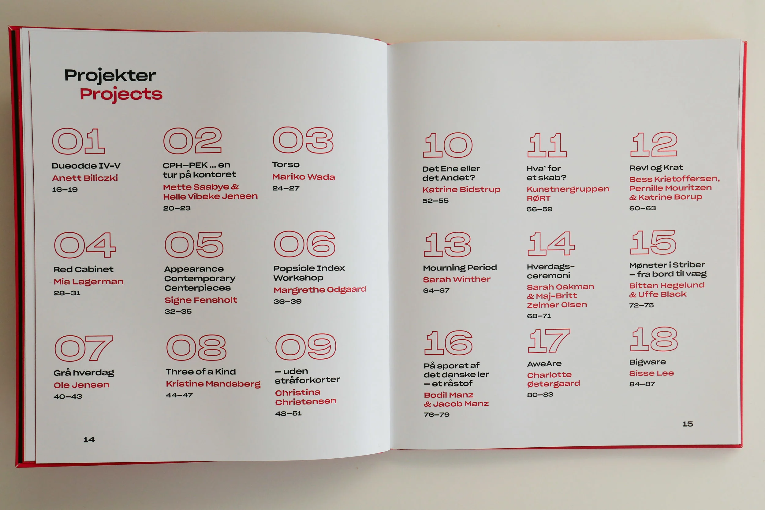
the exhibition with all eighteen works selected continues until 5 May 2019 at
Nordatlantens Brygge, Strandgade 91, København K

note:

I am curious about the translation of the title of the work.
In dictionaries revl is generally translated into English as batten or possibly lath (plausible as this is a woodland lodge) and krat as a thicket so presumably the saying implies something useful coming from something that might be dismissed or might be seen to be useless … in terms of potential materials, the tangled branches of a thicket are less useful than a carefully nurtured tree from managed woodland.  

This has been translated in the catalogue as Wheat and Chaff … where wheat is the grain or seed that you keep and use for food or for planting for the next crop while the chaff is the husks that are discarded after the crop is winnowed.

Is the implication therefore that if you appreciate the chaff then you can use teverything?

Fællesskab anno 2019 / Community anno 2019

Catalogue for Biennalen for Kunsthåndværk & Design / The Biennale for Craft & Design 2019

The forward for the catalogue has been written by  Hans Christian Asmussen - designer and lecturer in design and on the board of Danske Kunsthåndværkere & Designere / the Danish Association of Craft and Design.

He discusses the growing importance of our sense of community and the eighteen projects chosen for the Biennale consider, in one way or another, our "notion of community - some with a critical voice, some in a playful tone, some tenderly, but all striving to explore the value that community offers."

This is about how artists, through their work, explore complex ideas, express what they feel and give the viewer reasons to think and reconsider by emphasising or challenging a view point or simply by shining a light on aspects of our lives that possibly we need to reconsider.

There is a longer essay on Community by the design historian and design theorist Pernille Stockmarr. She makes the crucial observation that with the frequent use of terms such as 'sharing economy', 'co-creation', ‘co-design', 'crowdsourcing', and 'crowdfunding', the concepts of community and cooperation have a strong and important relevance.

Historically, the concept of community is strong in Denmark with a well-established welfare state; a strong sense of family and friendship; a strong and ongoing role for the co-operative movement in retailing for food and household design and a strong volunteer movement through various sports and hobby associations.

In part, political change outside Denmark and the growing pressure to resolve threats to our environment has lead many to question what motivates us and those uncertainties make us reconsider our priorities and help us decide how we can move forward as local or wider communities.

read more


the Biennale - Popsicle Index Workshop


A fascinating project by the textile and colour designer Margrethe Odgaard to explore links between our senses … so how taste or flavour, and presumably also smell, can form associations with certain colours.

In blind tastings of different foods in four different groups - Apricot, pomegranate and date in one trial and masala and marshmallows in another - people picked a colour from 520 different colour samples on the ice-lolly sticks and then put them into the slot in a wooden box to record which colours they associated with which flavours.

Colours selected for each specific group of flavours are shown in frames.

Obviously the mental and emotional process - linking a colour with a flavour or smell - is complex and surely has to be subjective. Some flavours will seem hot or cool or strong or subtle - we use many of the same words when we try to describe flavours and colours - and presumably that makes the choice of specific colours relatively straightforward but also people will also associate a specific smell or flavour with a particular memory of a specific event so that could well be the colour of the room they were in when they first tried a food or there might be a strong link between a person they knew and their favourite food and their favourite colour.

This experiment also, of course, throws a light on how designers, particularly product designers, have to consider options for colours that have to reflect fashion while allowing not only for personal taste but also conventions within a community or society for which colours are associated with a function … so designers have to consider colours that a wider community might associate with freshness or grief or passion or, that most curious of human concerns, about which colours reflect or might signal that you have good or bad taste. 

Biennalen for Kunsthåndværk & Design

margretheodgaard.com

the Biennale - to play and learn together


This work by Kristine Mandsberg has prominent labels that read "please touch".

Play and, through play, early learning is one of the first stages where a child not only begins to explore and understand the physical world but also begins to build bonds with parents, siblings and a growing circle of friends.

Copenhagen has remarkable playgrounds with a huge range of equipment to test agility, to stimulate the imagination of children and to encourage play and the production of toys and furniture for children has been important in the works of many designers.

Kristine Mandsberg trained as a textile designer in Kolding and once you know that then the structural form of Three of a Kind, with warp and weft, becomes intriguing.

She also describes herself as an illustrator and the bold simple shapes here and her use of strong, bold colours has to come from a graphic sensibility.

But it was not just children who spent time twisting and turning and resetting these pieces. It was interesting to watch adults set and re set the pieces … perhaps not to find the inner child but seemed to reflect, at least, the way humans are curious about complex and adaptable structures.

These works have an element of mechanics about them … reminiscent of old wood football rattles that are never seen at matches now.

Biennalen for Kunsthåndværk & Design

kristinemandsberg.com